Scope:
Brand Strategy, Brand Identity, Website Design
Collaborators:
The Local Folk
Mrsippy came to us with a big ambition: to shake up the children's water bottle category with a product that put filtered water, functionality and fun first. With a logo, a colour direction and a clear vision already established, our role was to build the brand world around it. We were tasked with creating a cohesive online and in-person presence through packaging and website design, transforming those initial foundations into a distinctive, commercially considered brand experience. One that could capture the imagination of little sippers while earning the confidence of the parents buying for them.
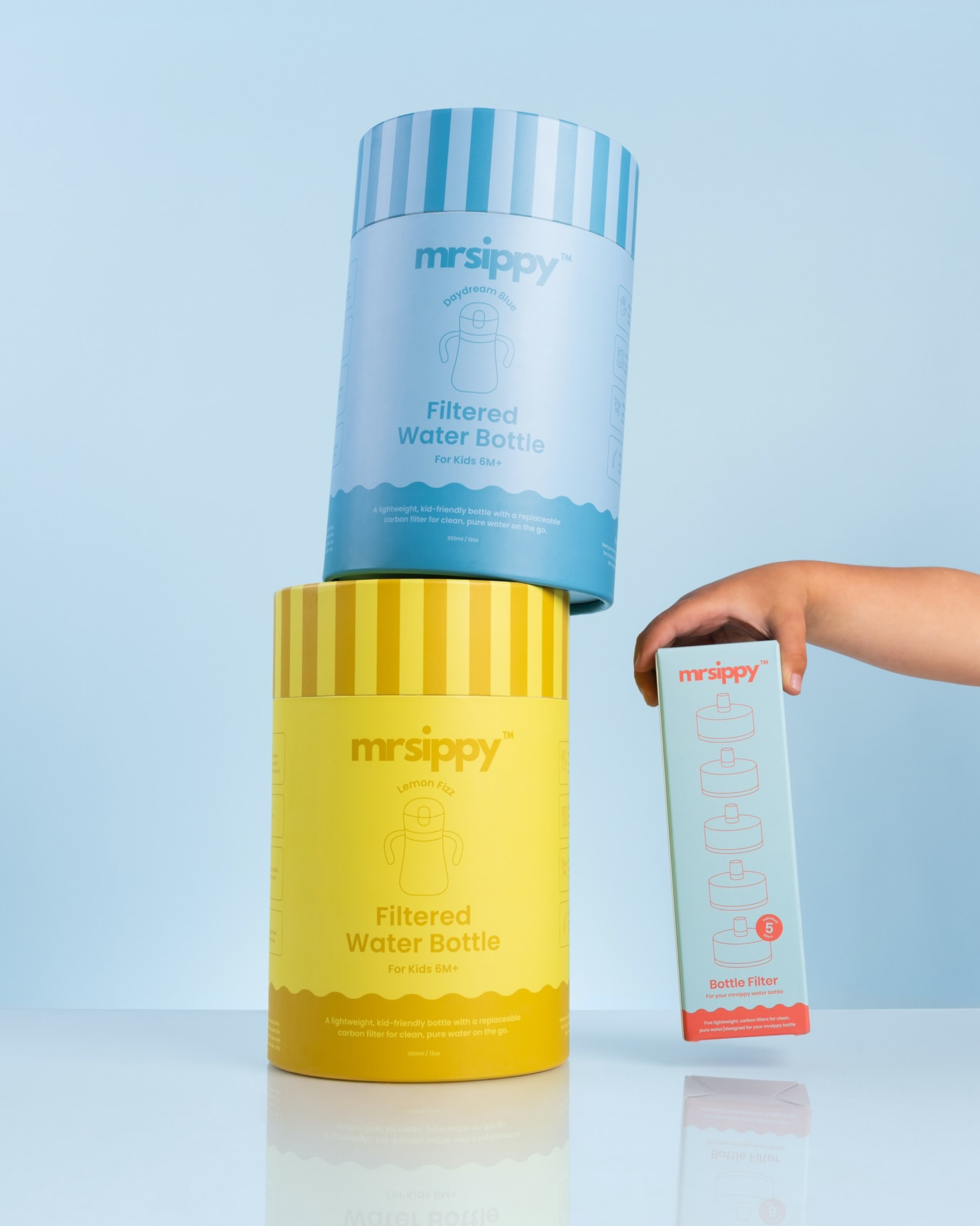
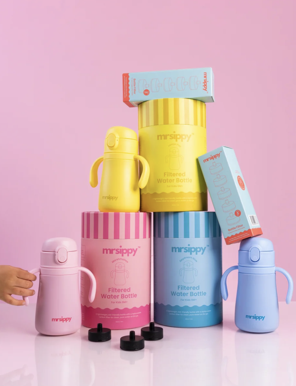
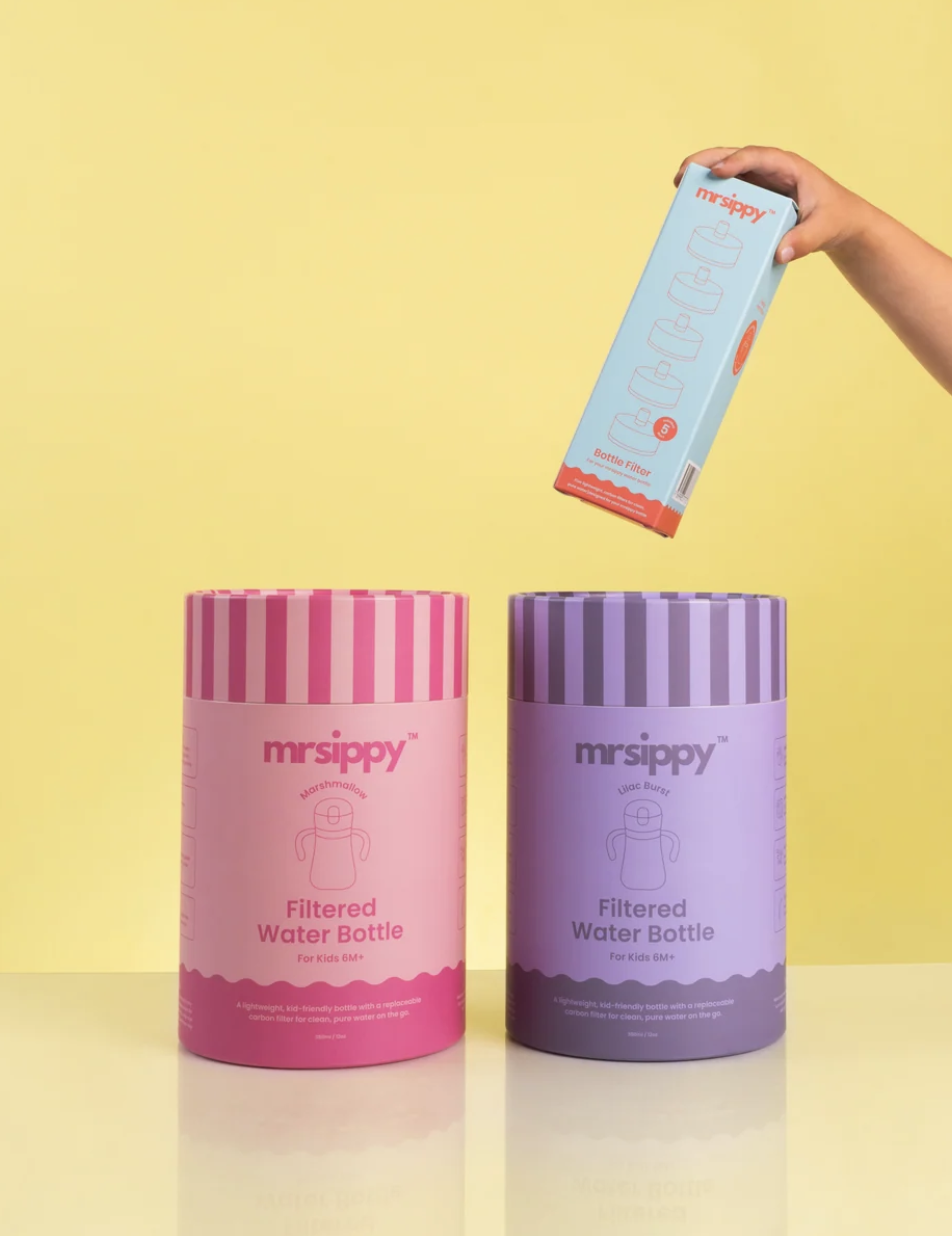
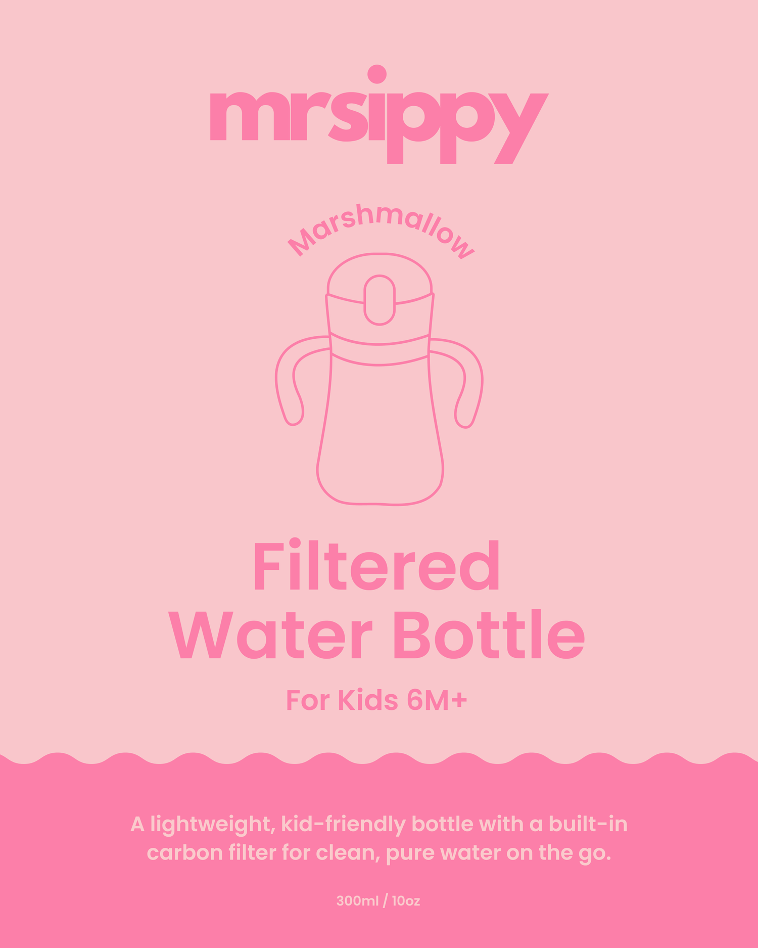
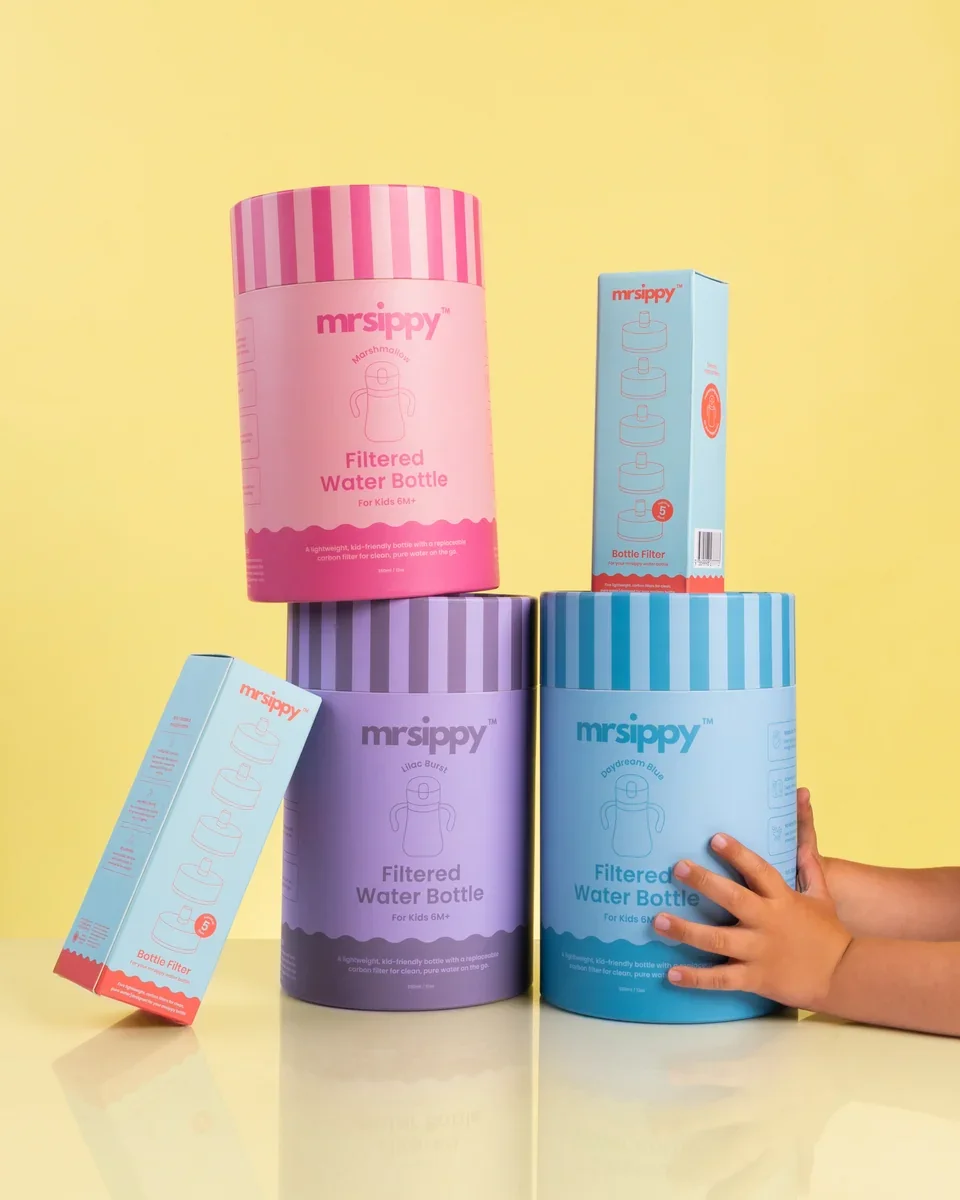
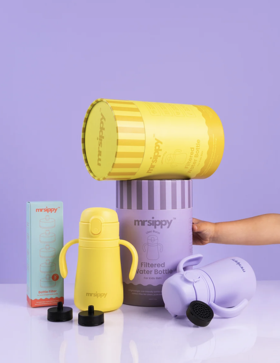
The packaging needed to do more than look good on a shelf. It had to stand out, tell a story and communicate what made mrsippy different. We developed a playful packaging system built around vibrant colour, expressive typography, soft shapes and considered illustrations, giving the brand a recognisable presence across its bottles and replacement filters. Every detail served a purpose, balancing the fun of childhood with clear, benefit-led messaging that helped parents understand the product's functionality and value. The result was packaging designed to be picked up, explored and remembered, creating a memorable first interaction with the brand.
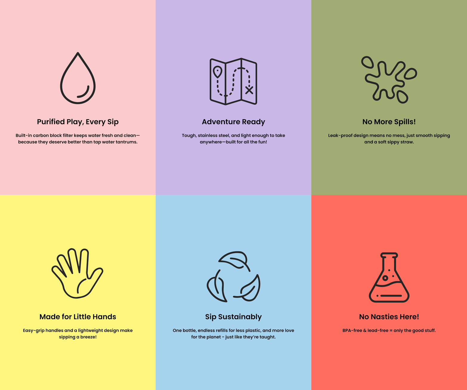
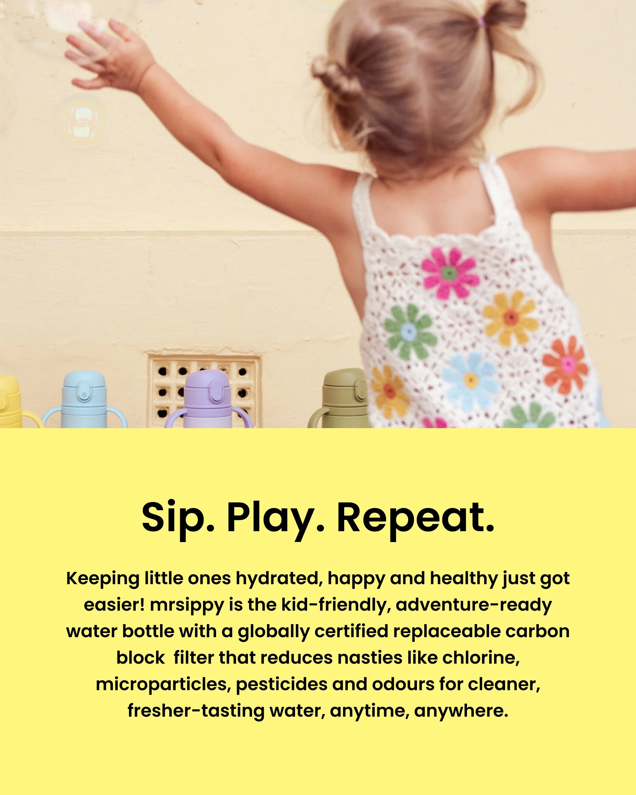
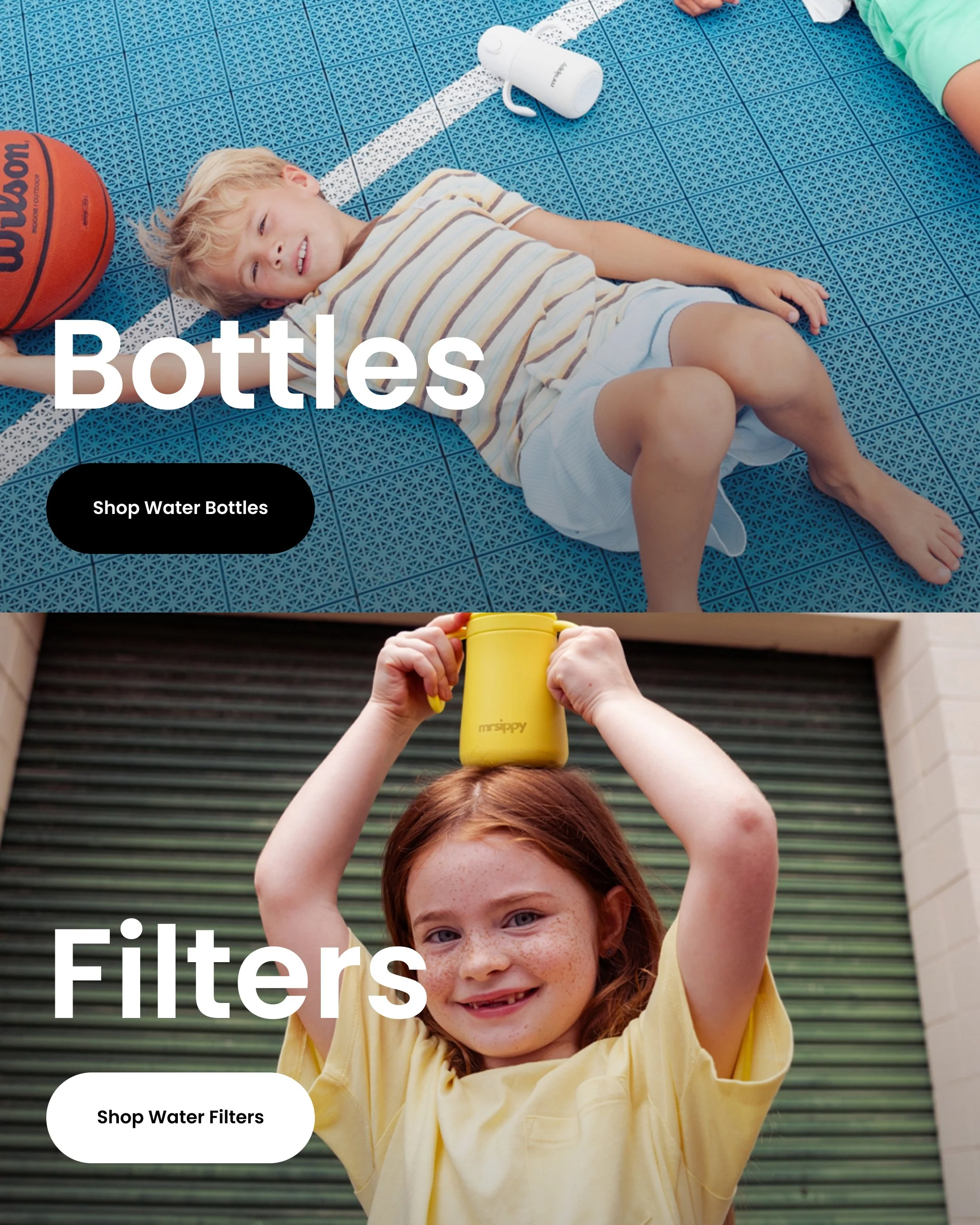
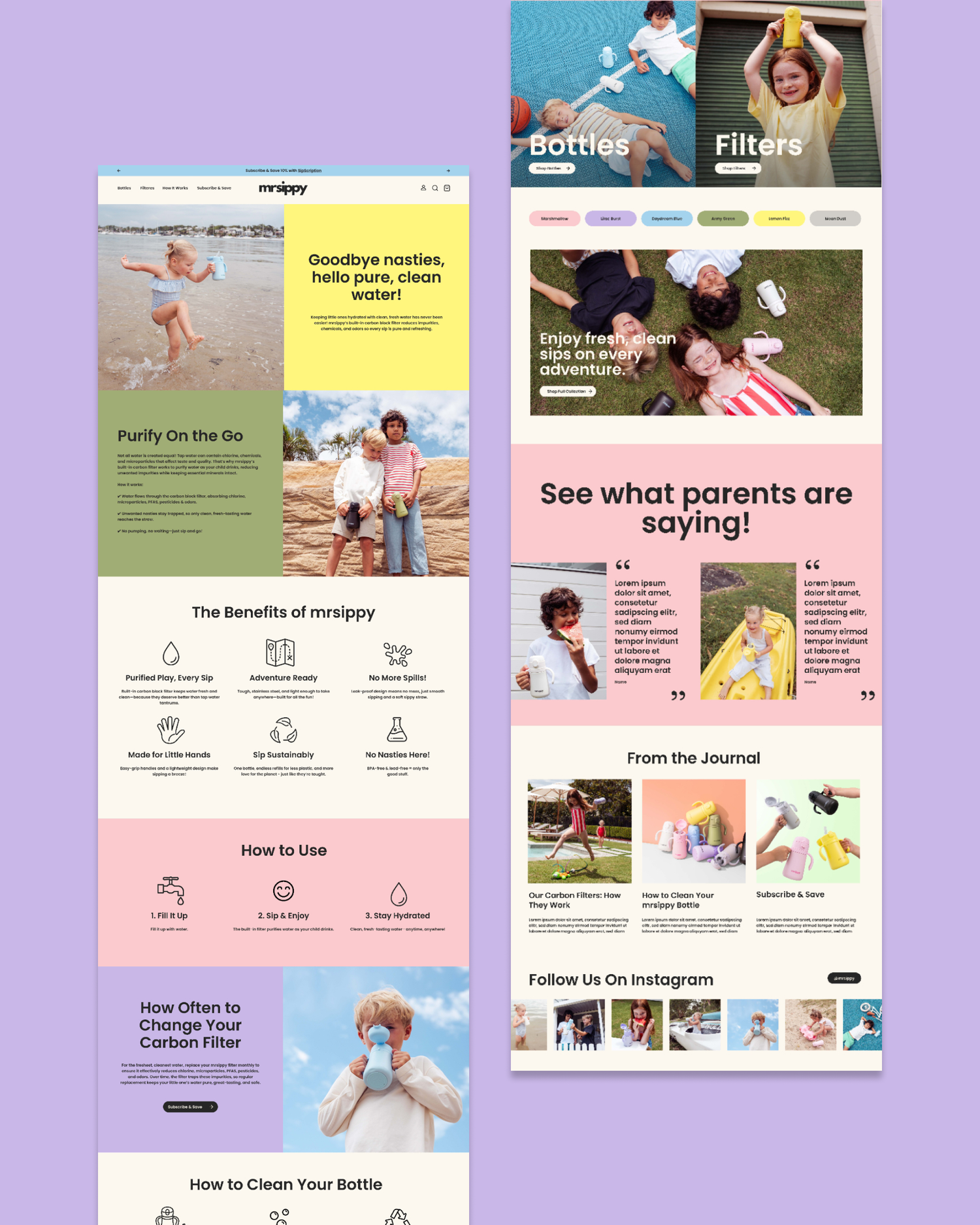
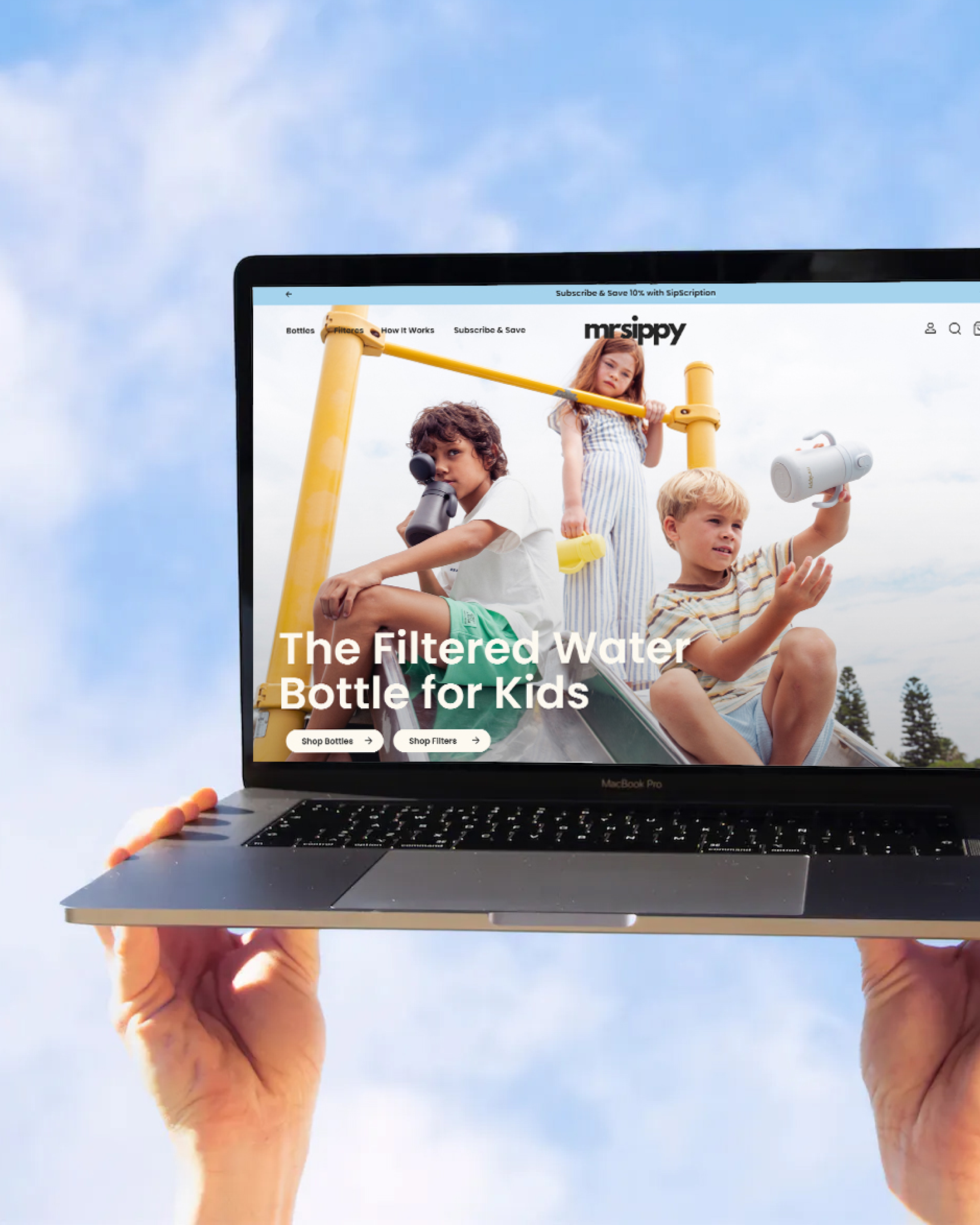
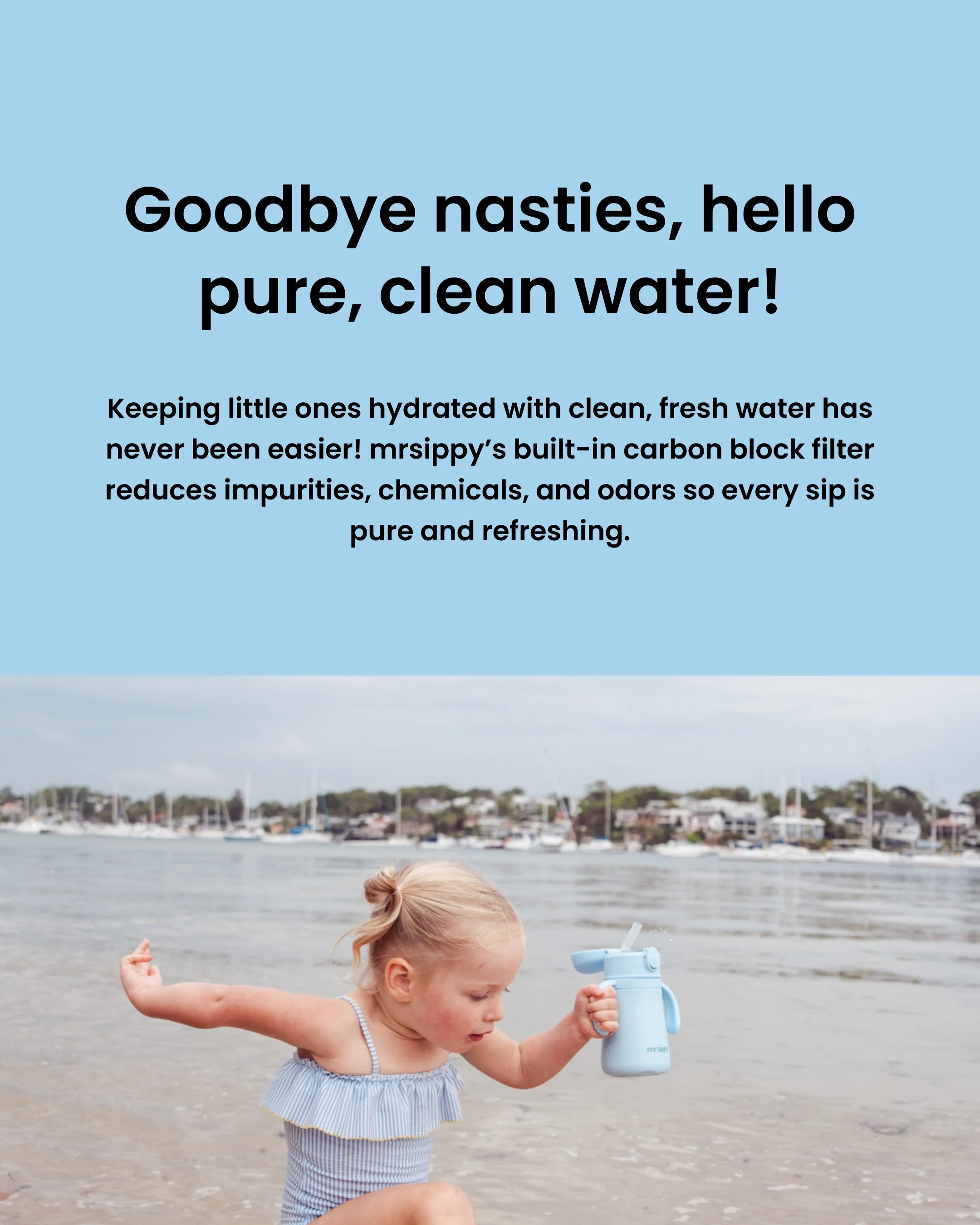
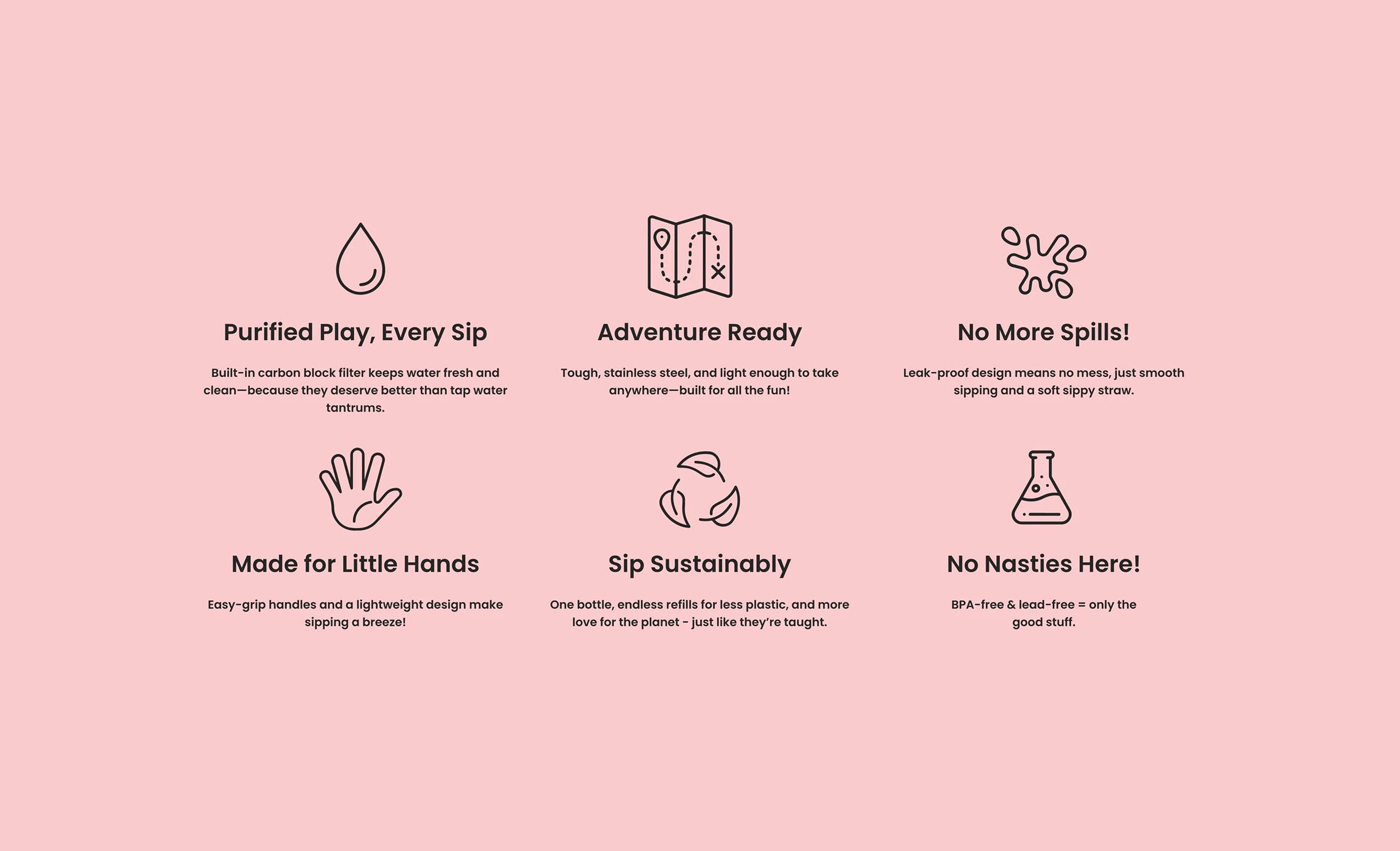
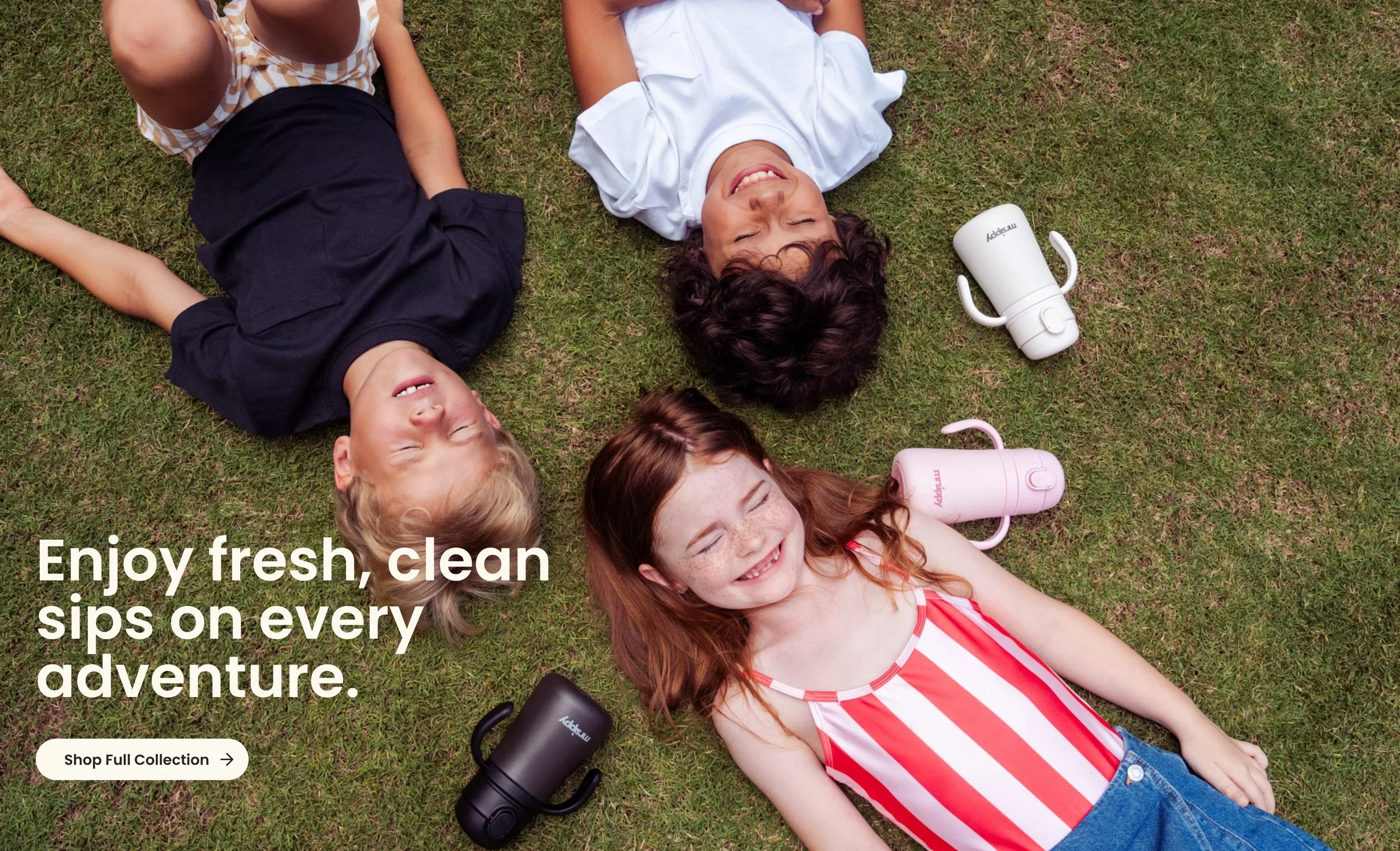
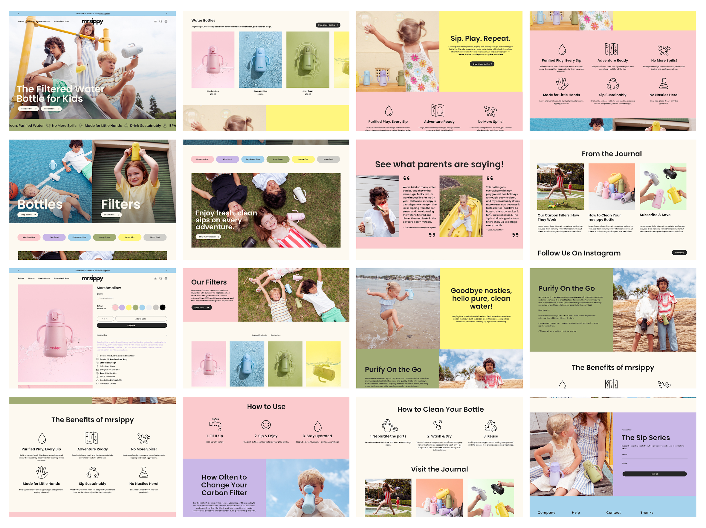
We approached the Shopify website as an extension of the physical brand experience, carrying the same energy, personality and visual language into the digital space. Rather than building a conventional online store, we designed an engaging ecommerce experience that balanced storytelling, product education and conversion. From explaining the science behind the carbon block filter to highlighting the bottle's everyday benefits, every section was considered to make a relatively new product concept easy to understand and exciting to purchase. We also incorporated the SipScription subscription model, creating a simple pathway for ongoing filter replacements and supporting the brand's relationship with customers beyond their first purchase.