Scope:
Brand Strategy, Brand Identity, Website Design
Collaborators:
The Local Folk
For Common Ground, we set out to give connection a visual language. The starting point was a simple idea: a sense of belonging begins with how a brand makes people feel. We wanted the identity to welcome people in, while giving the business a clear, confident presence. That balance shaped our approach, bringing warmth and commercial purpose into the same conversation.
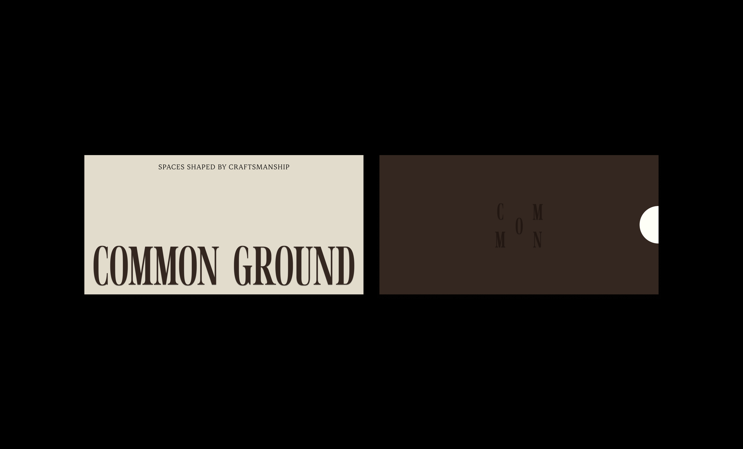
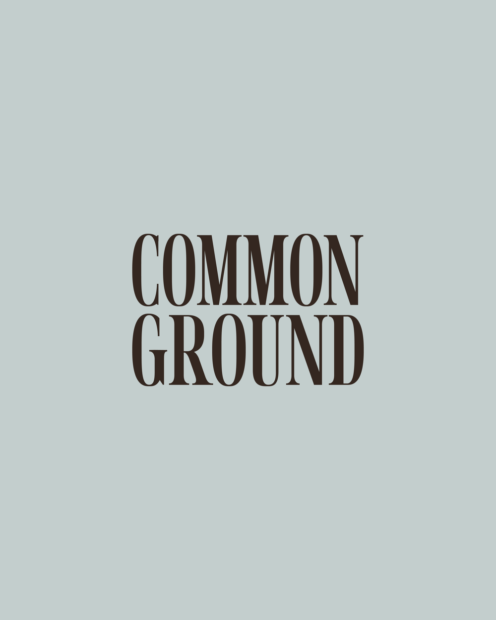
We built the identity around refined typography, grounded colour and considered spacing. The typography brings definition and strength, while the palette introduces a softer, more familiar quality. Together, these elements establish a steady visual rhythm, giving Common Ground an approachable character with enough distinction to hold its own.
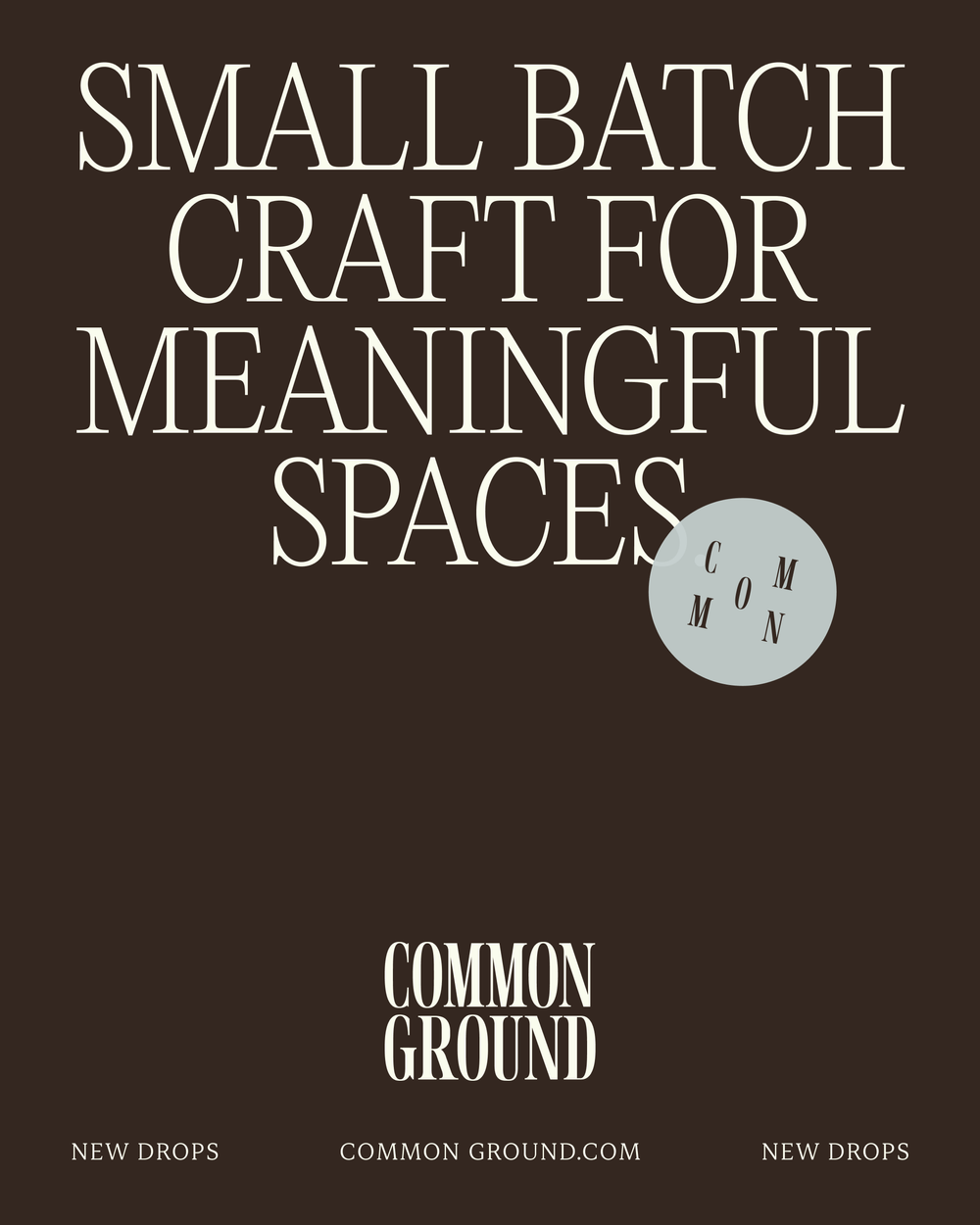

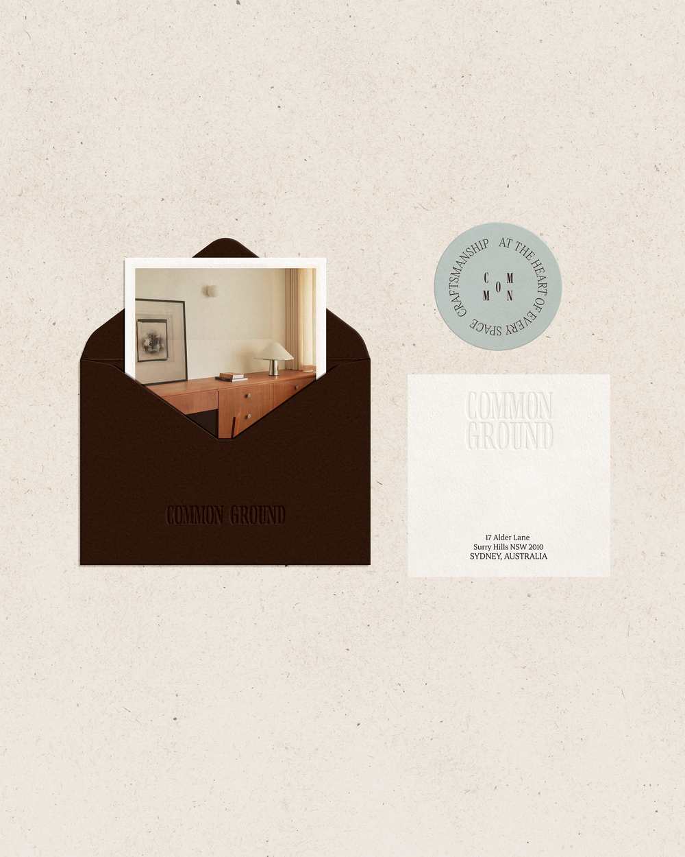

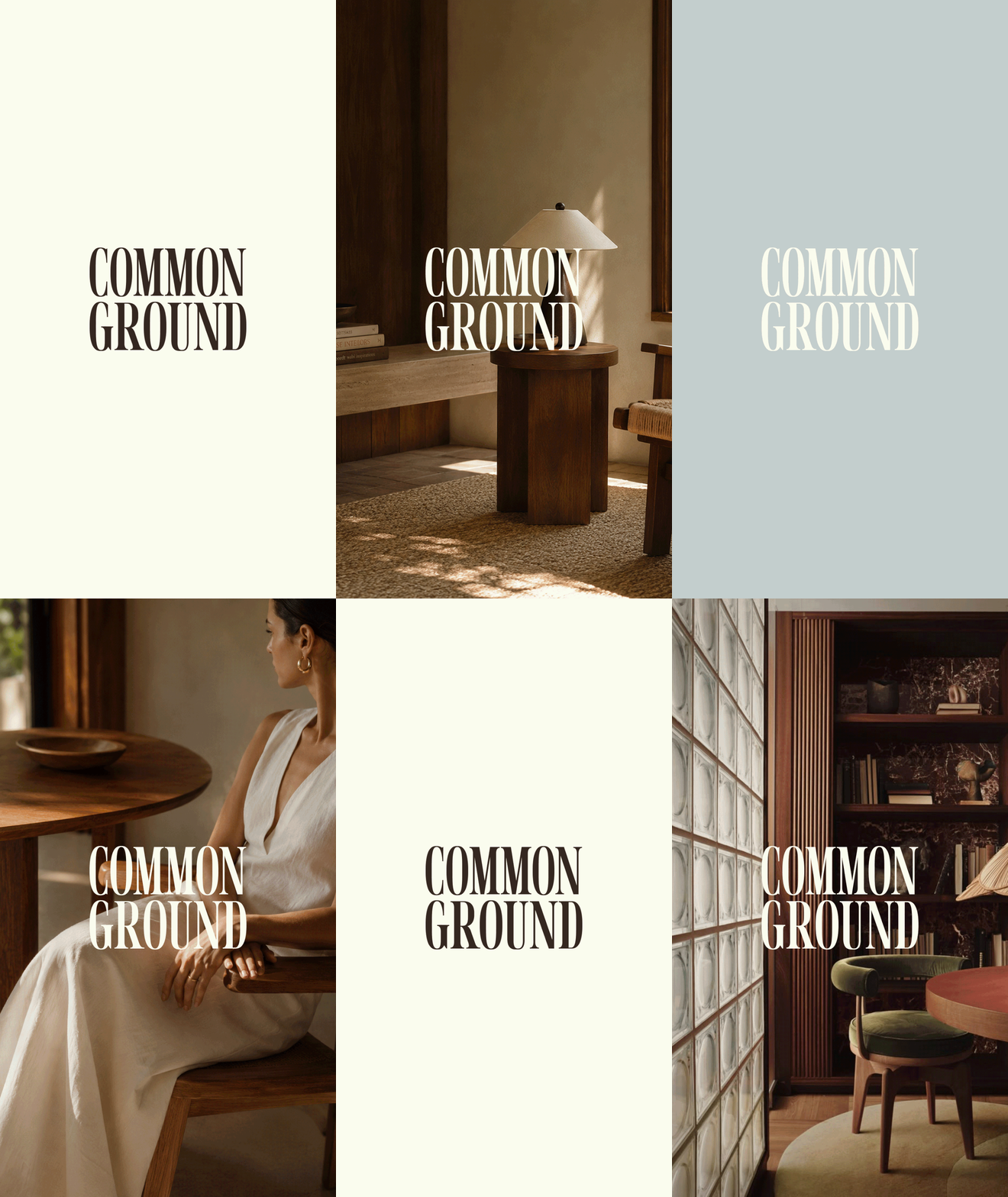
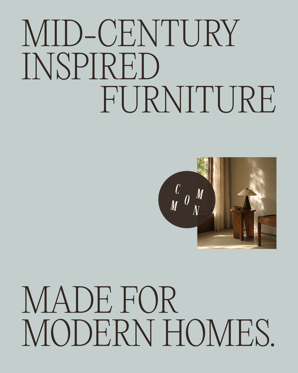
We considered how the identity would carry across digital, print and customer-facing touchpoints. Each element needed to contribute to a recognisable whole, with enough flexibility to suit different formats and moments. Thoughtful details bring character to the system, while a consistent structure helps every application feel connected. It gives the brand a clear way to show up wherever people encounter it.
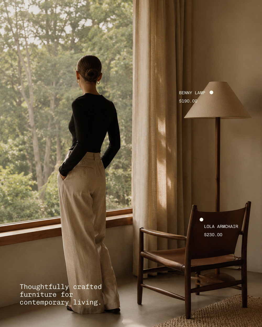
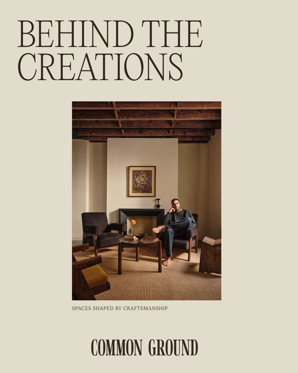
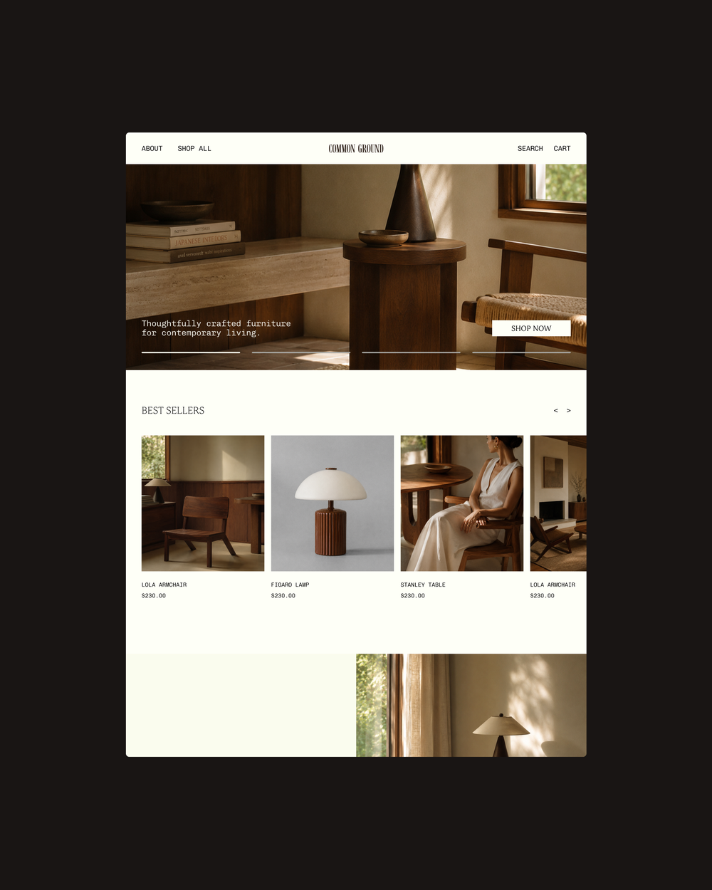
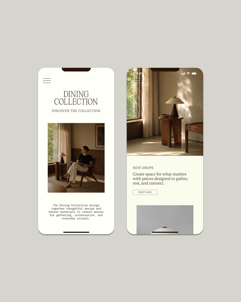
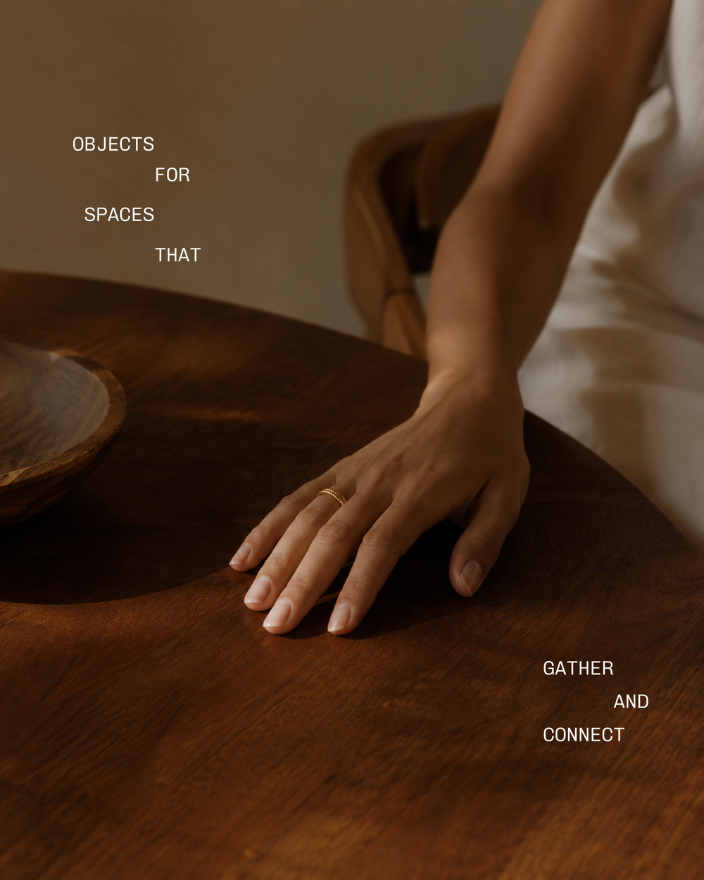
The result is an identity that makes connection feel tangible. Calm, warm and assured, Common Ground has a visual presence that reflects its name and gives people something to recognise and return to. For the business, it creates a cohesive foundation for communication and growth. For its audience, it offers a welcoming first impression that carries through the wider brand experience.