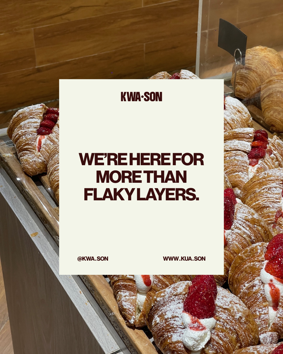
KAW.SON
Project
Brand Identity, Website Design, Packaging Design, Digital Design, Print Design
Scope
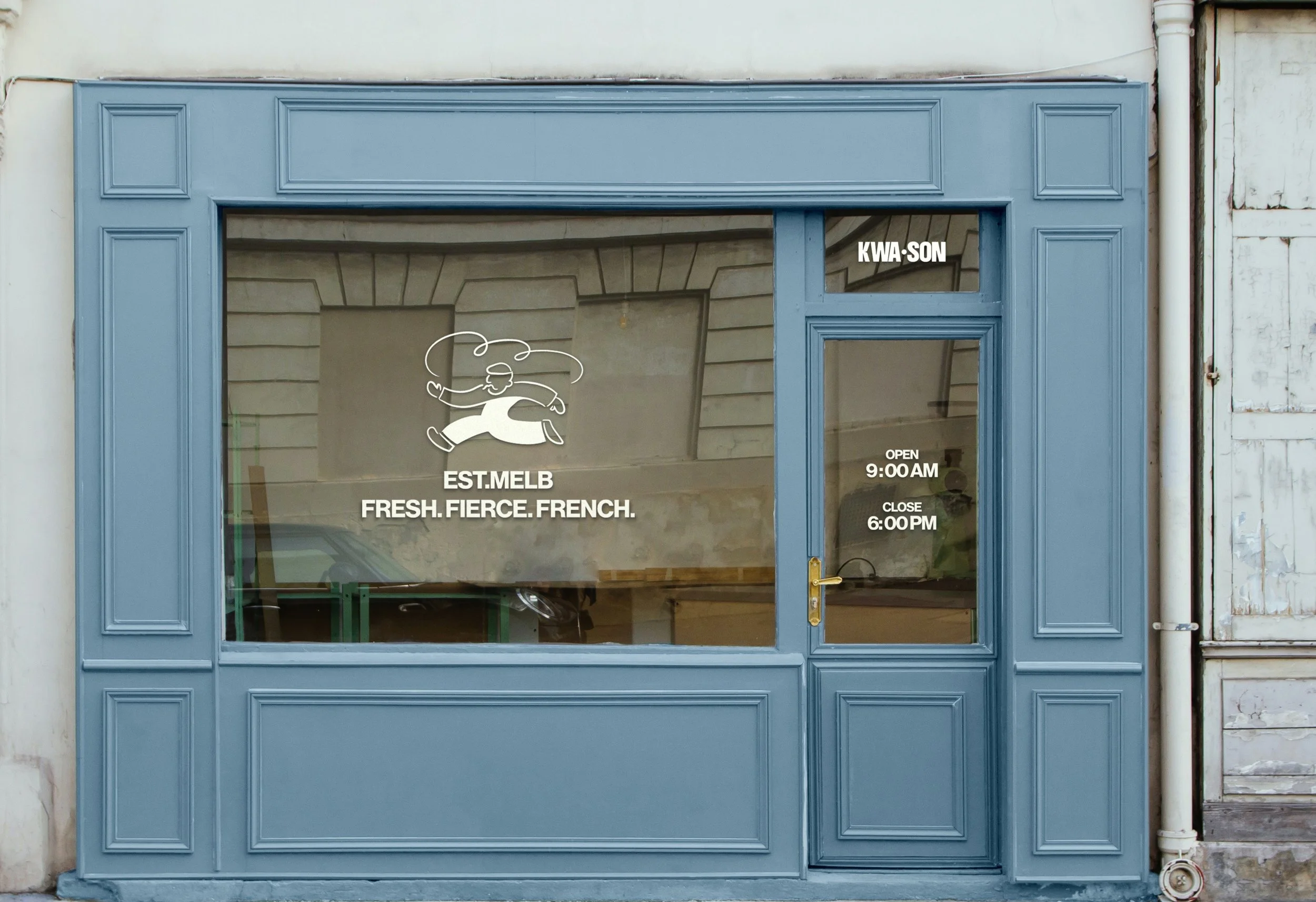
Fresh. Fierce. French.
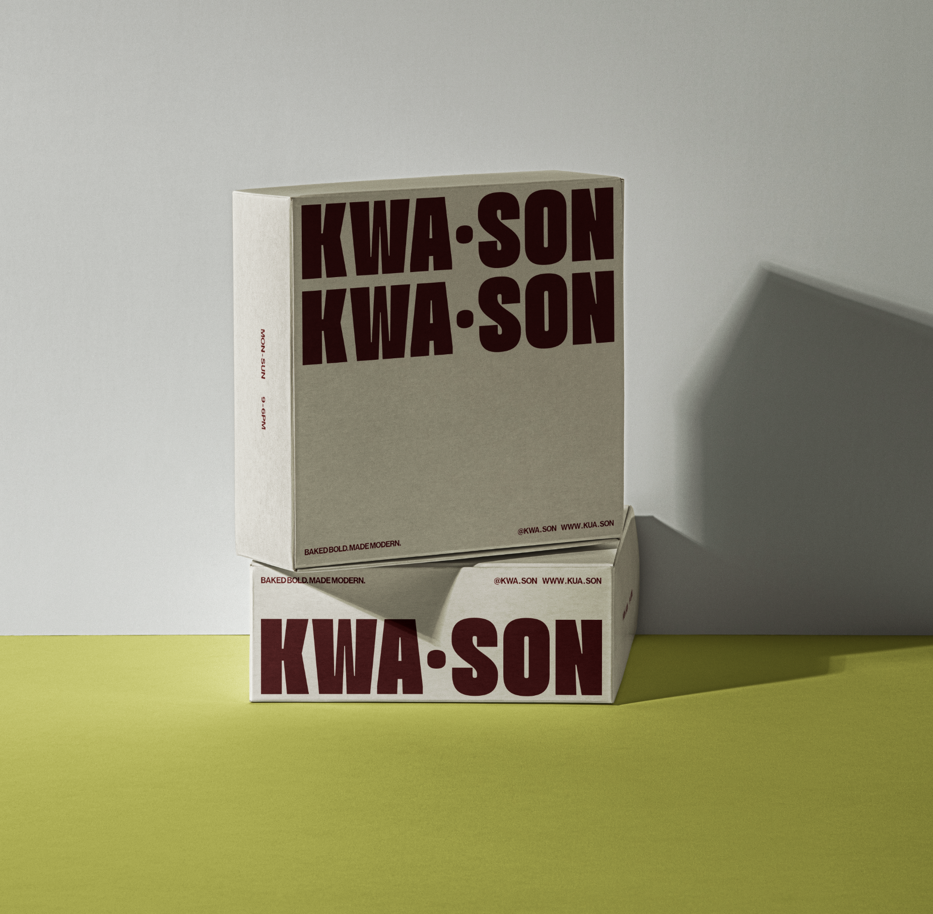
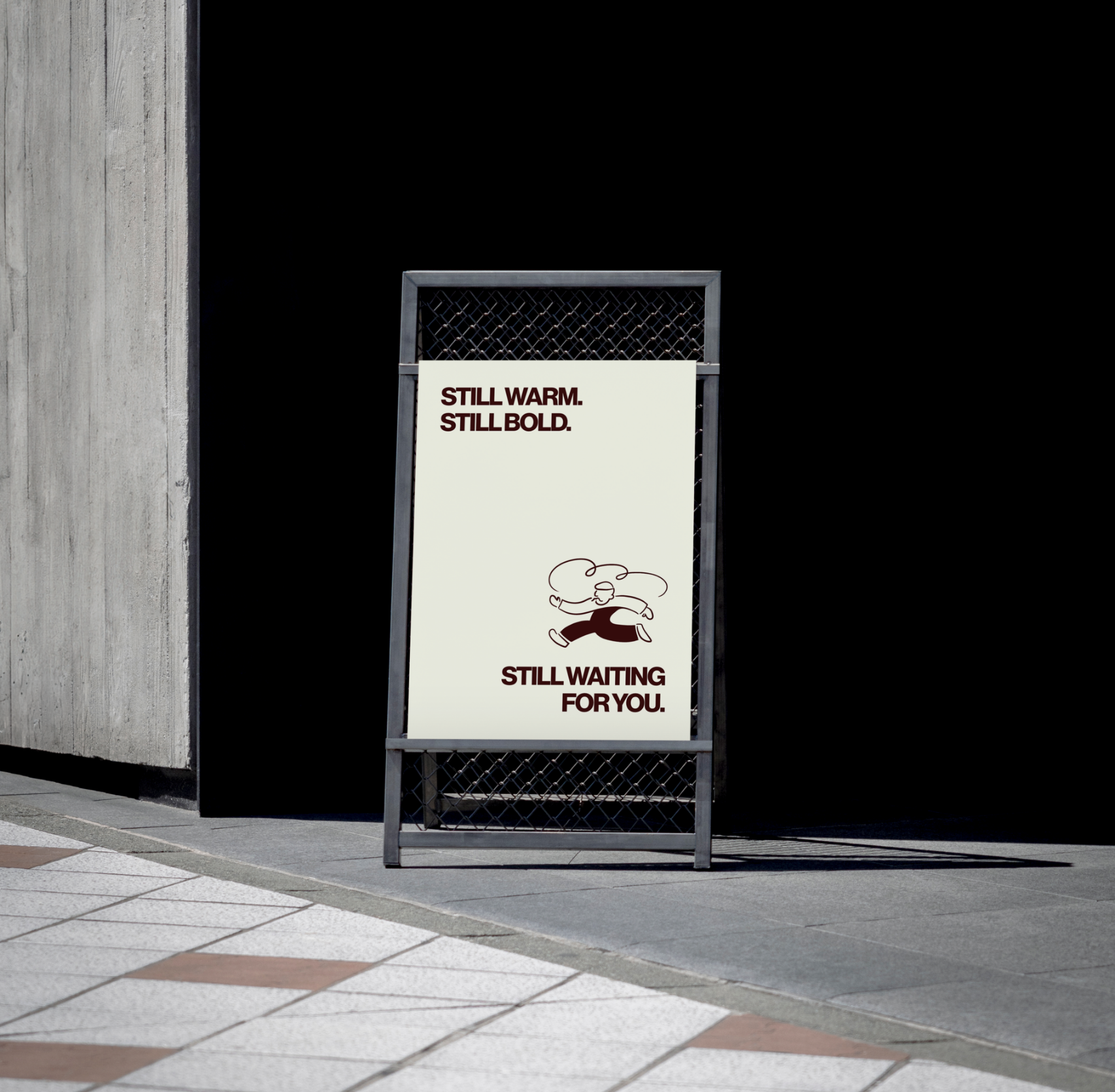
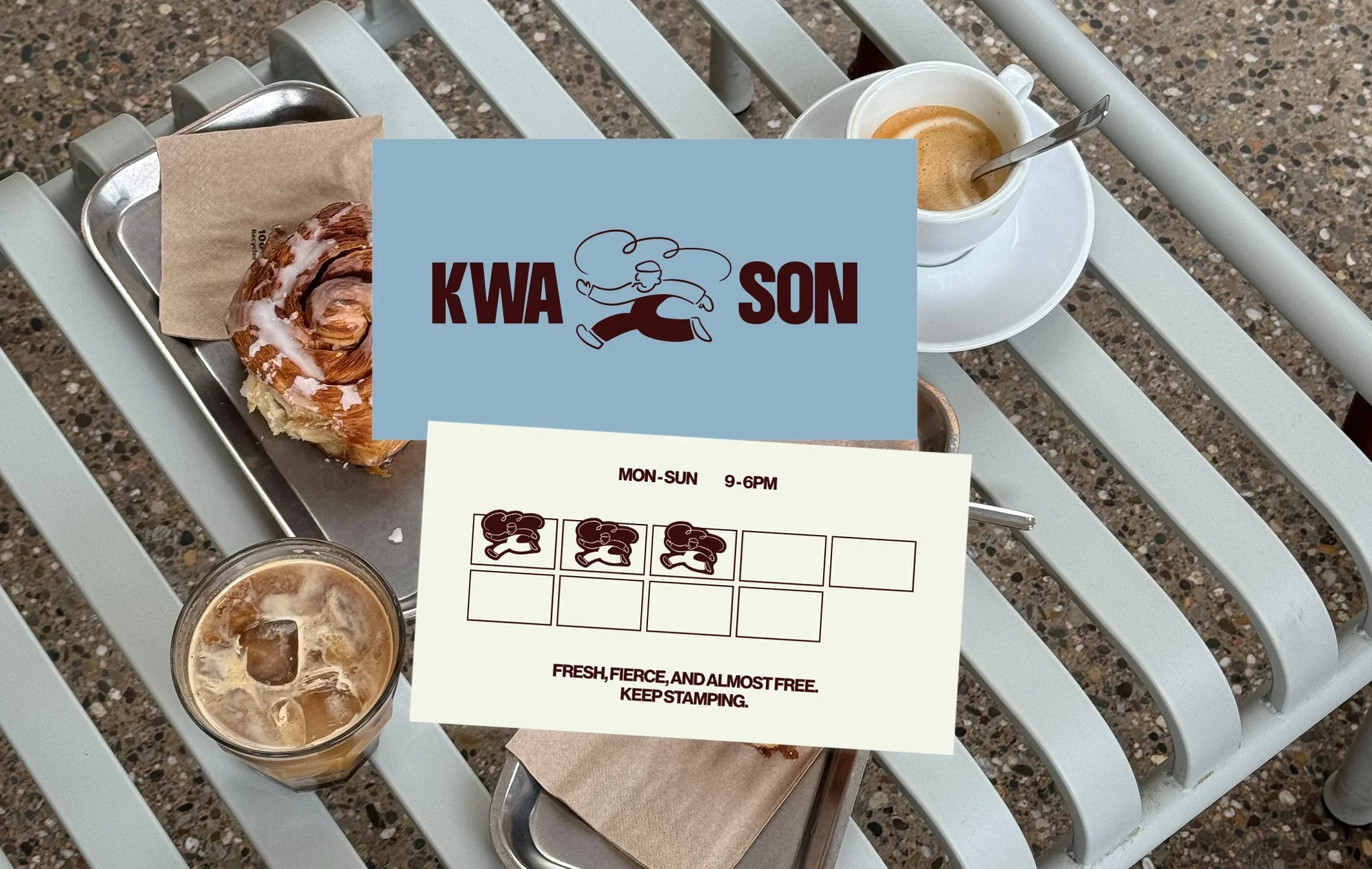
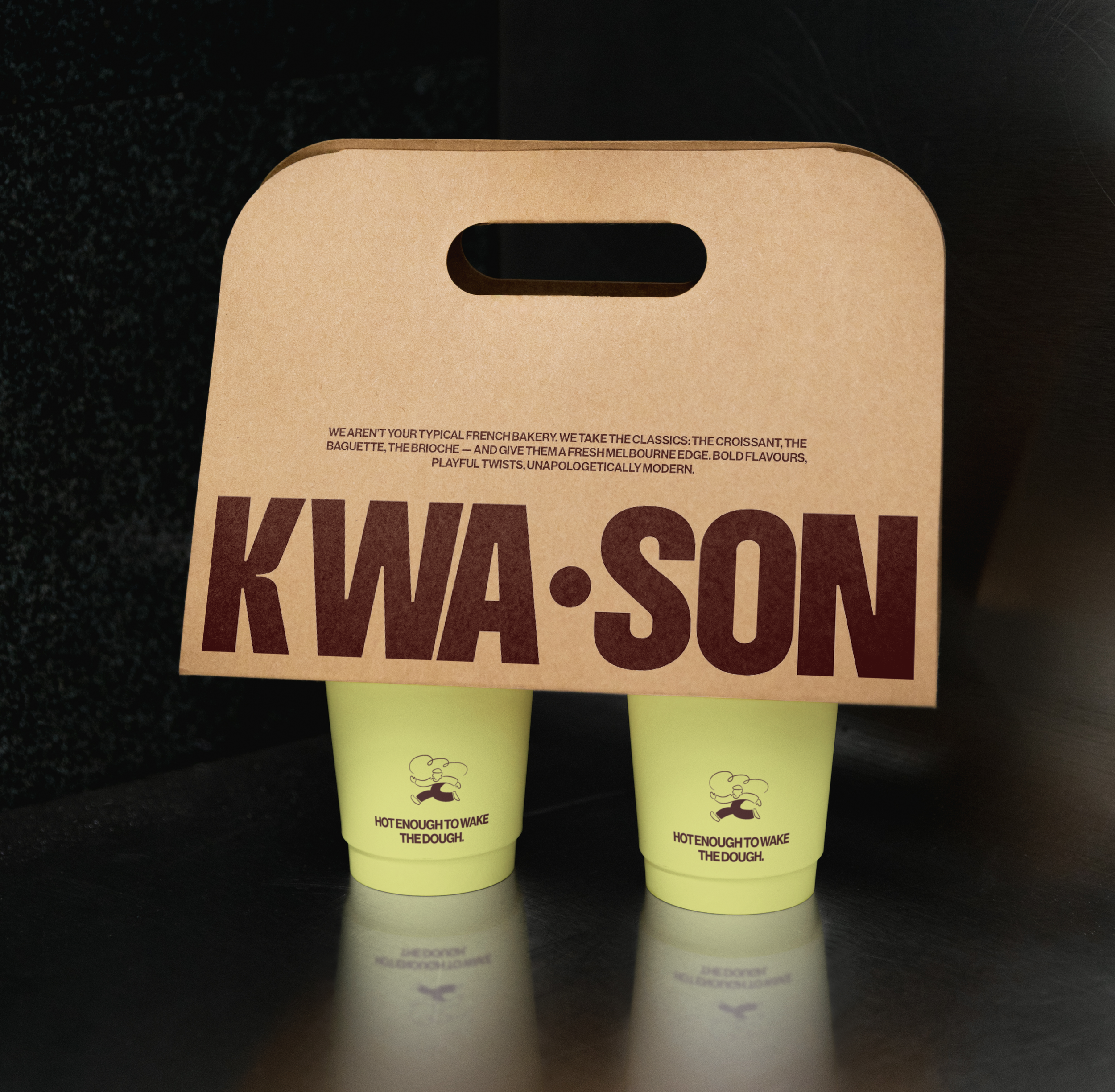
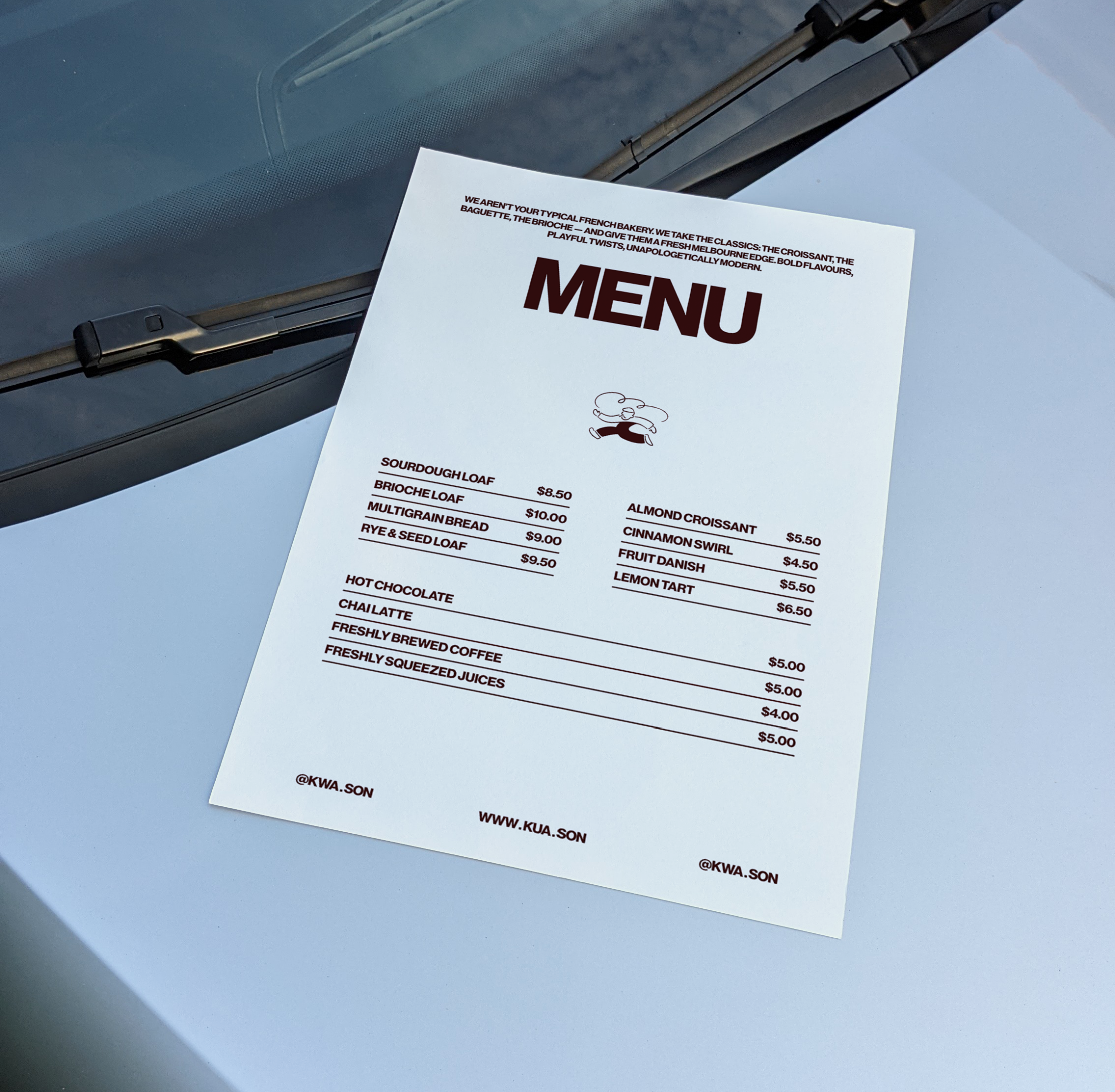
The bold, French-inspired character (complete with a hidden croissant) set the tone for the whole identity. A confident, heavyweight font gave the brand its voice, loud, clear, and impossible to miss. Packaging and print media played a starring role, transforming every bag, box, and coffee card into a story worth keeping.
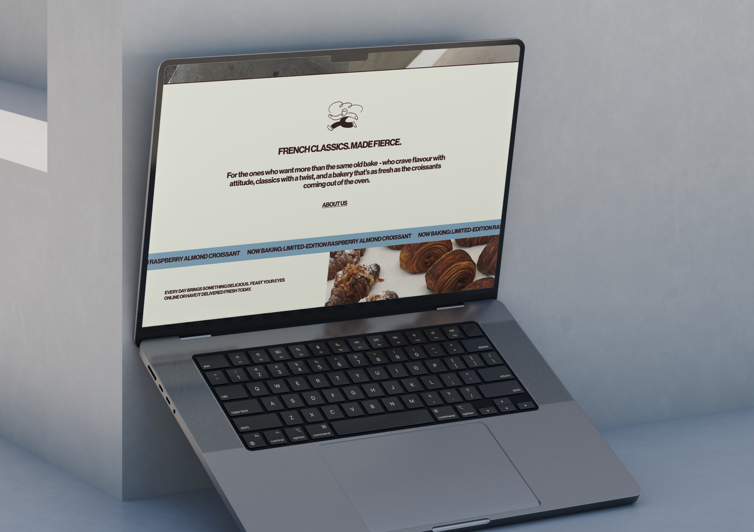
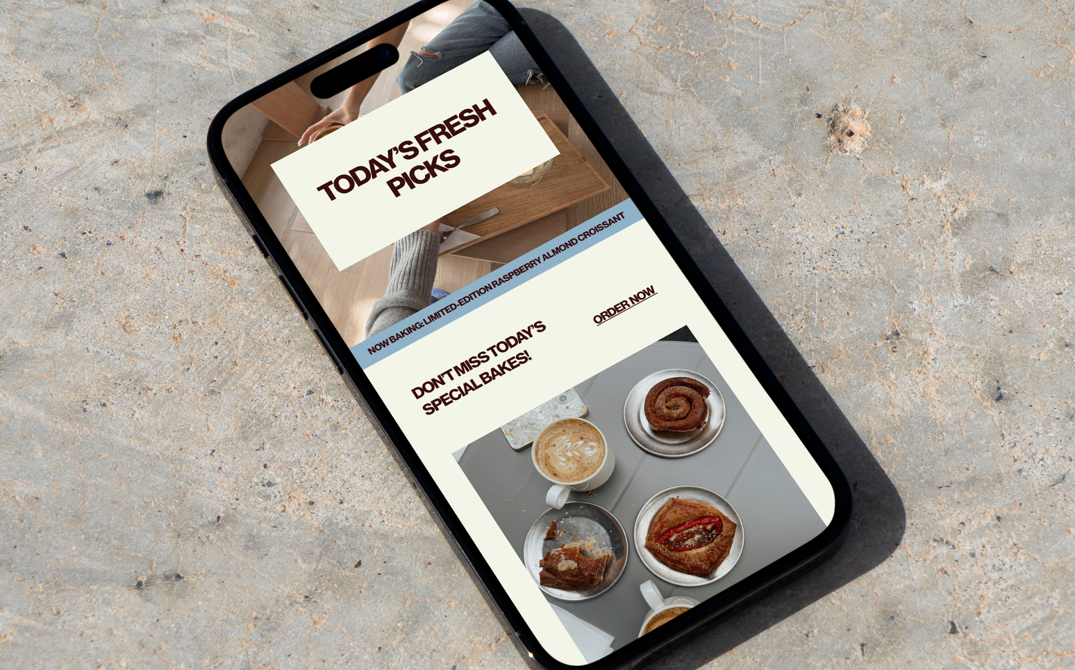
On the street, the shopfront and signage stop you in your tracks; online, the website carries that same energy into the digital space. Every touchpoint - from wayfinding to takeaway cups - pulls you into the world of KWA•SON. The result? A brand that’s fresh, fierce, and unmistakably its own — designed to be photographed, shared, and remembered.