Scope:
Brand Strategy, Brand Identity, Website Design
Collaborators:
The Local Folk
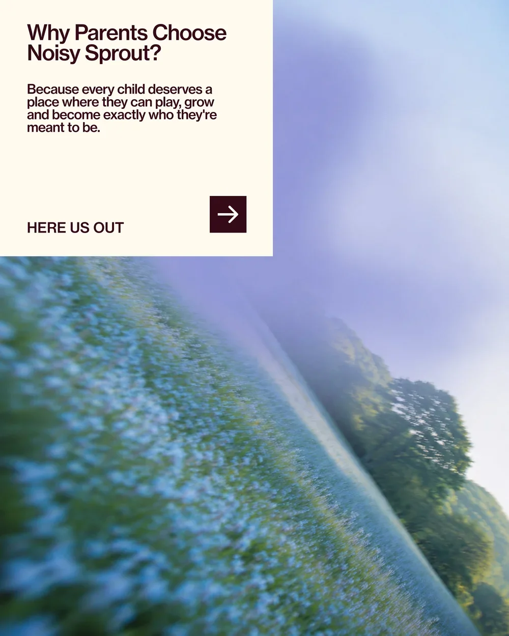
Noisy Sprout is an early childhood centre created for brilliant little humans to learn, play and flourish in their own way. A place for the curious, the chatty, the sensitive, the loud, the shy and the wonderfully weird — where individuality is encouraged and childhood is allowed to be exactly what it should be: full of movement, imagination and joyful chaos.
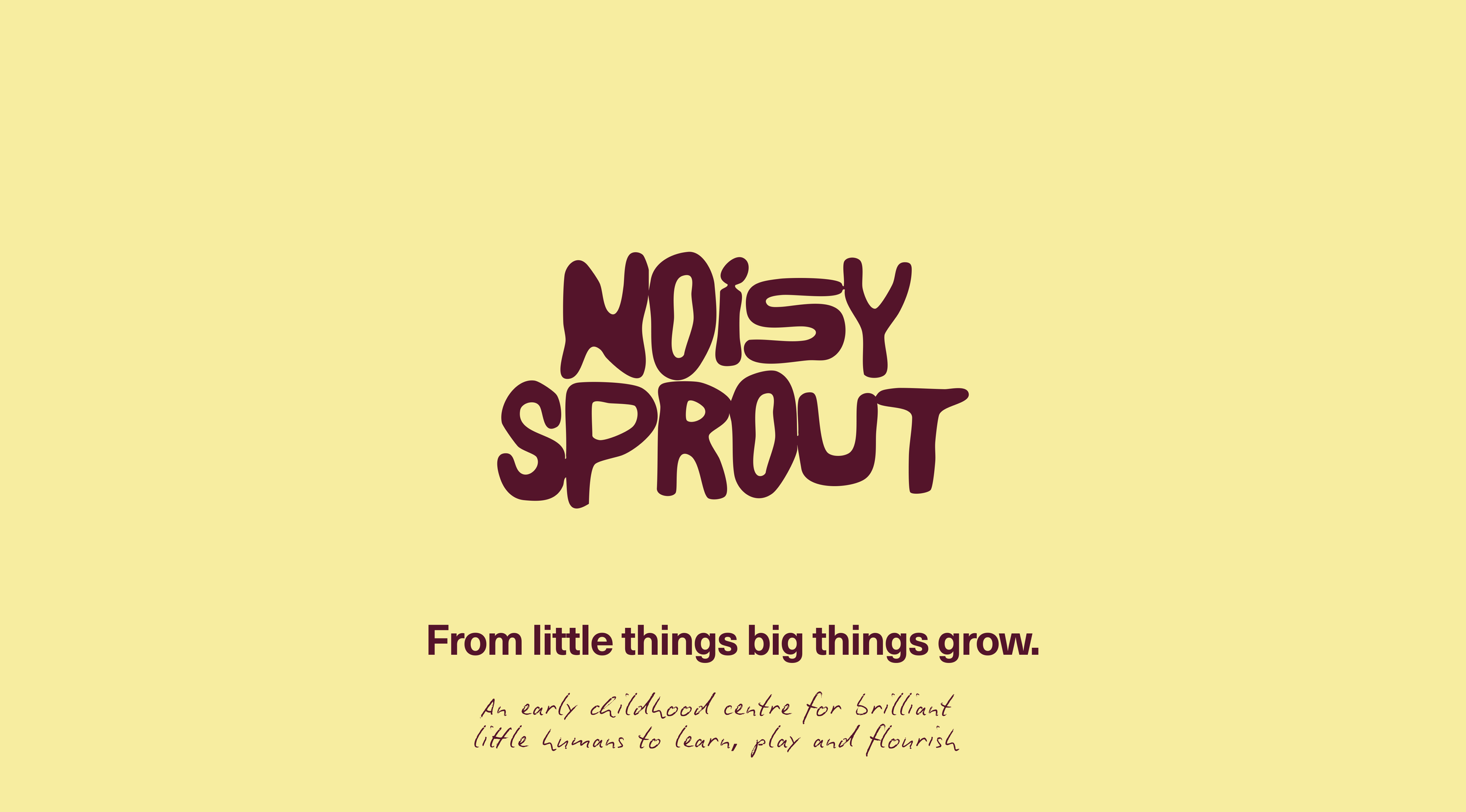
The opportunity was to create something that felt distinctly different from the soft, neutral and predictable world of early learning. Noisy Sprout needed an identity that could capture the energy and personality of childhood while still giving parents a strong sense of trust, care and credibility. Playful, but never childish. Expressive, but always intentional.
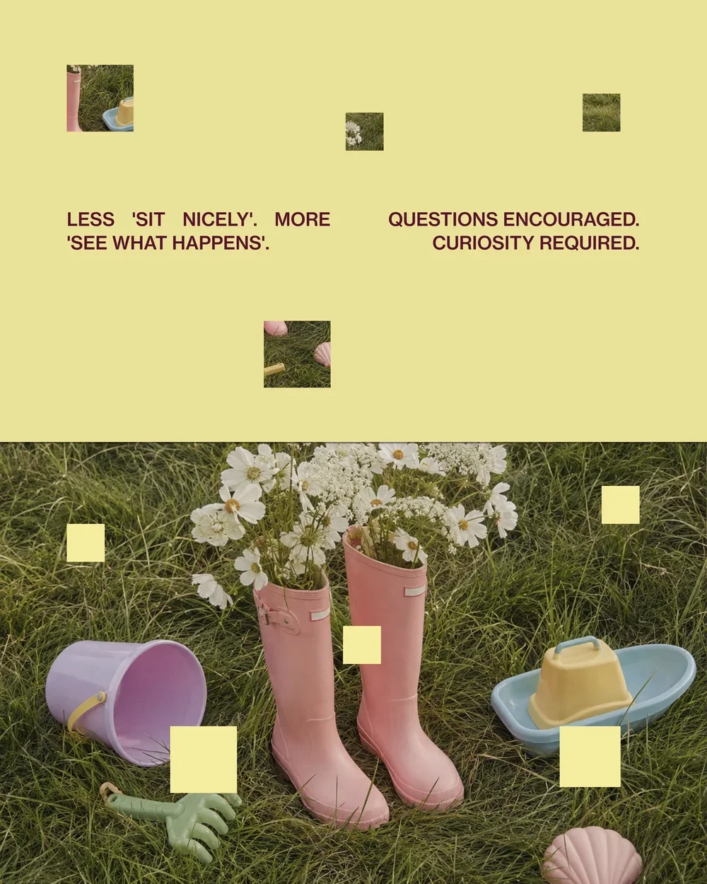
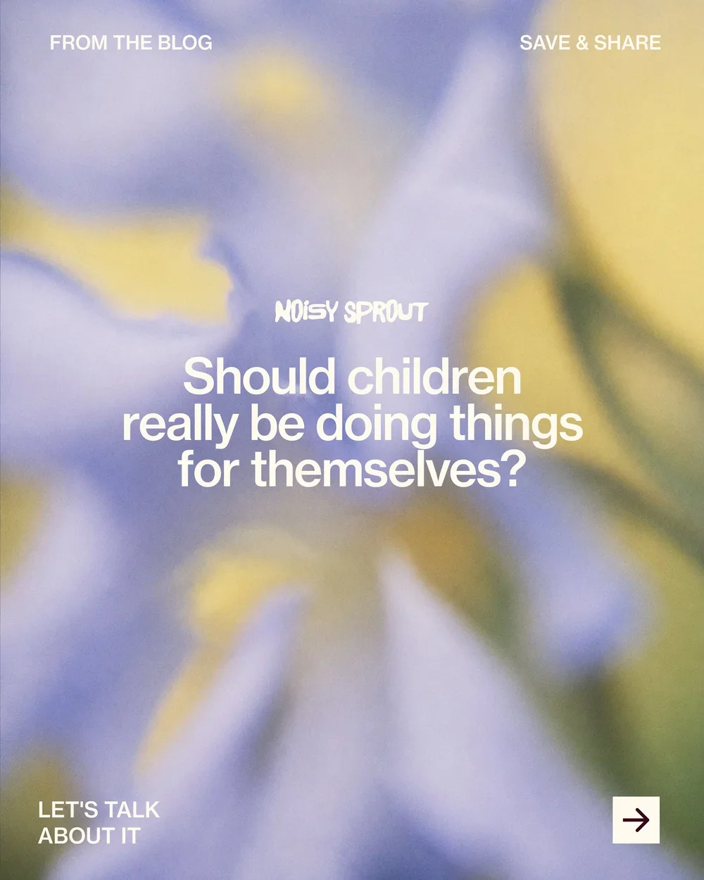
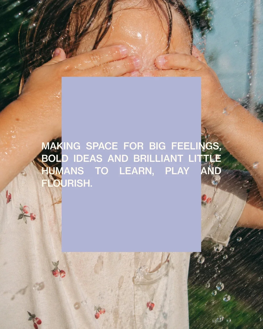
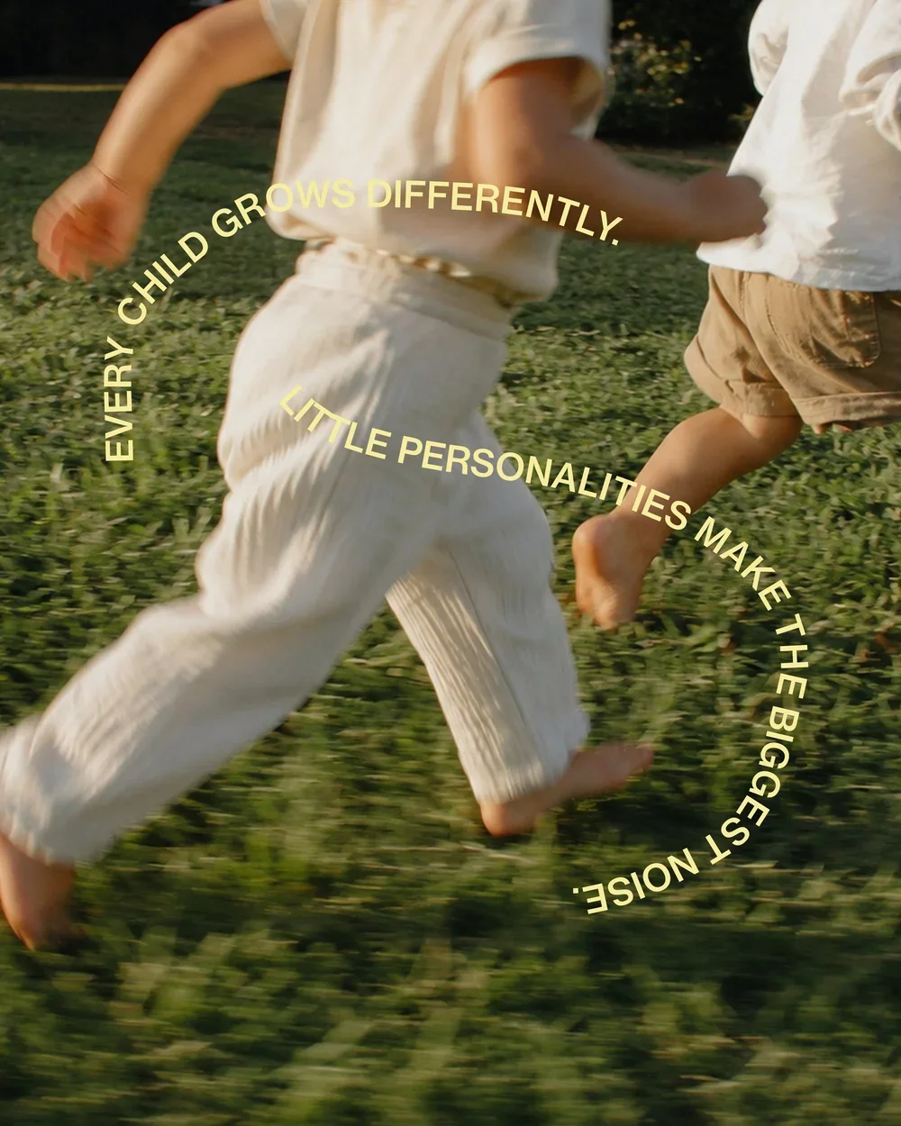
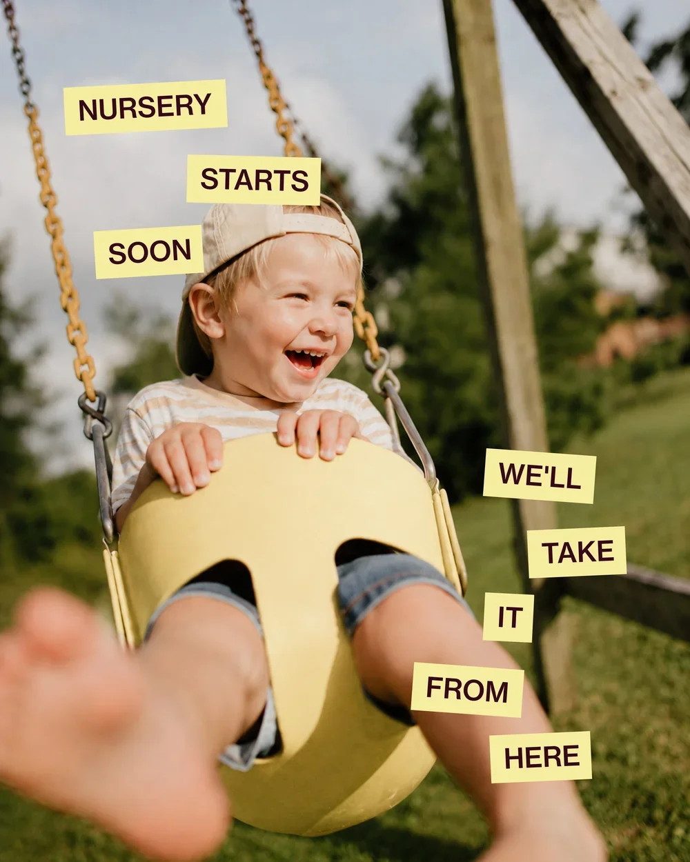
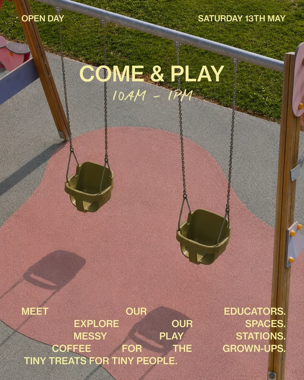
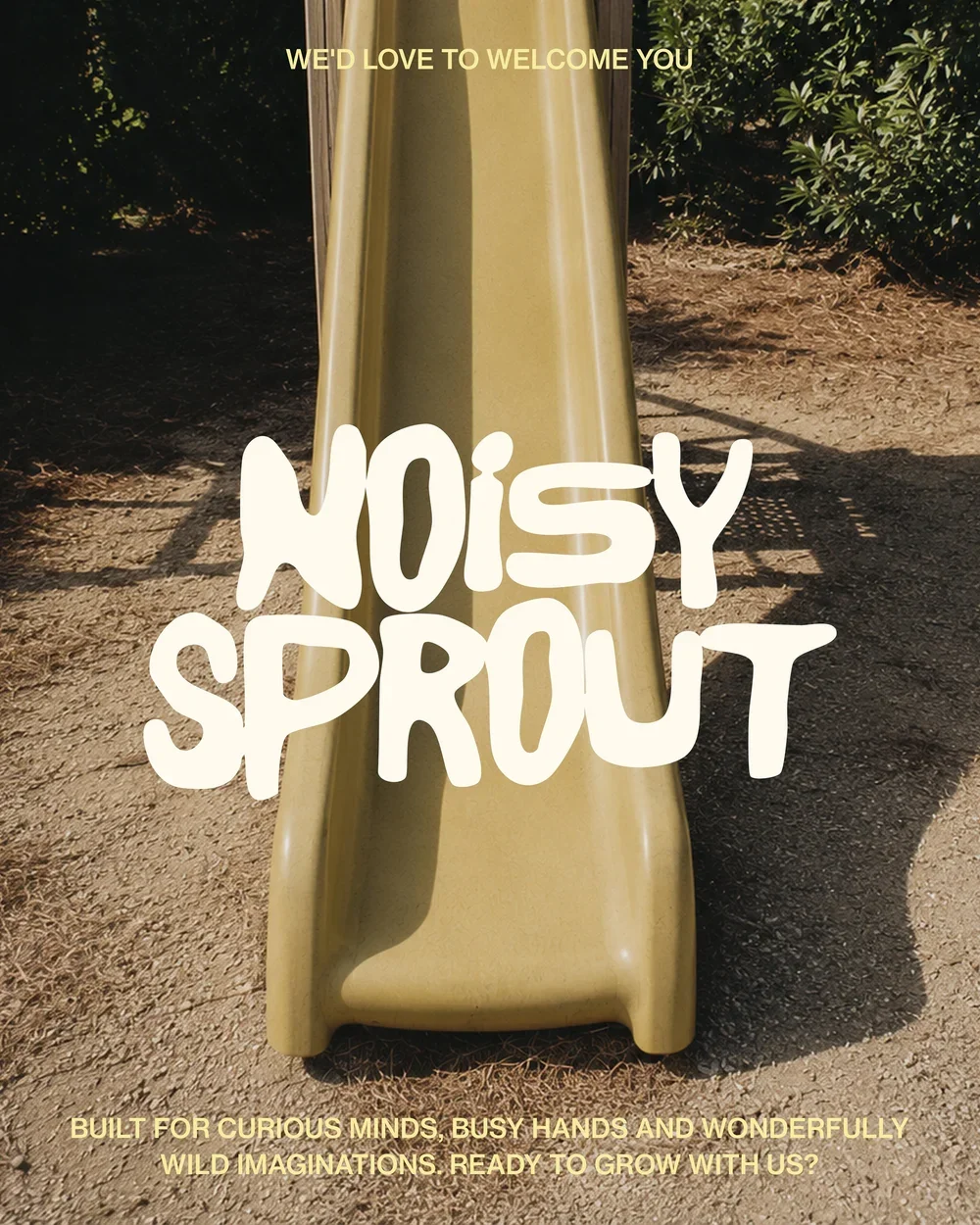
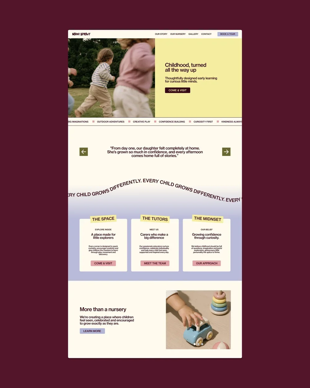
We built a colourful and characterful visual world through playful typography, hand-drawn illustrations, wobbly shapes and unexpected colour combinations. Every element embraces a sense of imperfection and spontaneity, creating an identity that feels almost like a child’s imagination brought to life — while a considered design system keeps everything cohesive and recognisable.

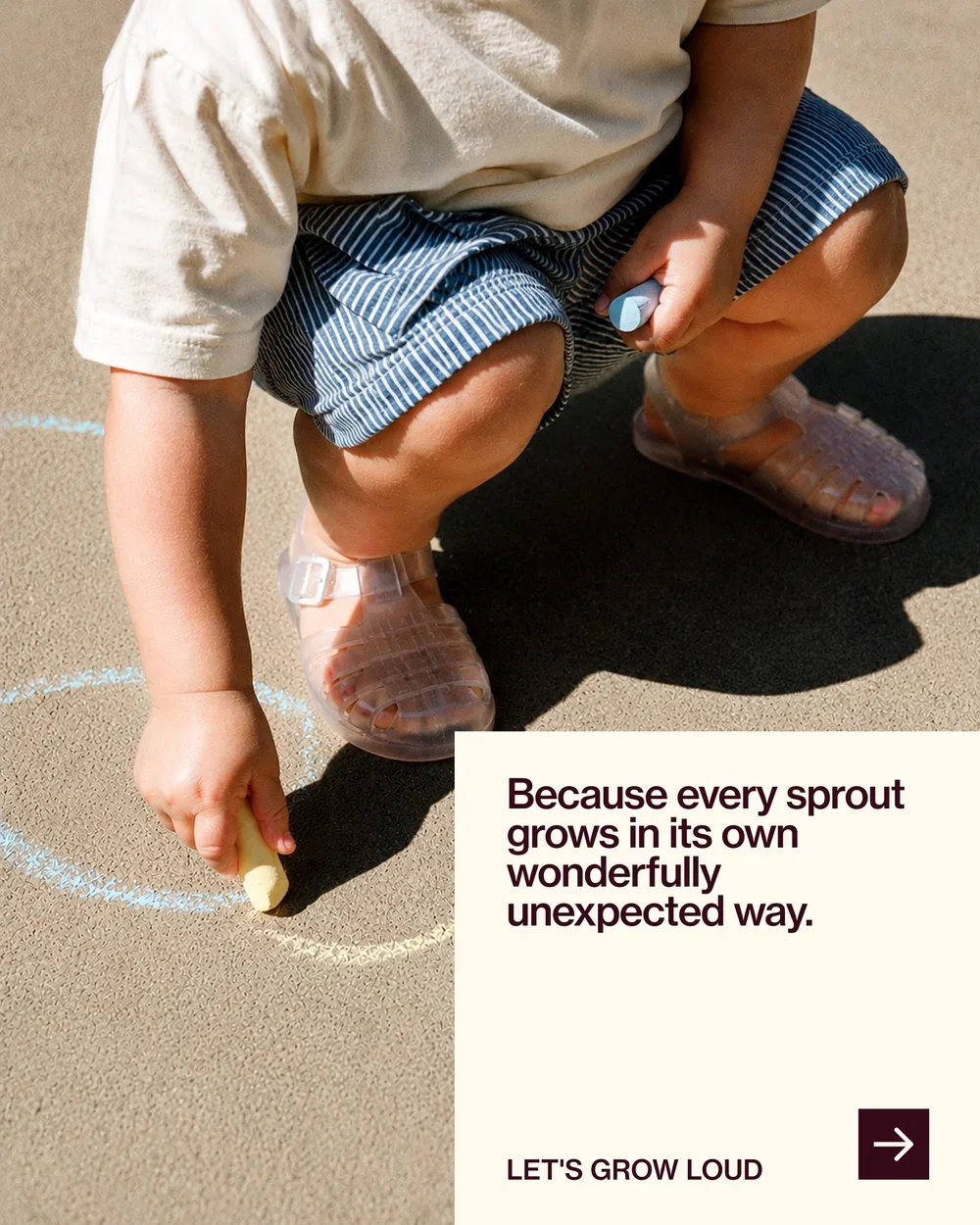
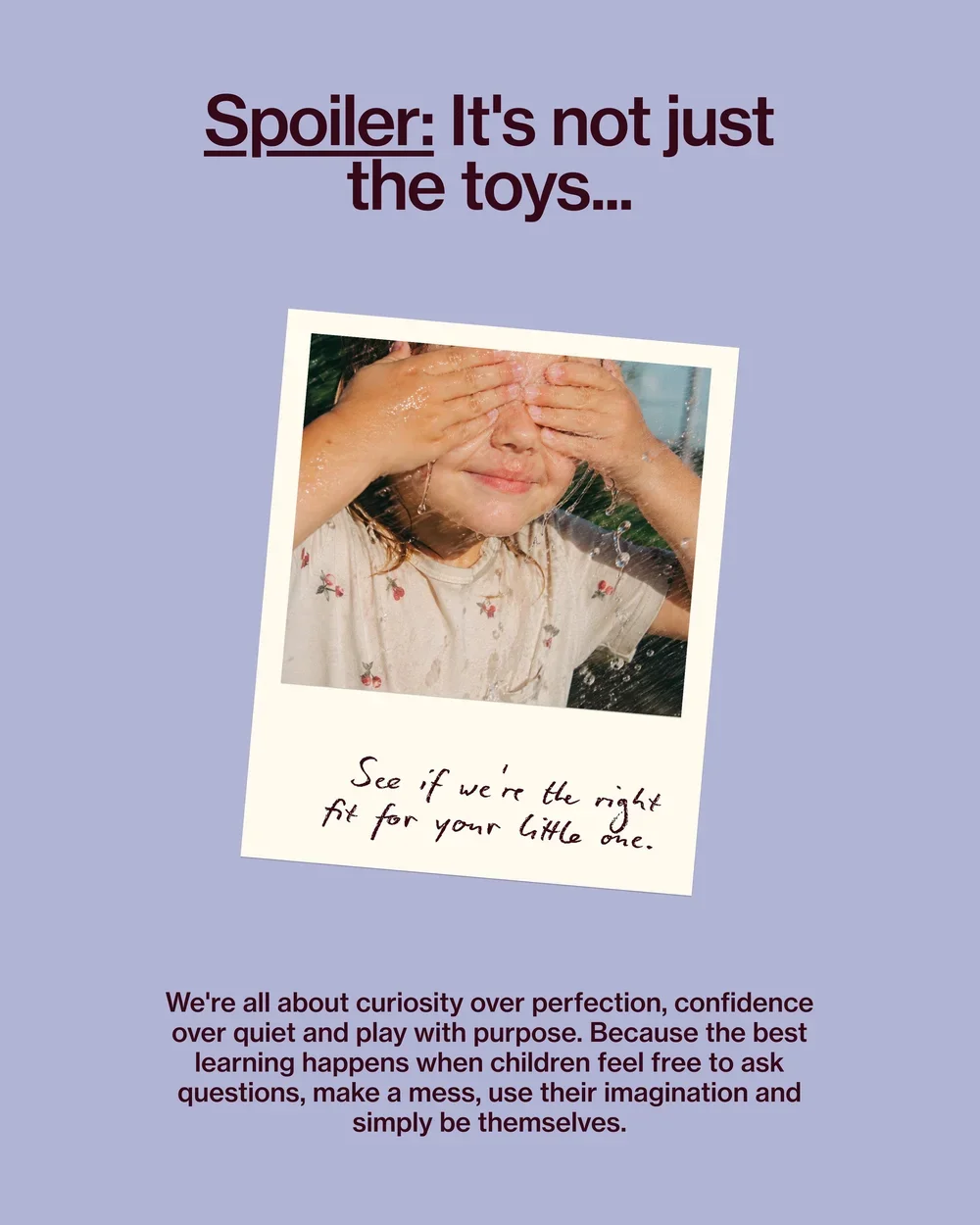

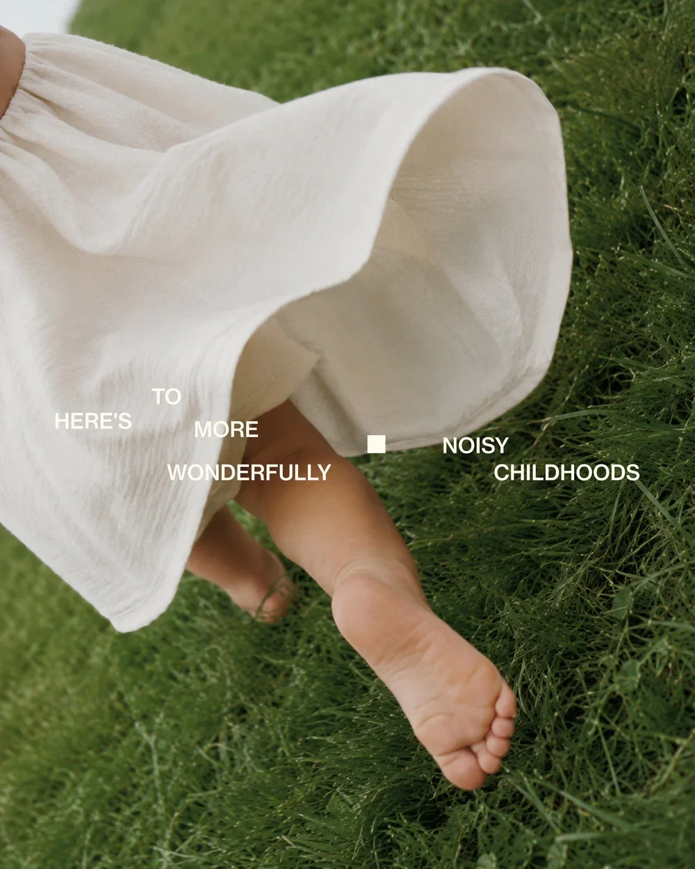
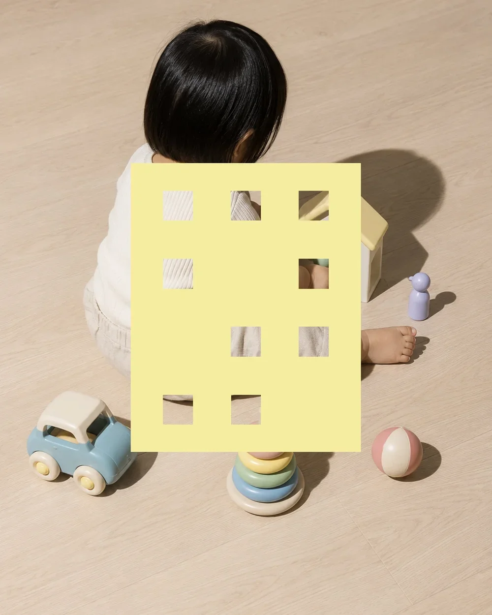
The result is a distinctive early learning brand that feels warm, expressive and completely its own. One that speaks to parents who value creativity, individuality and emotional development, while creating a world children can feel part of.
Noisy Sprout is growth without the hush. A little louder. A little messier. A lot more alive.