Scope:
Brand Strategy & Positioning, Brand Identity, Website Design, Ecommerce, Packaging, Photography
Collaborators:
Website Development by The Local Folk
Garnish Jewellery creates sculptural pieces designed to become part of everyday life. The earrings you reach for without thinking. The necklace that makes an outfit feel complete. Jewellery chosen for the pleasure of wearing it, without needing an occasion.
The name captures this idea. Like a garnish, each piece adds something to the whole: a little texture, interest or an unexpected detail. Inspired by still lifes, European cafés and objects collected over time, Garnish finds beauty in familiar things, thoughtfully composed.
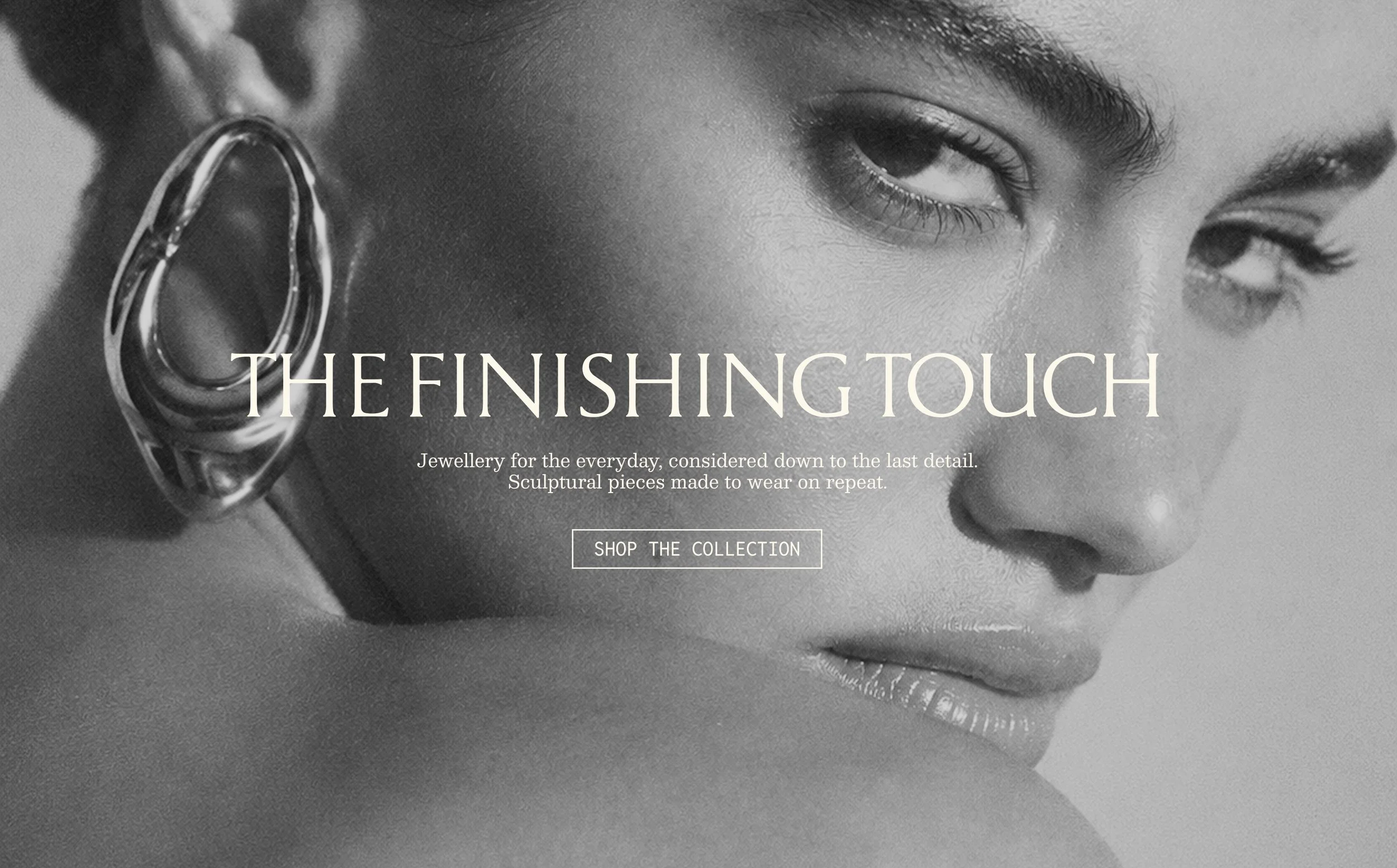
The brief was to create a brand that felt refined, instinctive and quietly assured. It needed to communicate the quality and sculptural character of the jewellery while feeling warm, personal and easy to live with.
Garnish needed a distinctive world that could carry across its identity, packaging, imagery and website. Every encounter would build the same impression: considered pieces, worn often, that bring a sense of completion to everyday dressing.



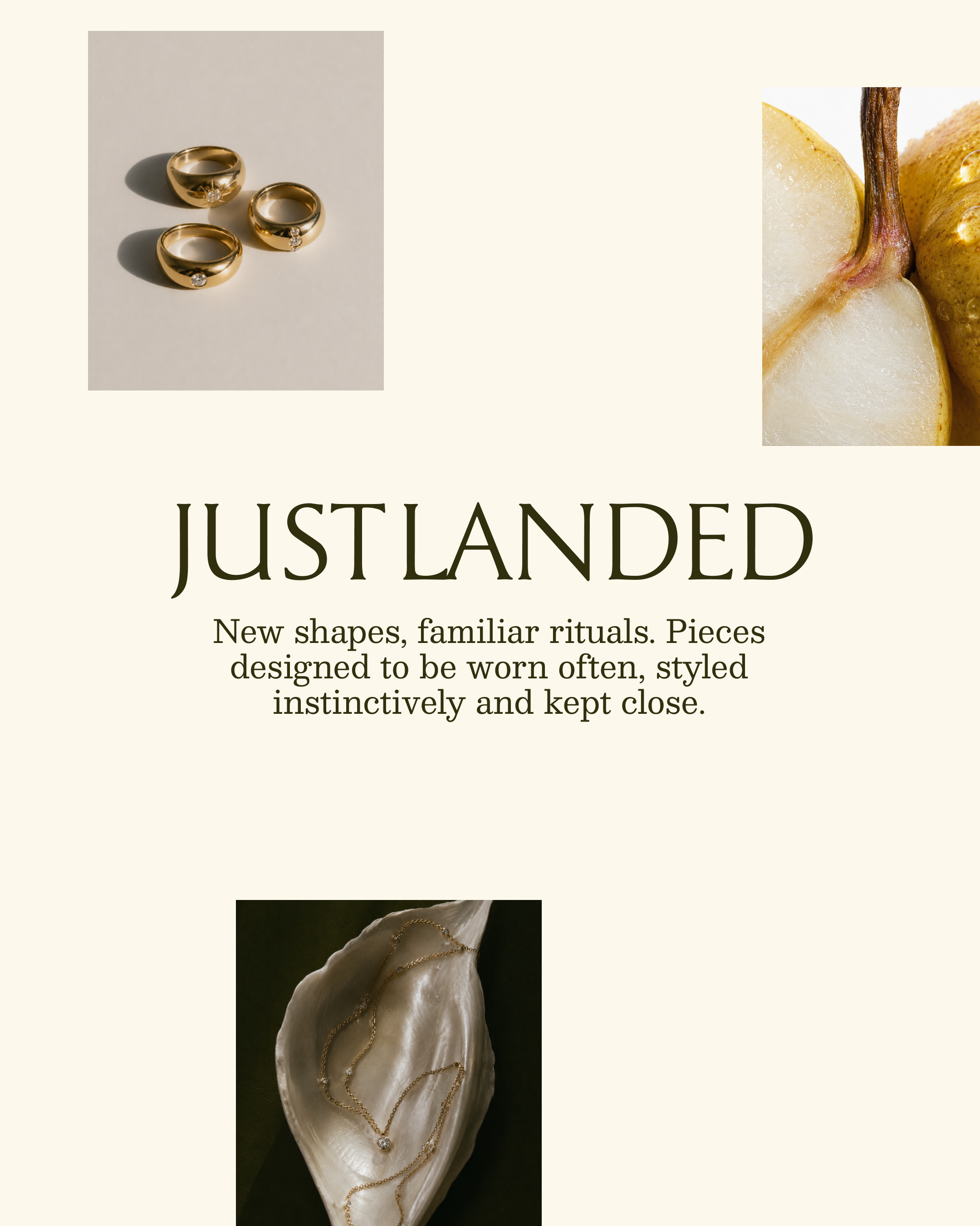
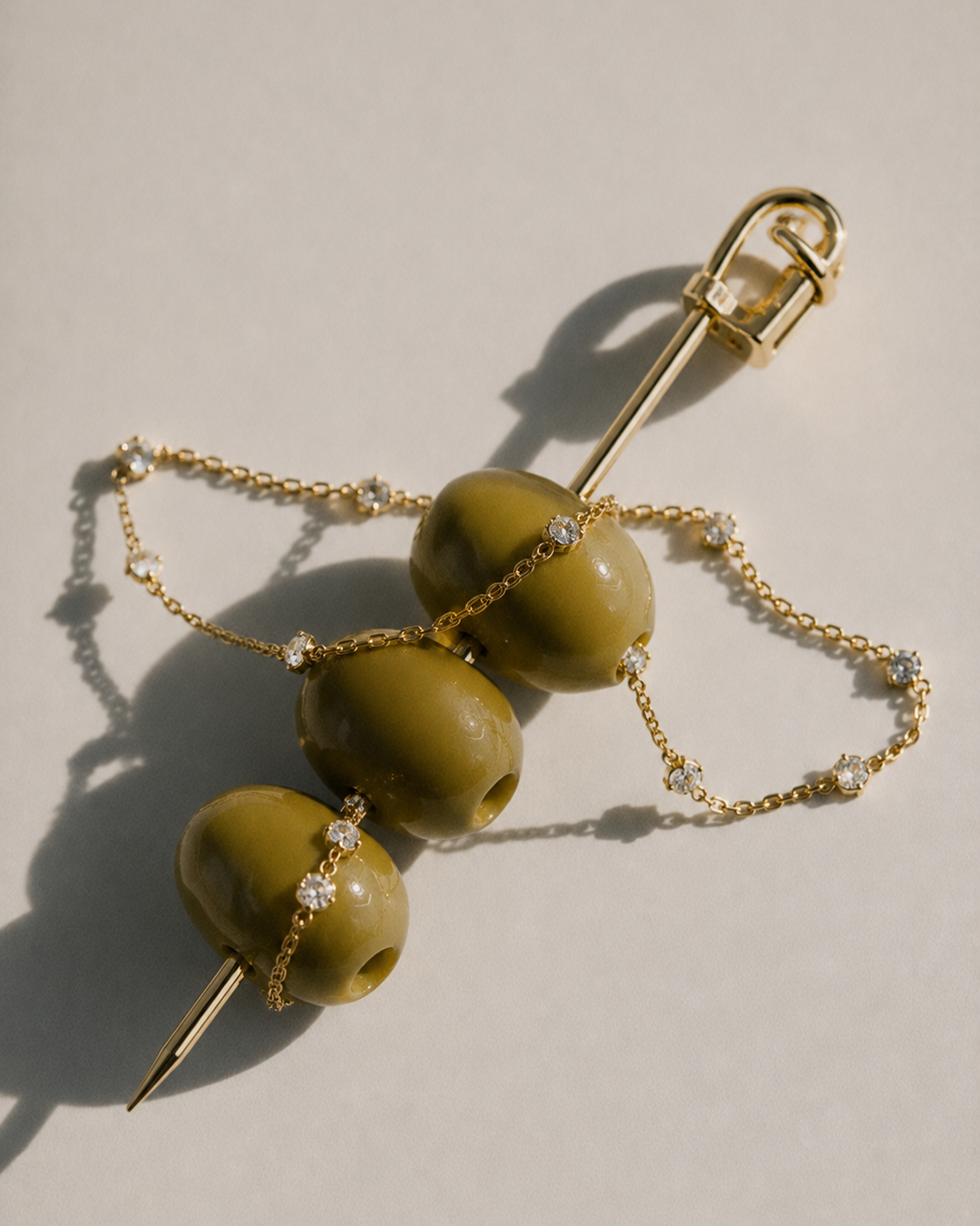
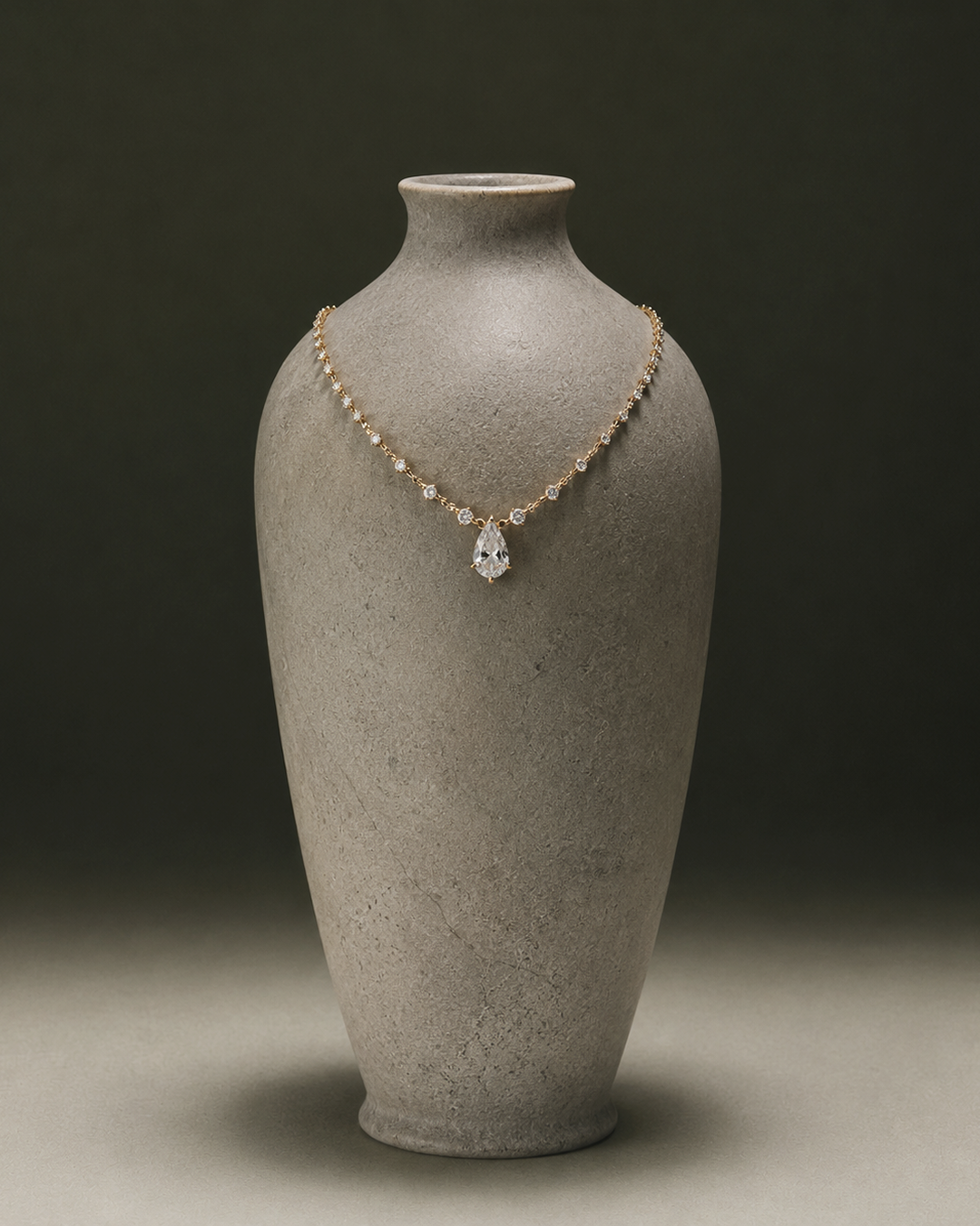
We began with the meaning behind the name, developing “the finishing touch” into a strategic foundation for the whole brand. This gave every creative decision a shared purpose, from the identity to the way the jewellery was styled and presented online.
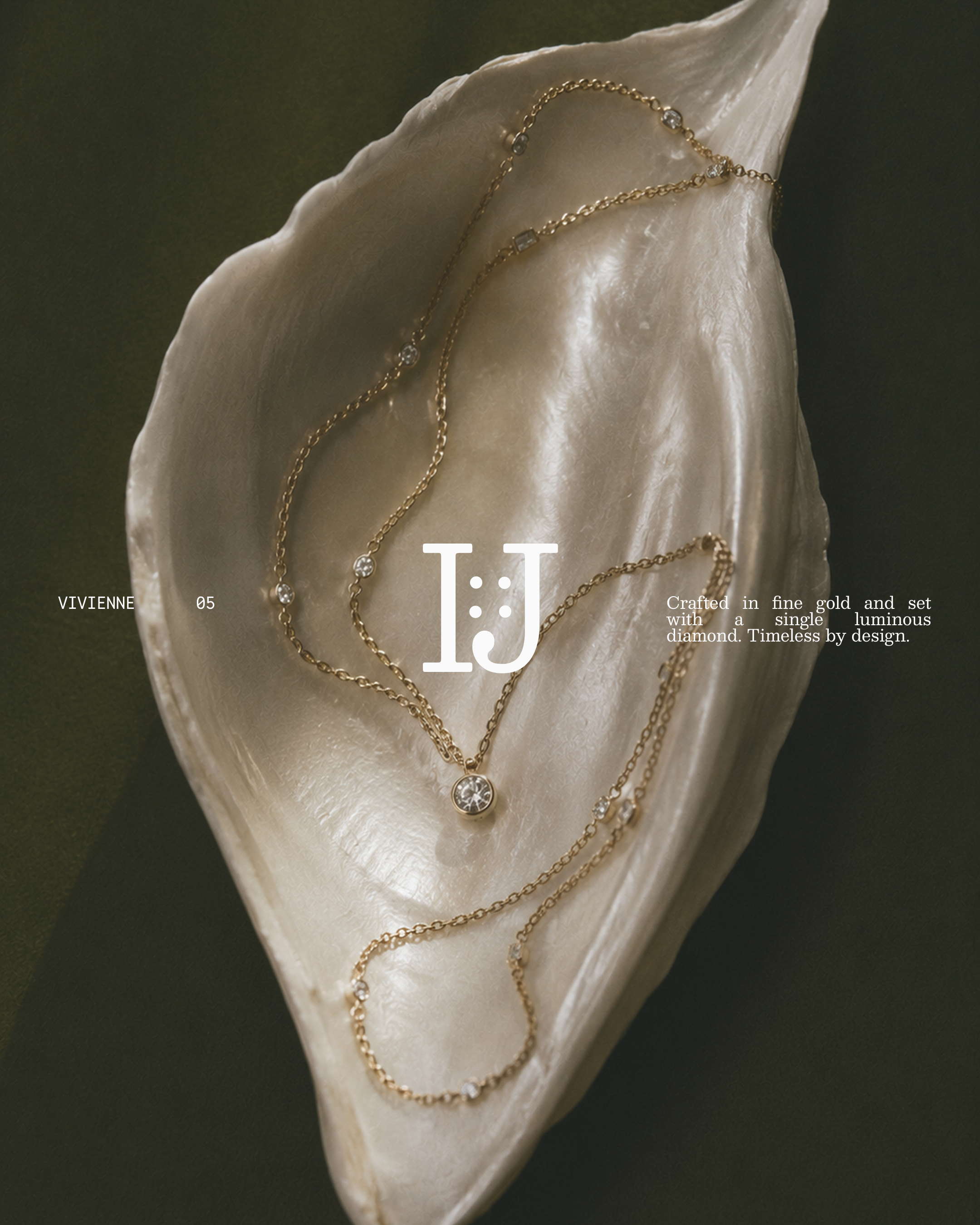
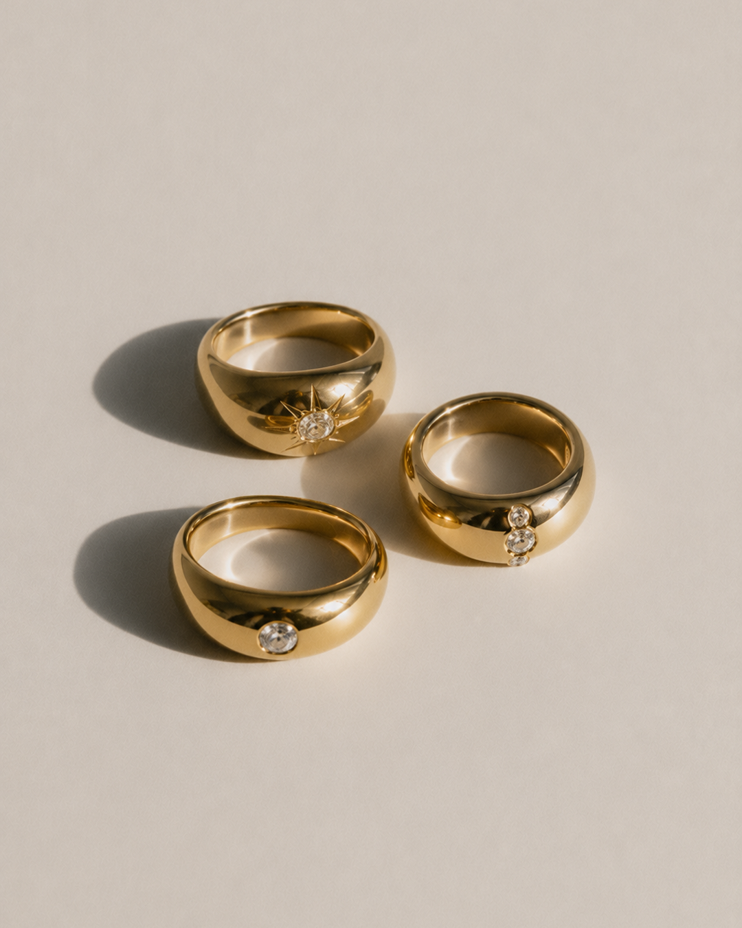
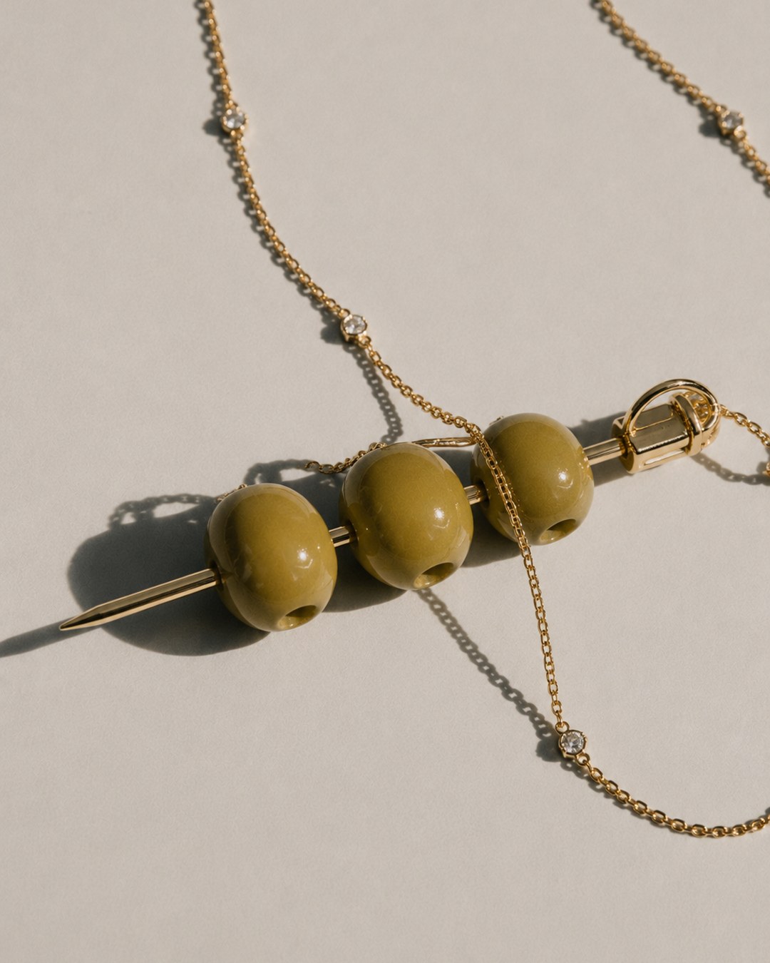
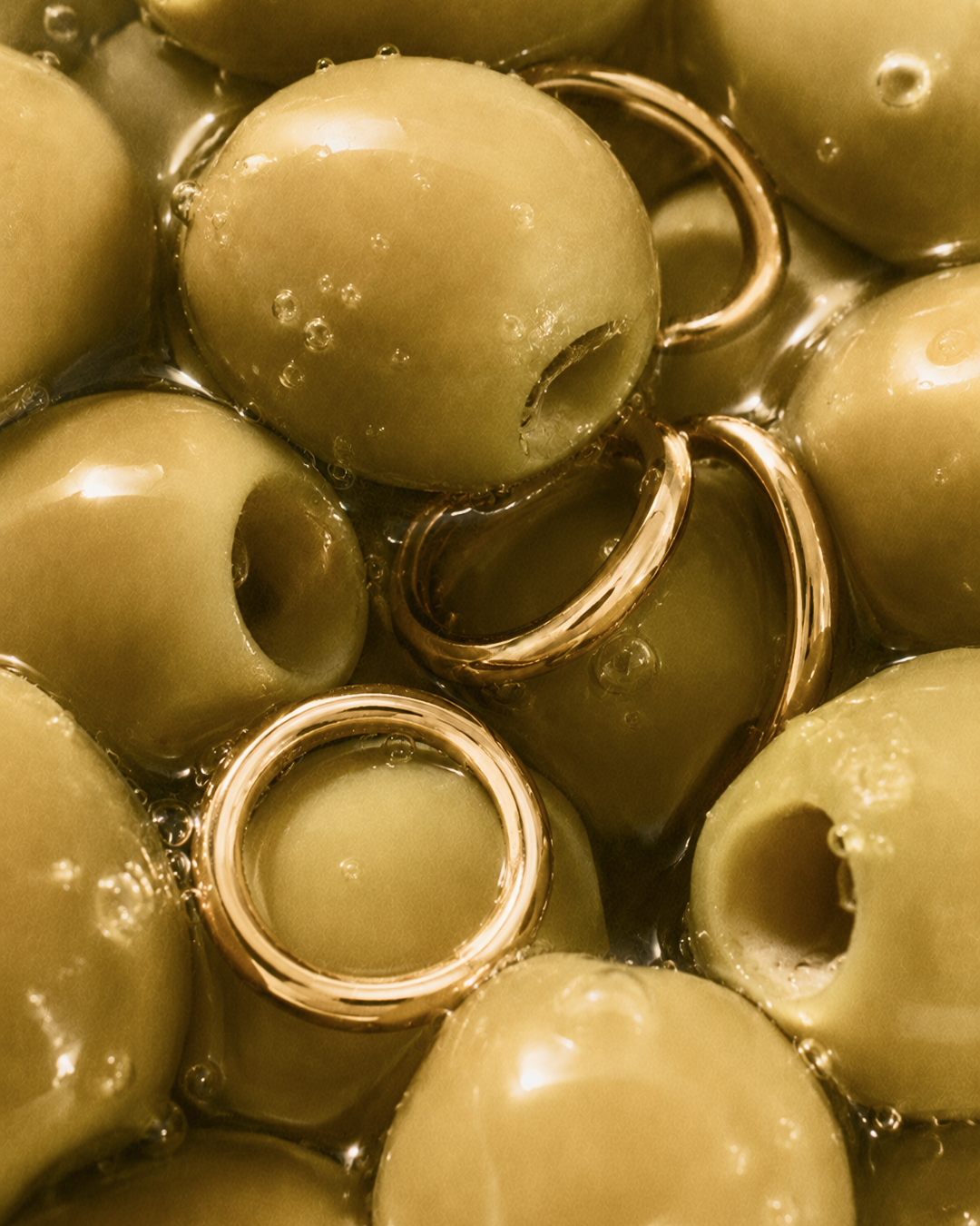
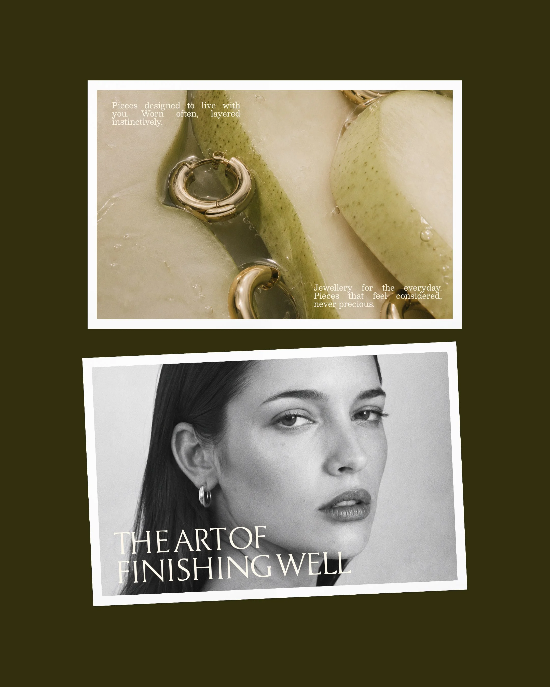
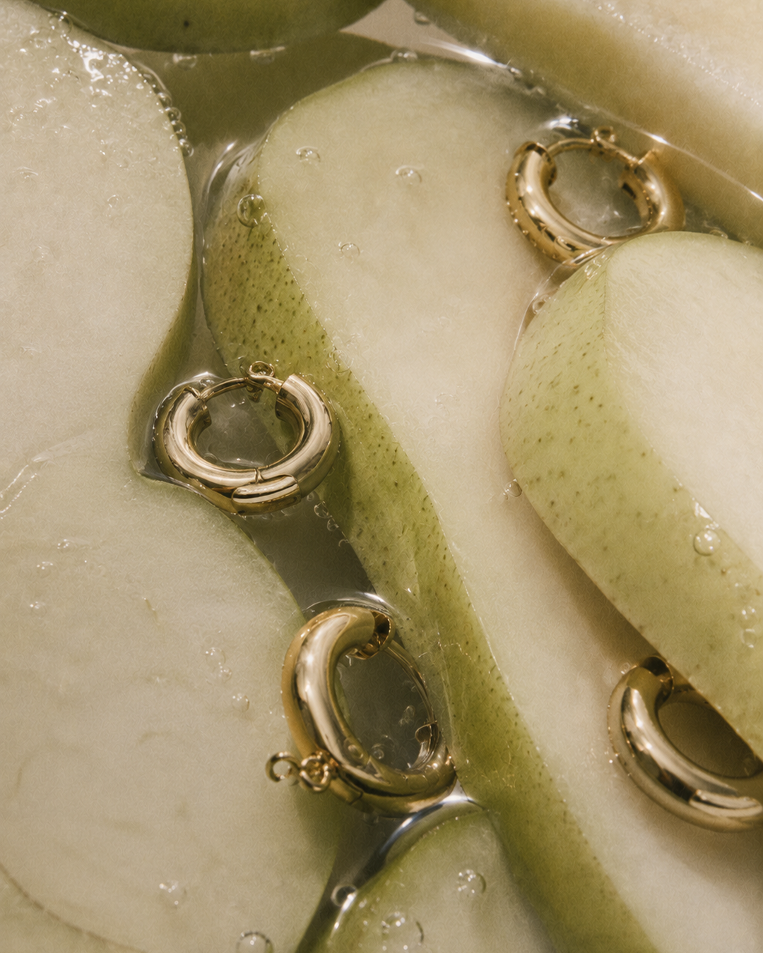
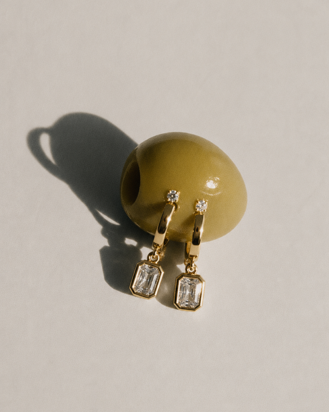
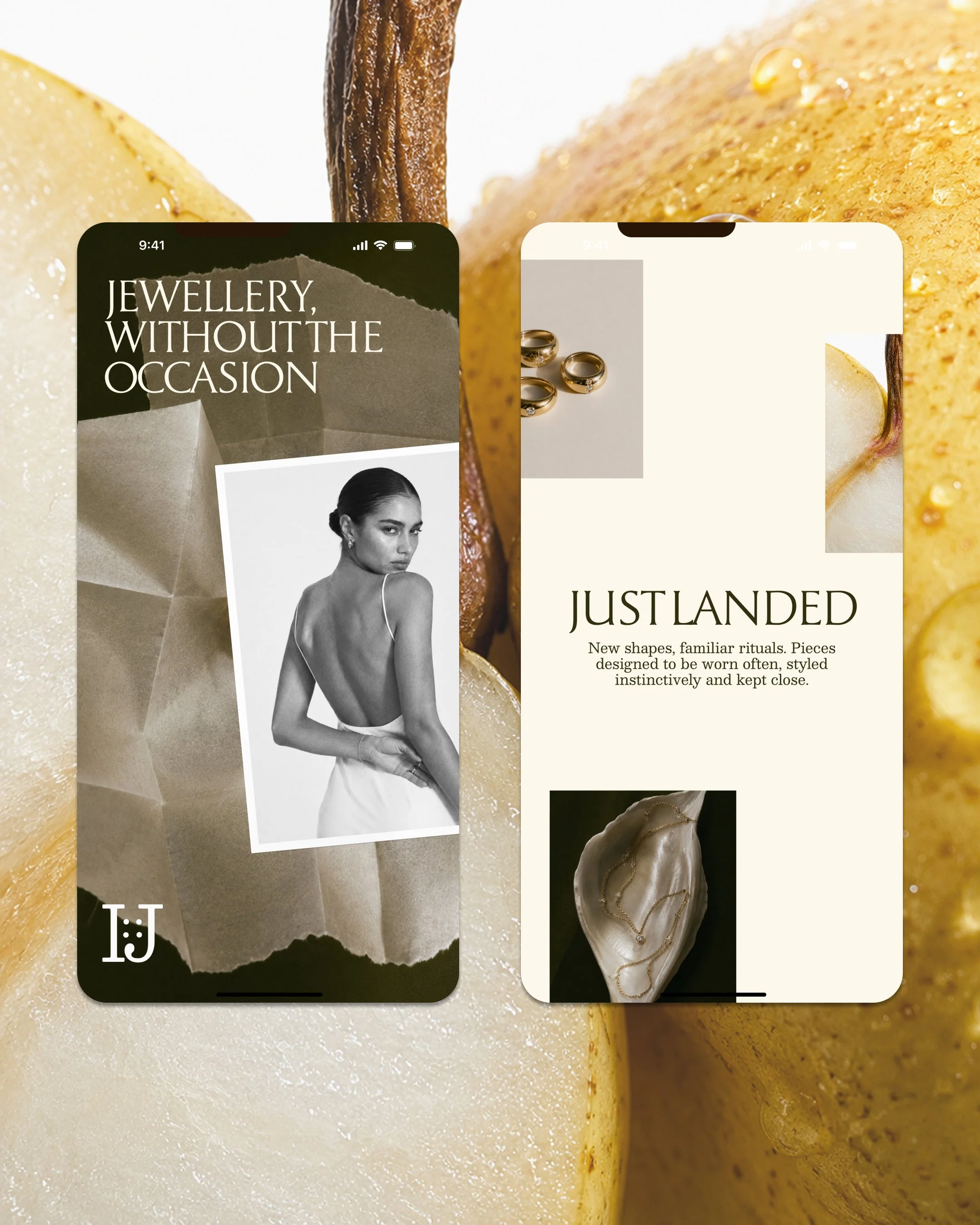
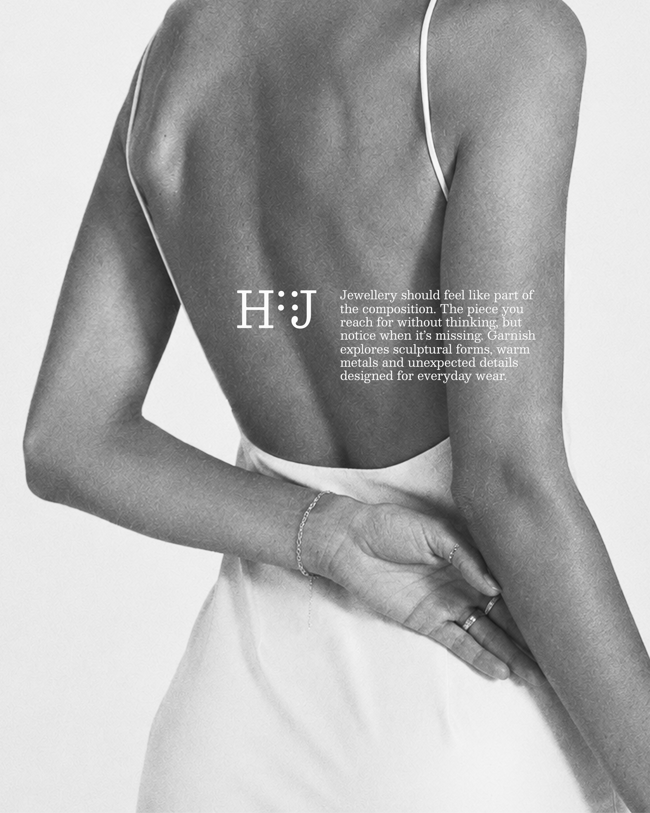
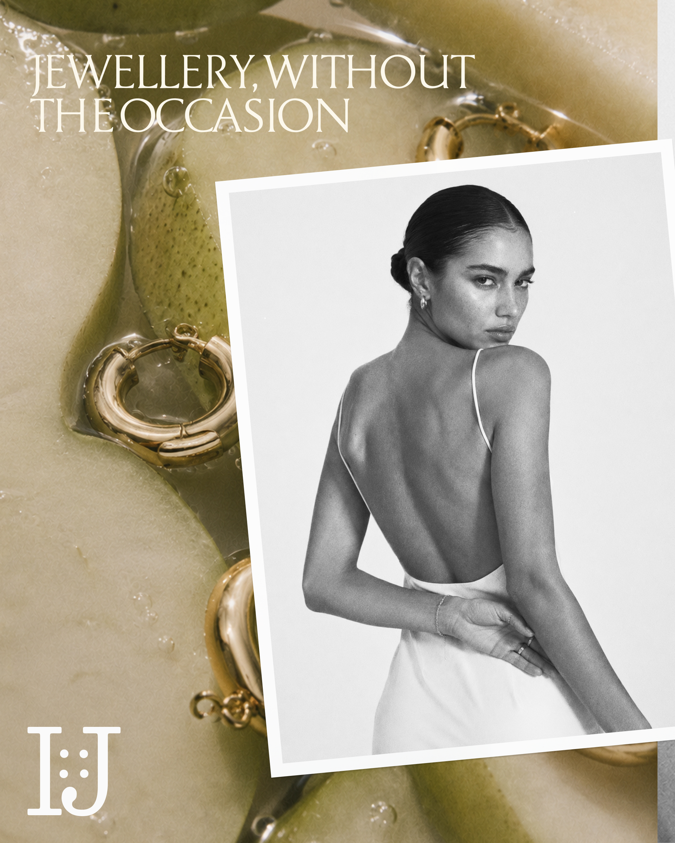
Expressive serif typography and a sculptural monogram established the visual identity, supported by a warm palette of olive, butter, chocolate and cream. Art direction placed jewellery amongst olives, pears, linen and ceramics, drawing connections between the pieces and the shapes, textures and rituals of everyday life.
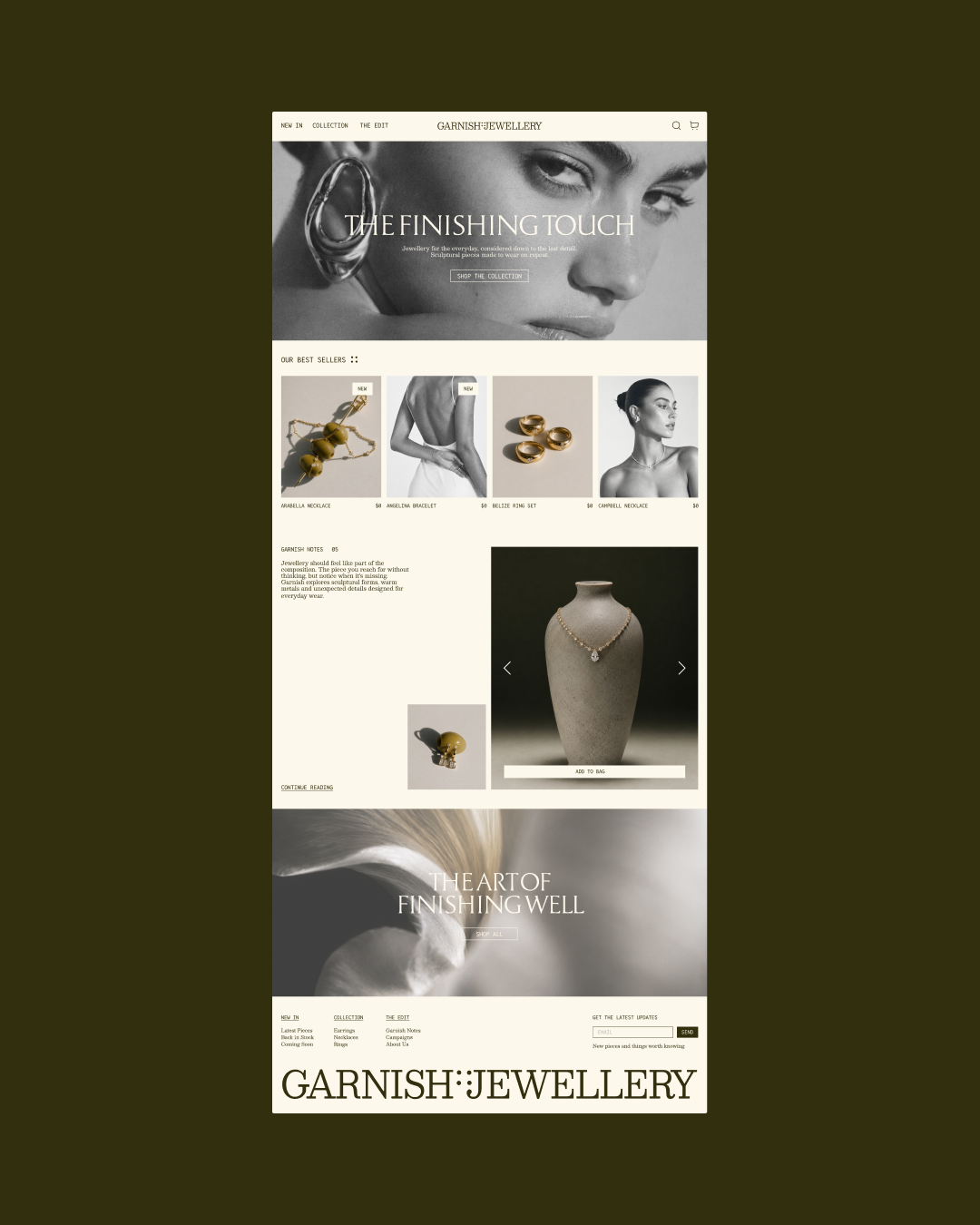
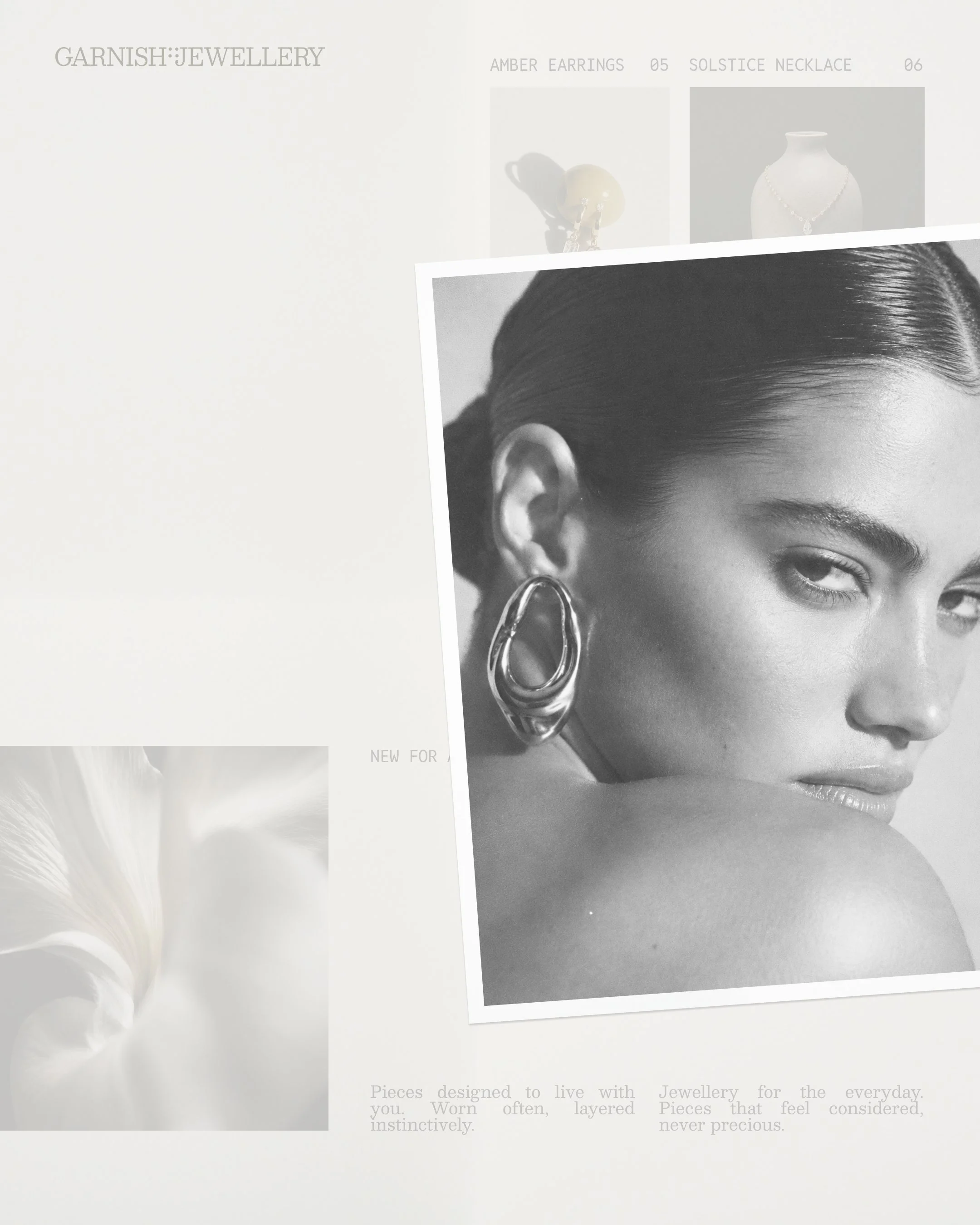
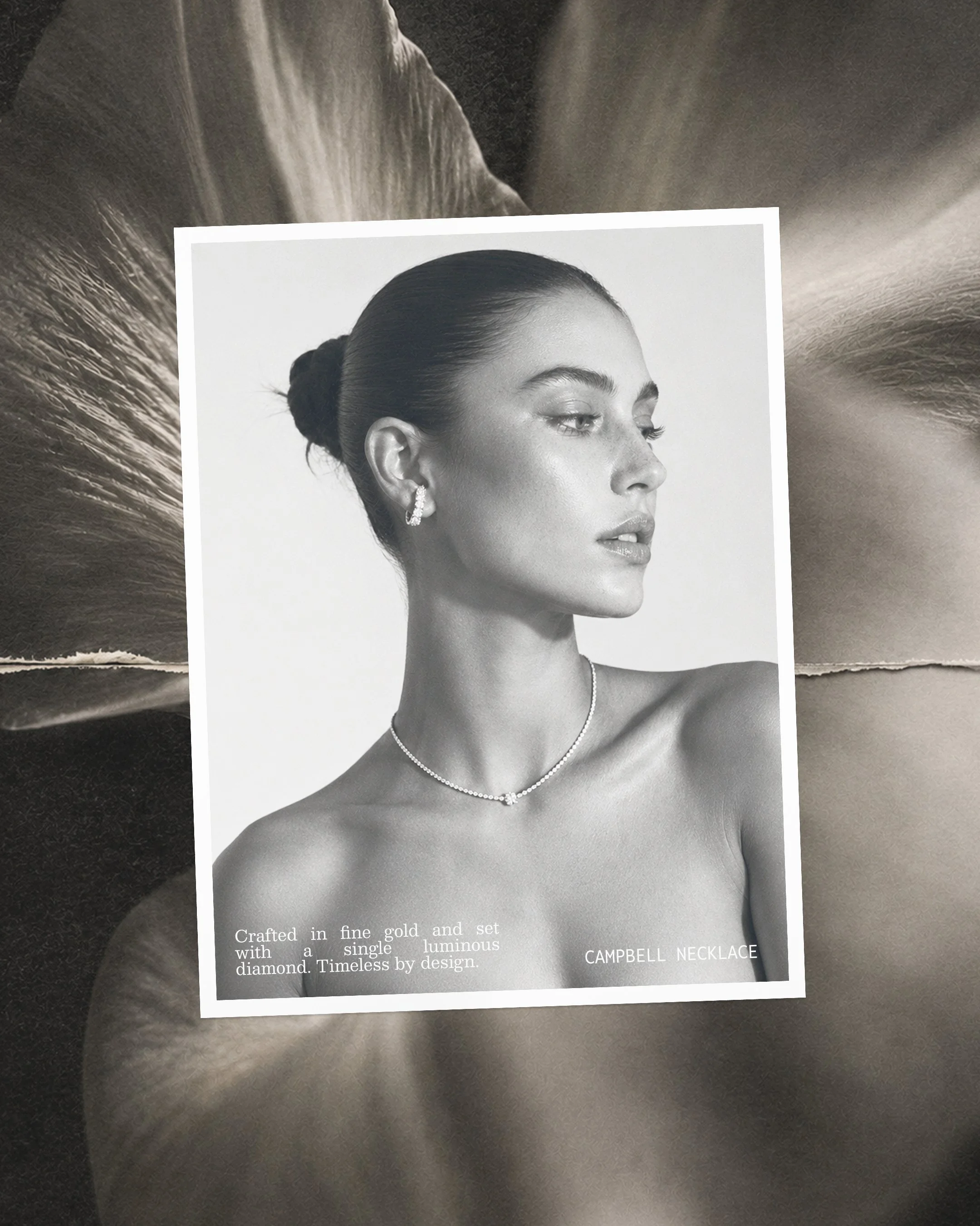
Collage introduced a sense of things collected over time, while intimate portraits showed how the jewellery sits naturally on the body. We carried this visual language into packaging and the website, balancing editorial storytelling with clear navigation and product discovery.

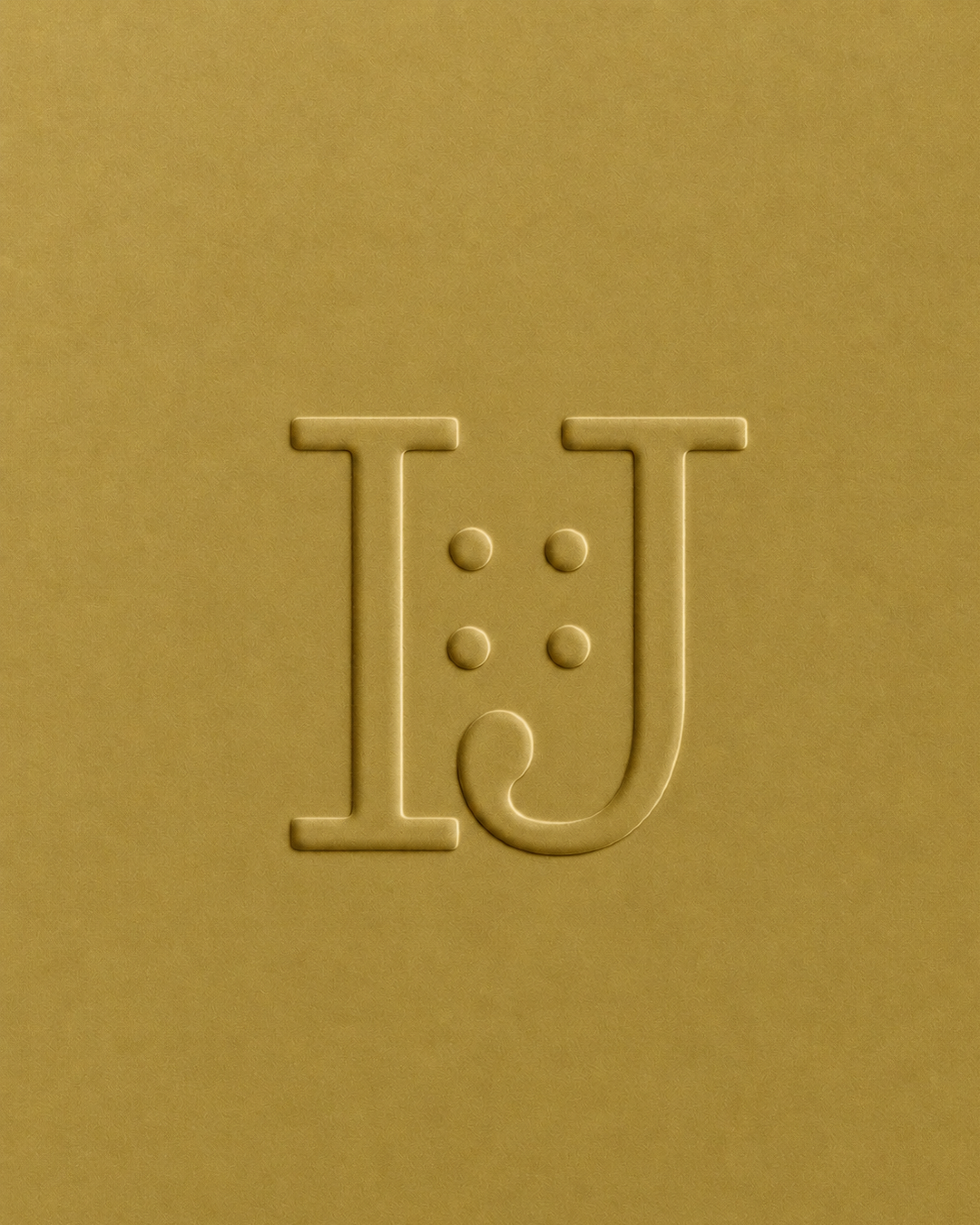
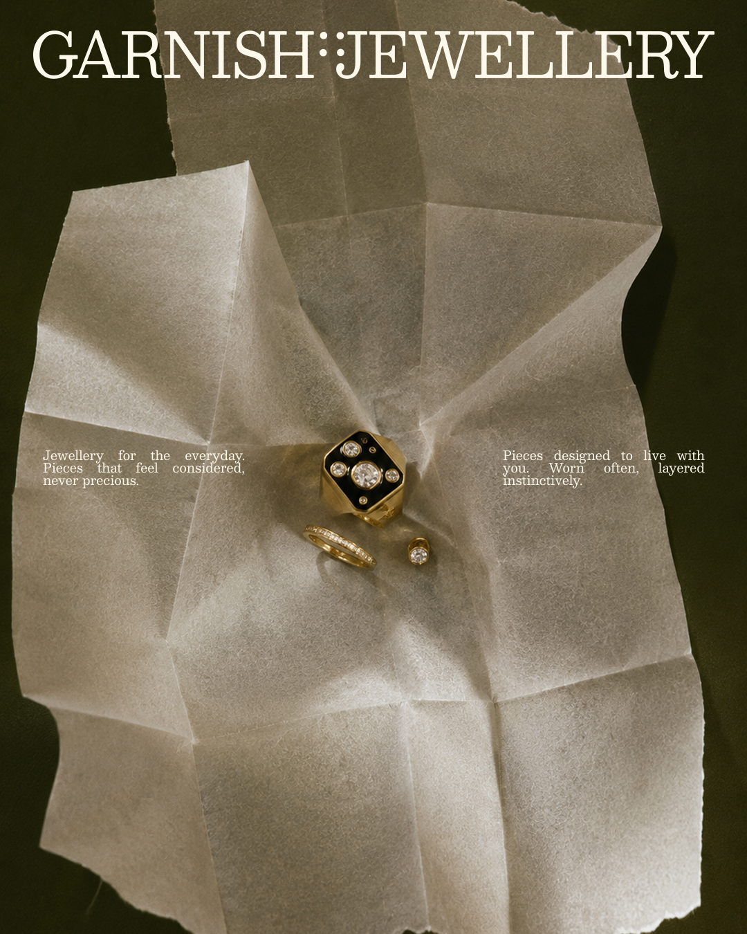
The result is a complete brand experience built around one clear idea. The identity, imagery, packaging and website feel connected, with each contributing to a world that is recognisably Garnish.
The result gives the jewellery context and character. Customers can appreciate the individual pieces, imagine wearing them and understand the point of view behind the brand. From a first impression to a closer look, every detail reinforces Garnish’s place in everyday life.
Thoughtfully composed. Finished with Garnish.