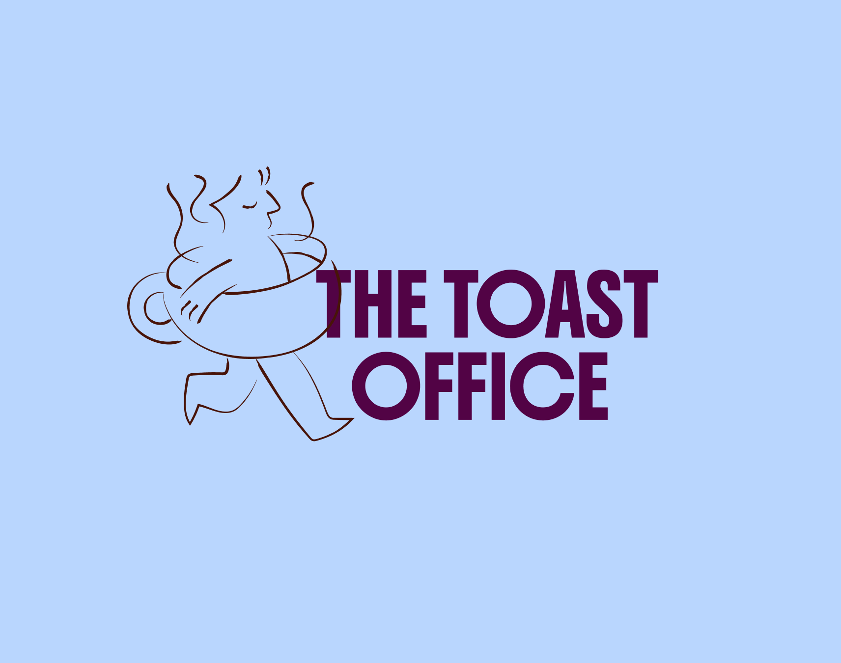
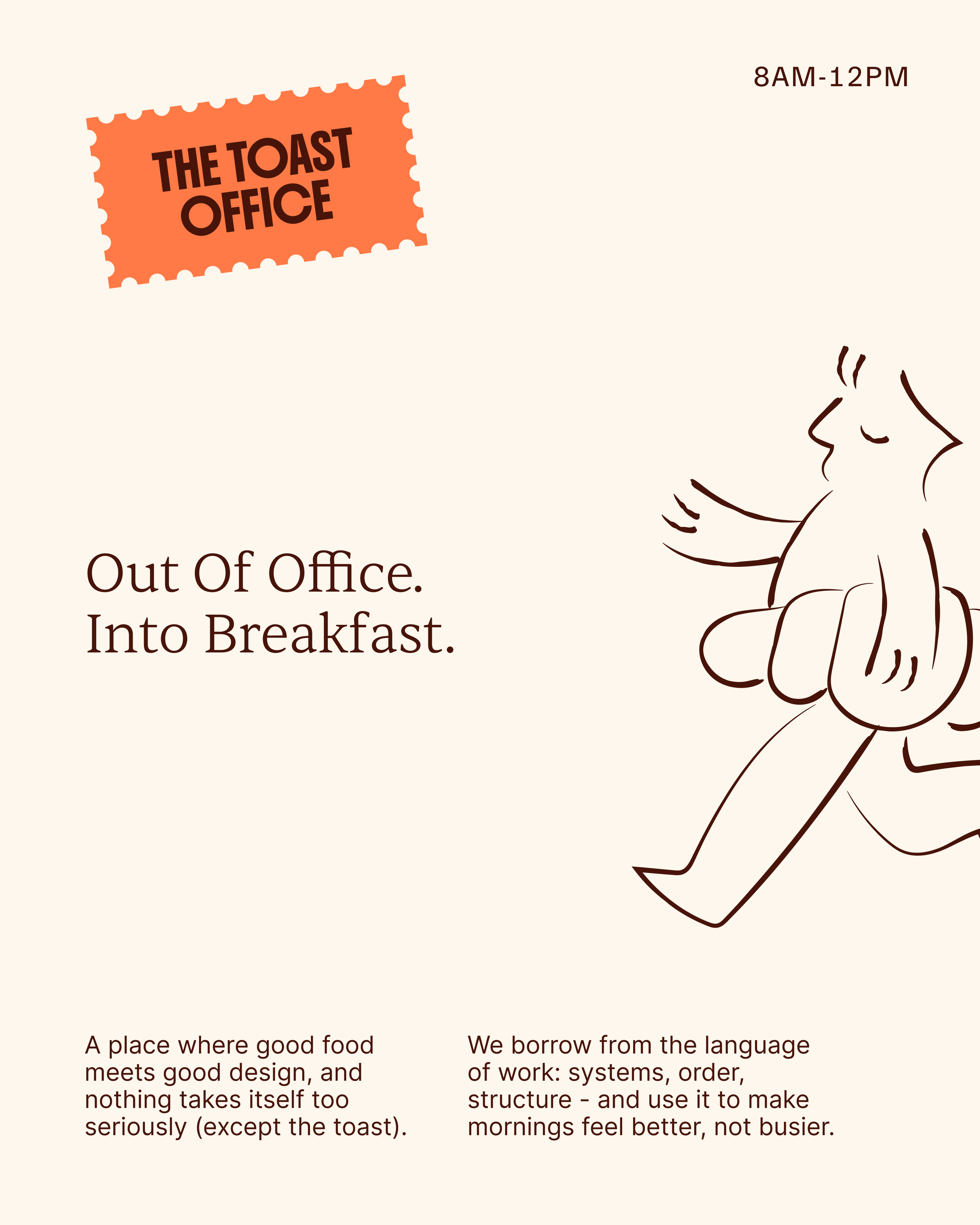
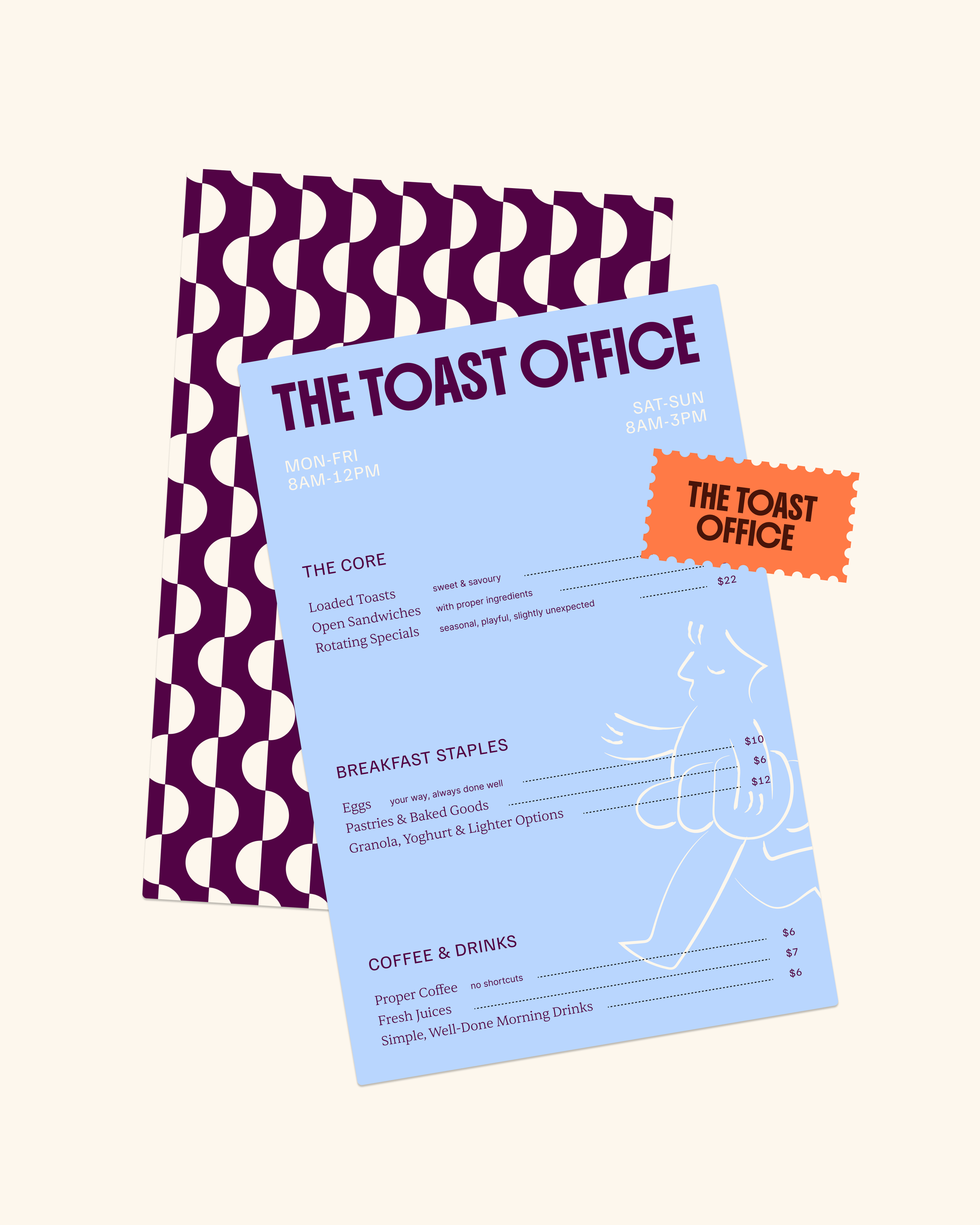
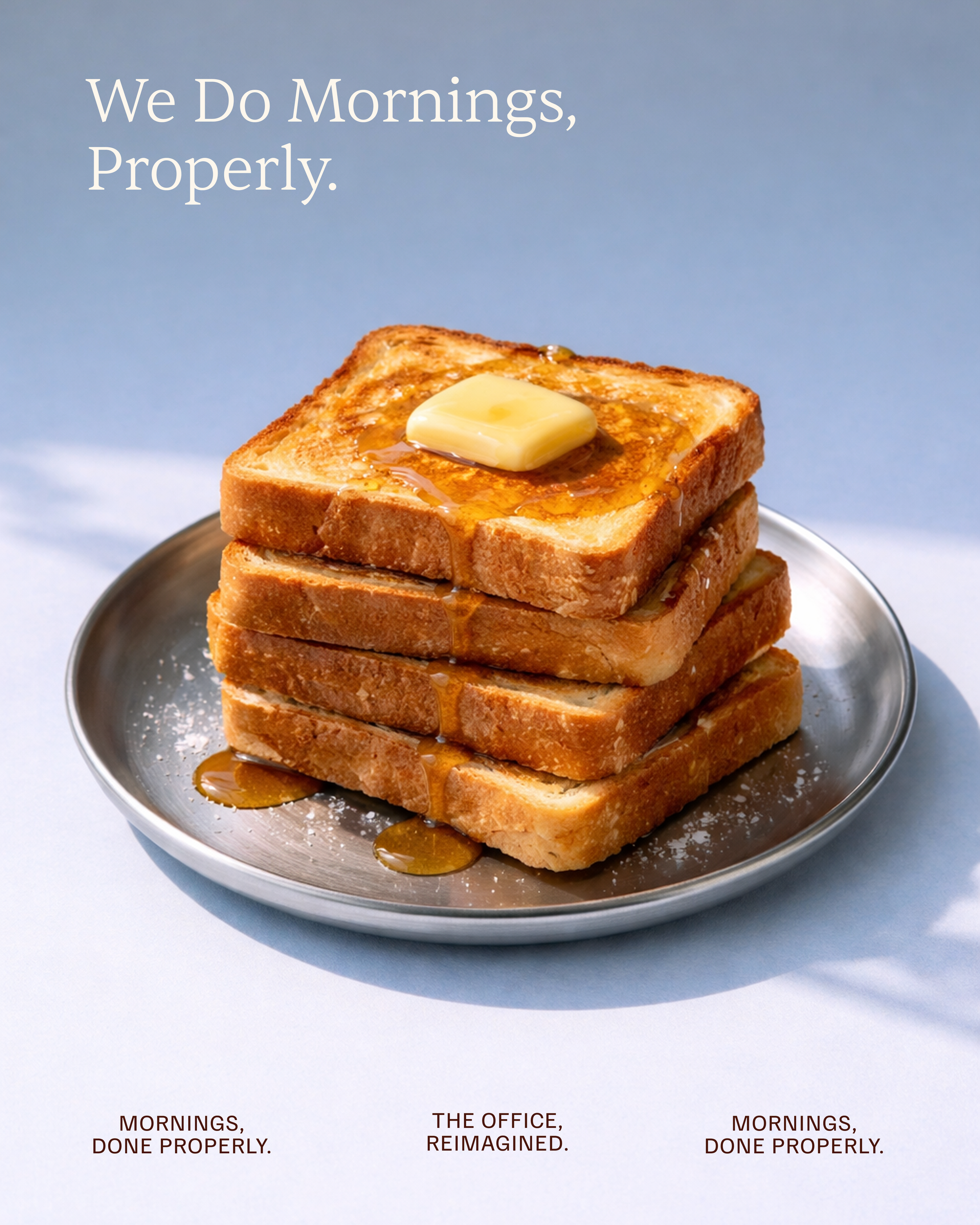
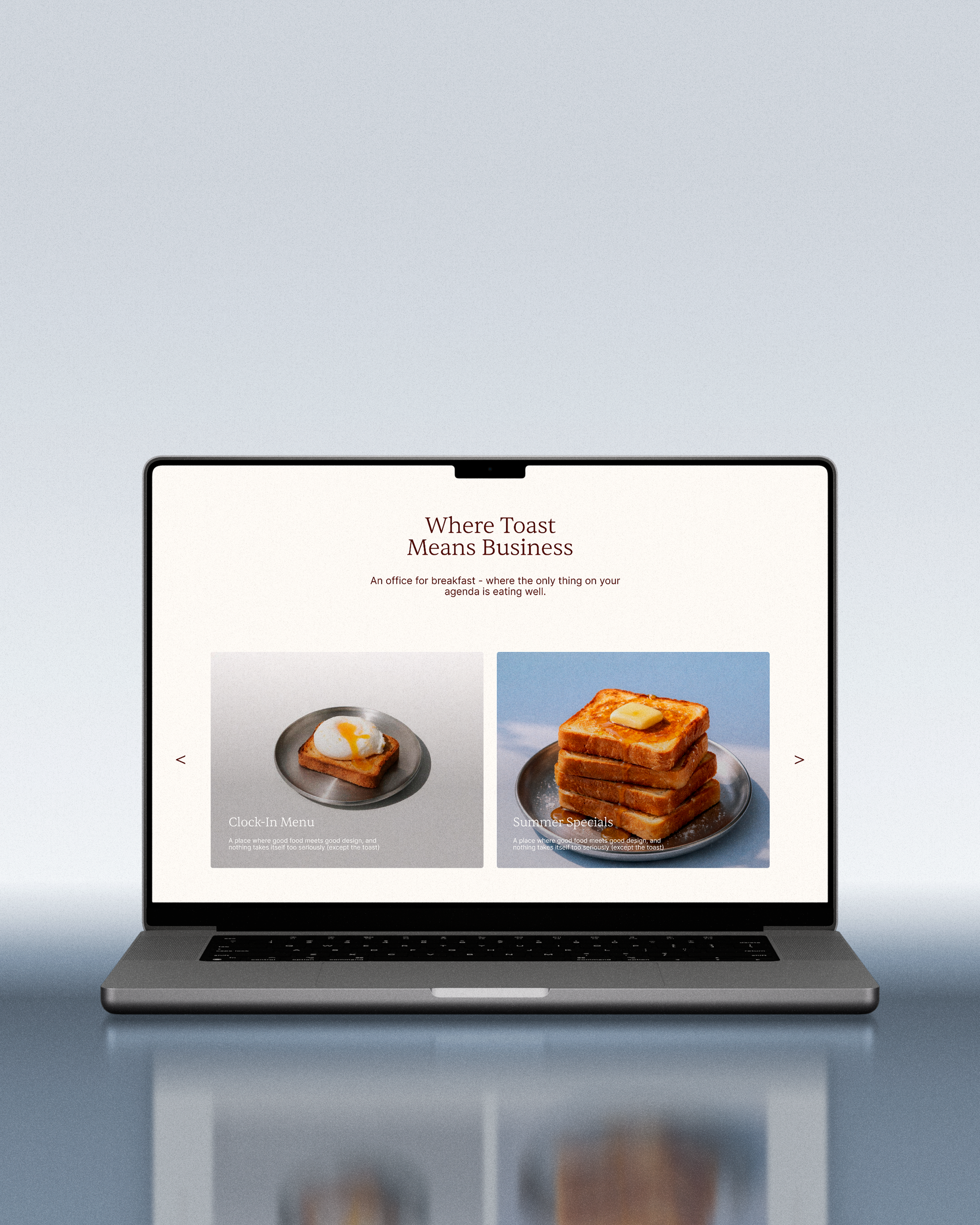
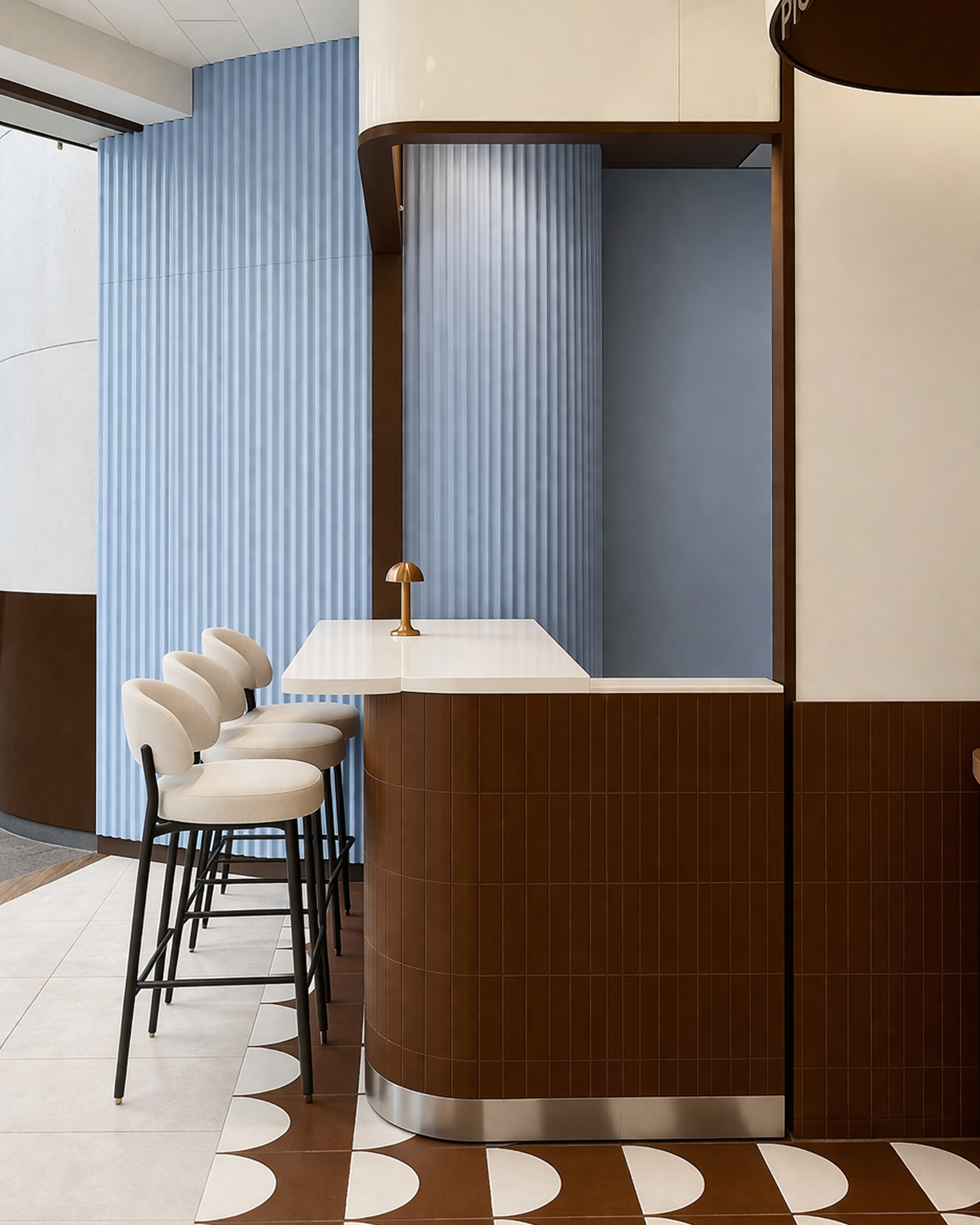
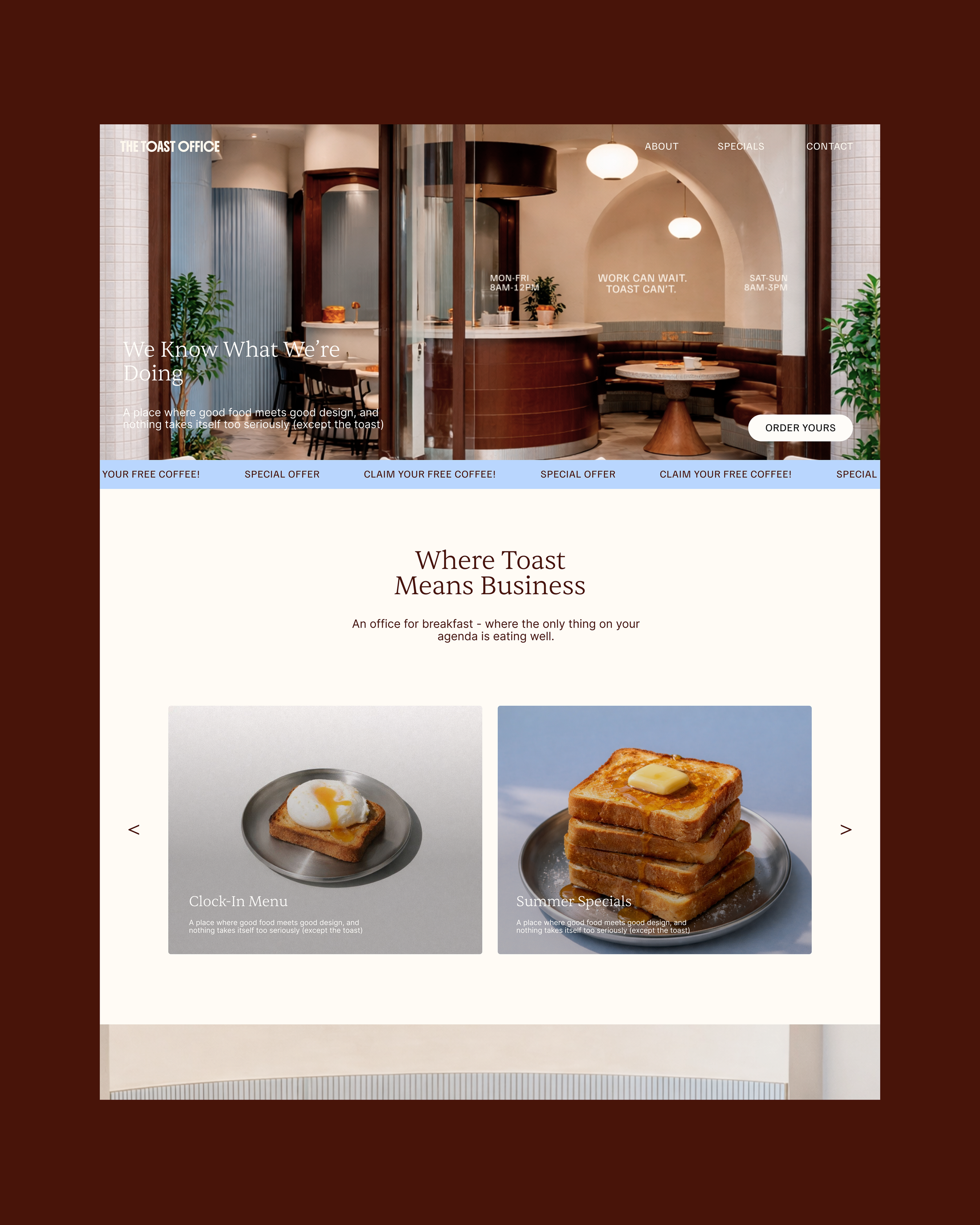
The Toast Office was conceived as a deliberate contradiction, an “office” where productivity takes a back seat and breakfast takes the lead, and our role began at the very beginning, shaping the Strategy, Naming, Brand Identity and Digital Experience into one considered system.
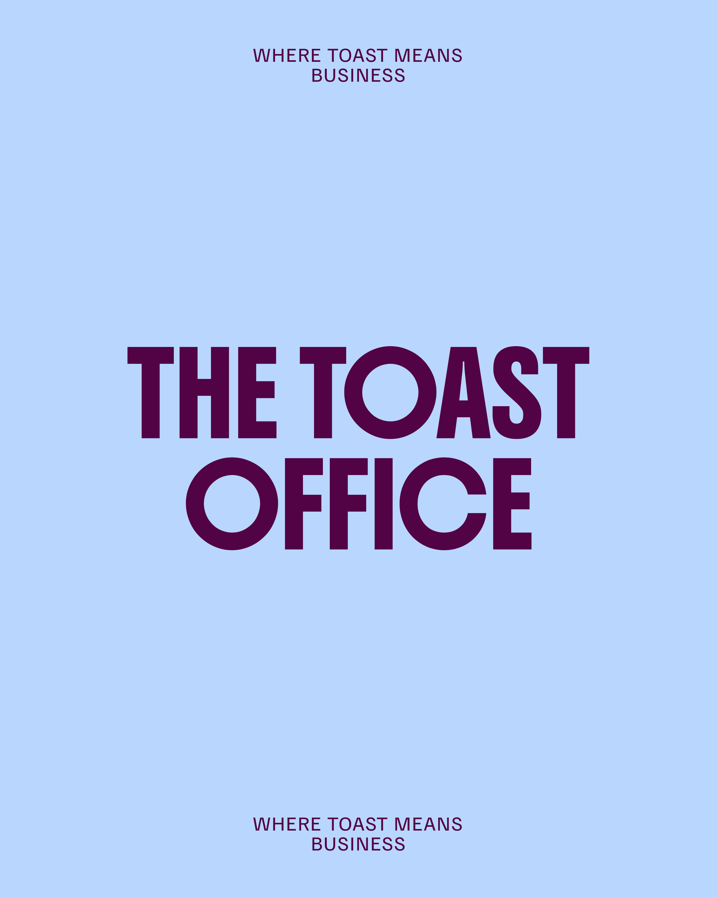
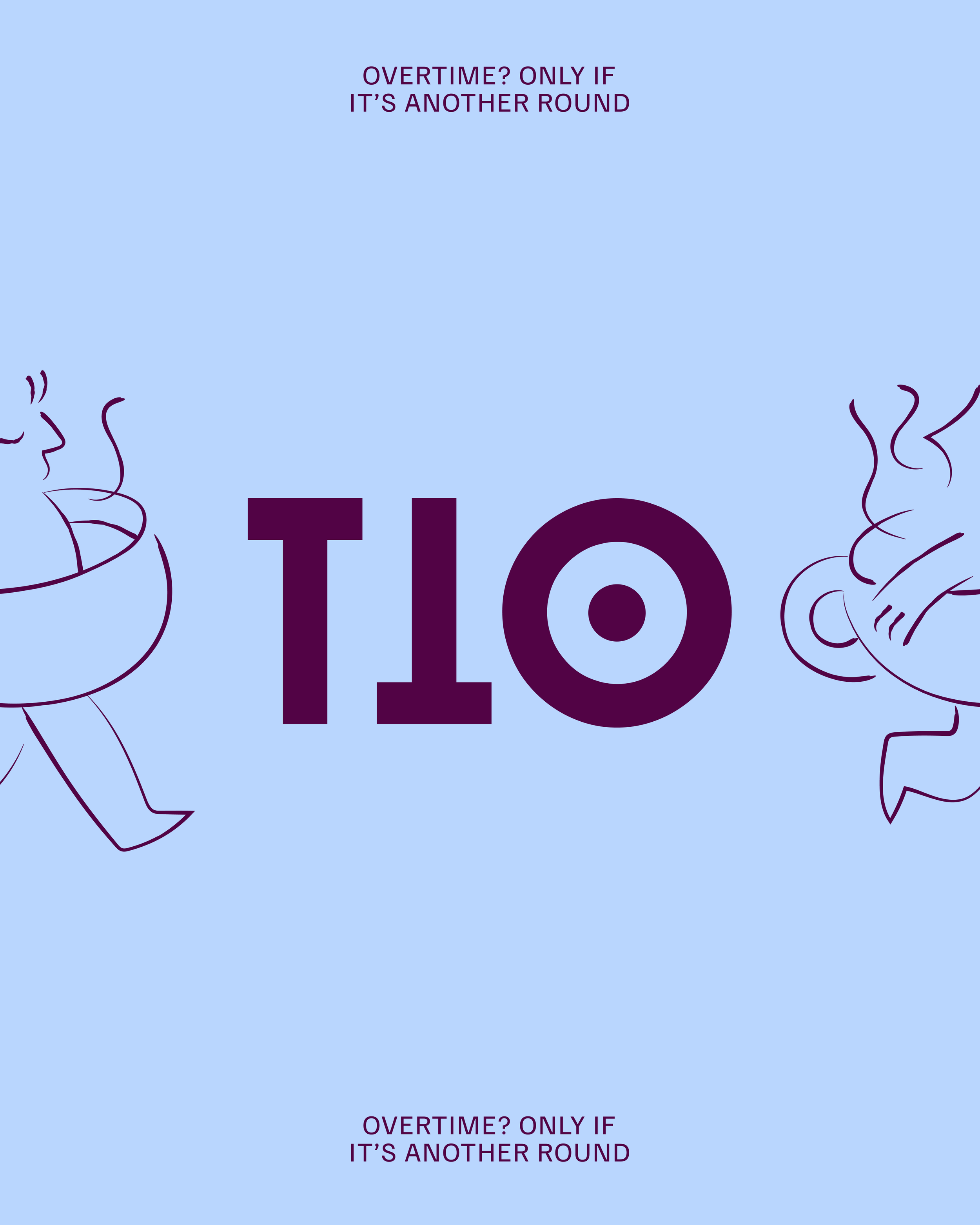
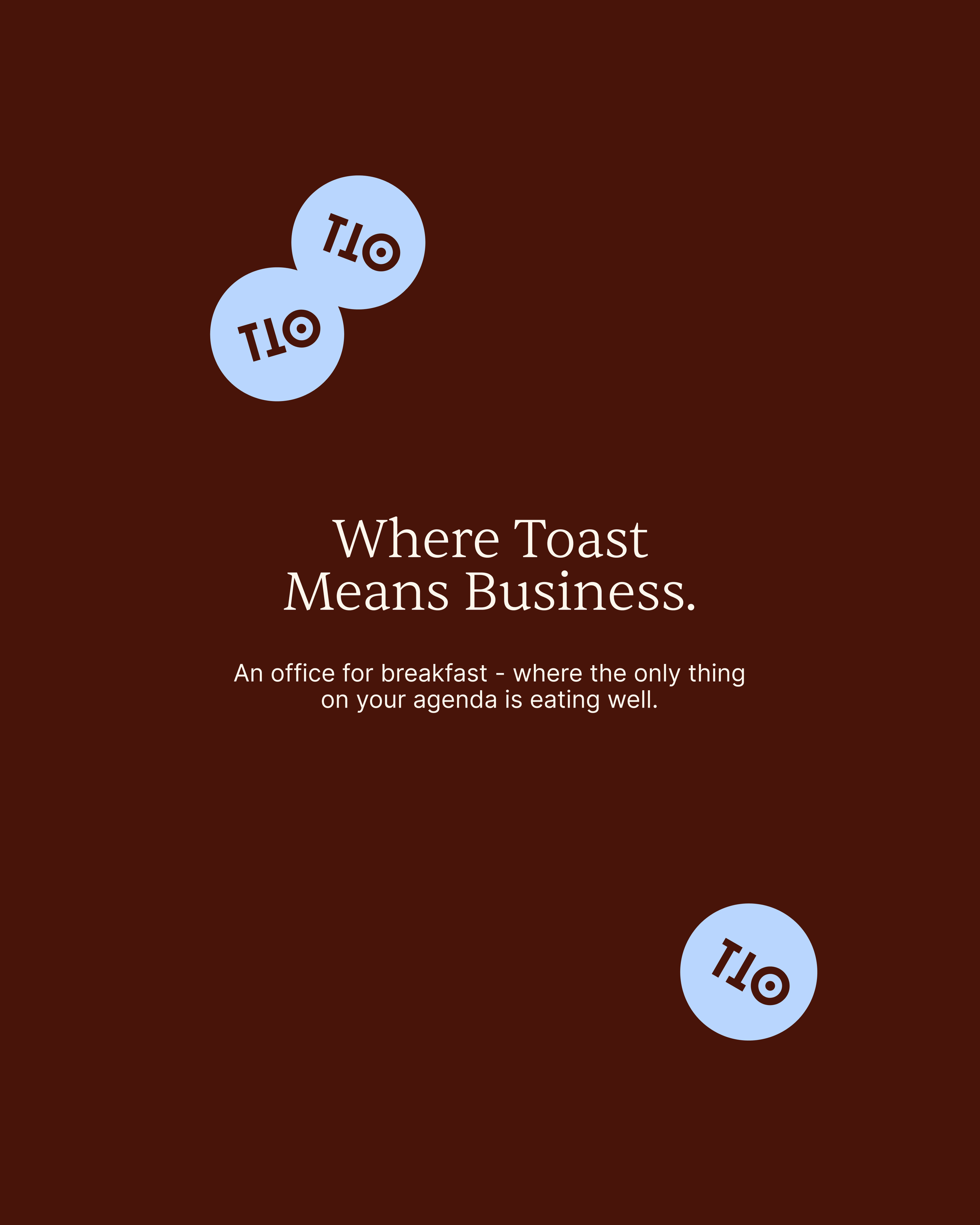
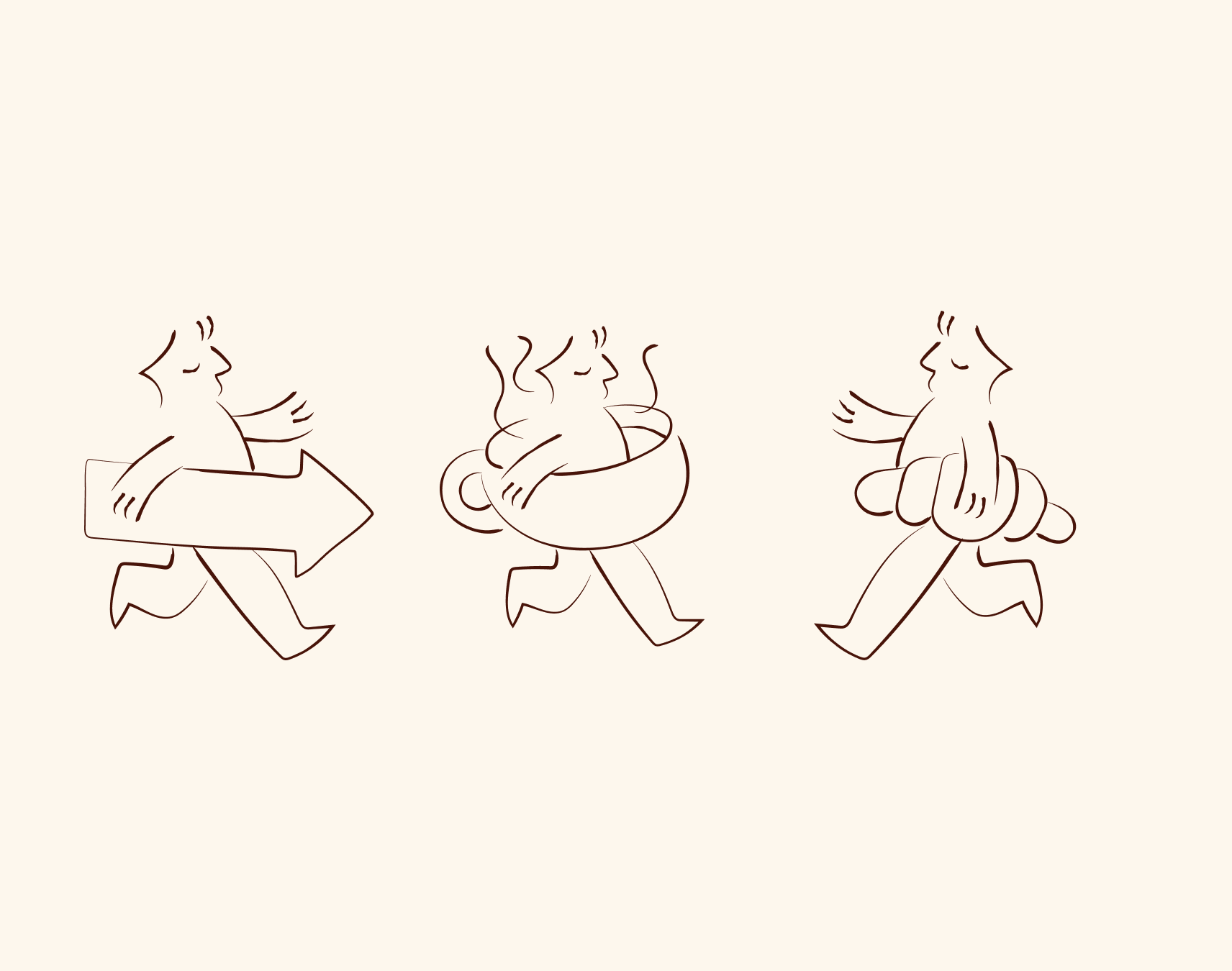
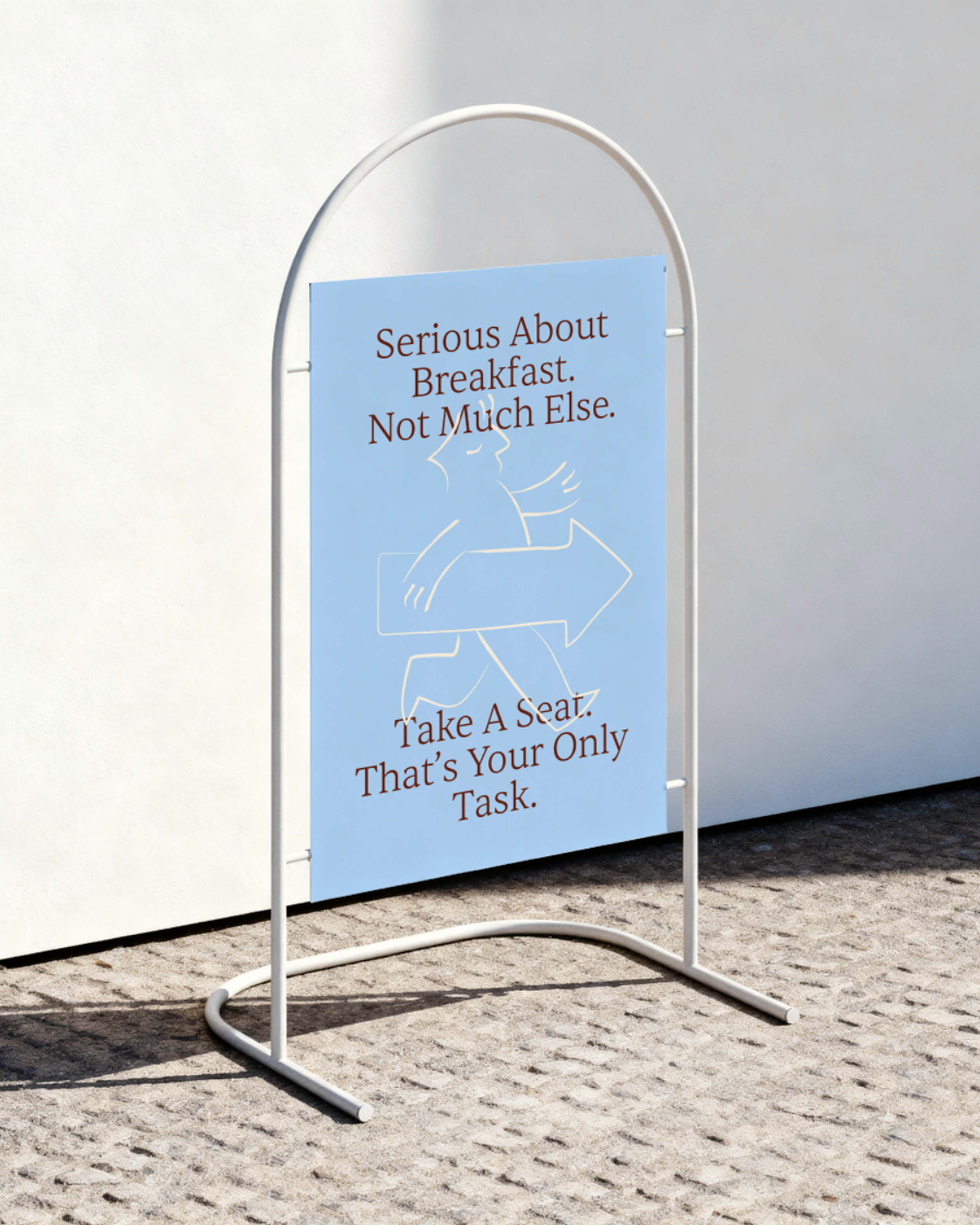
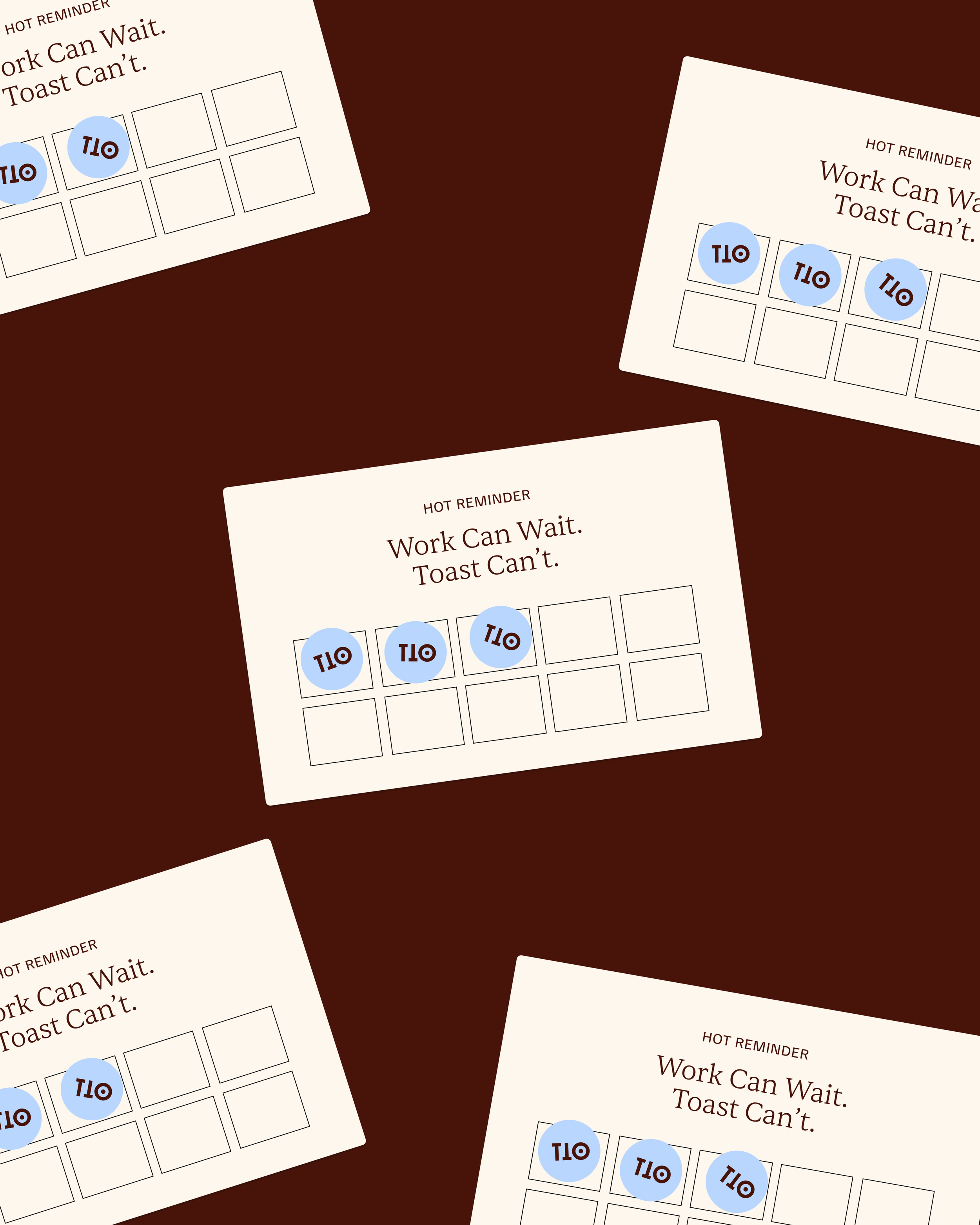
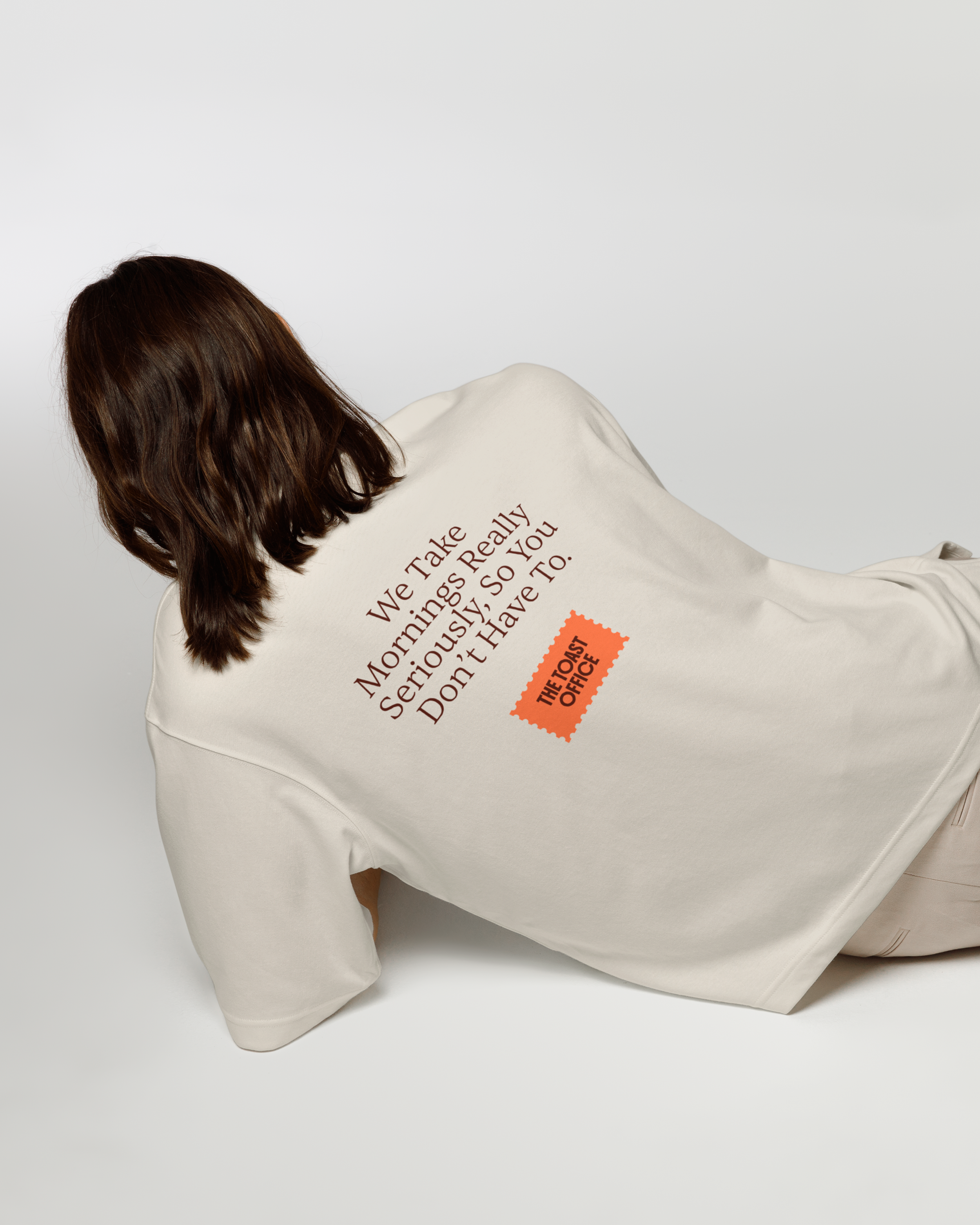
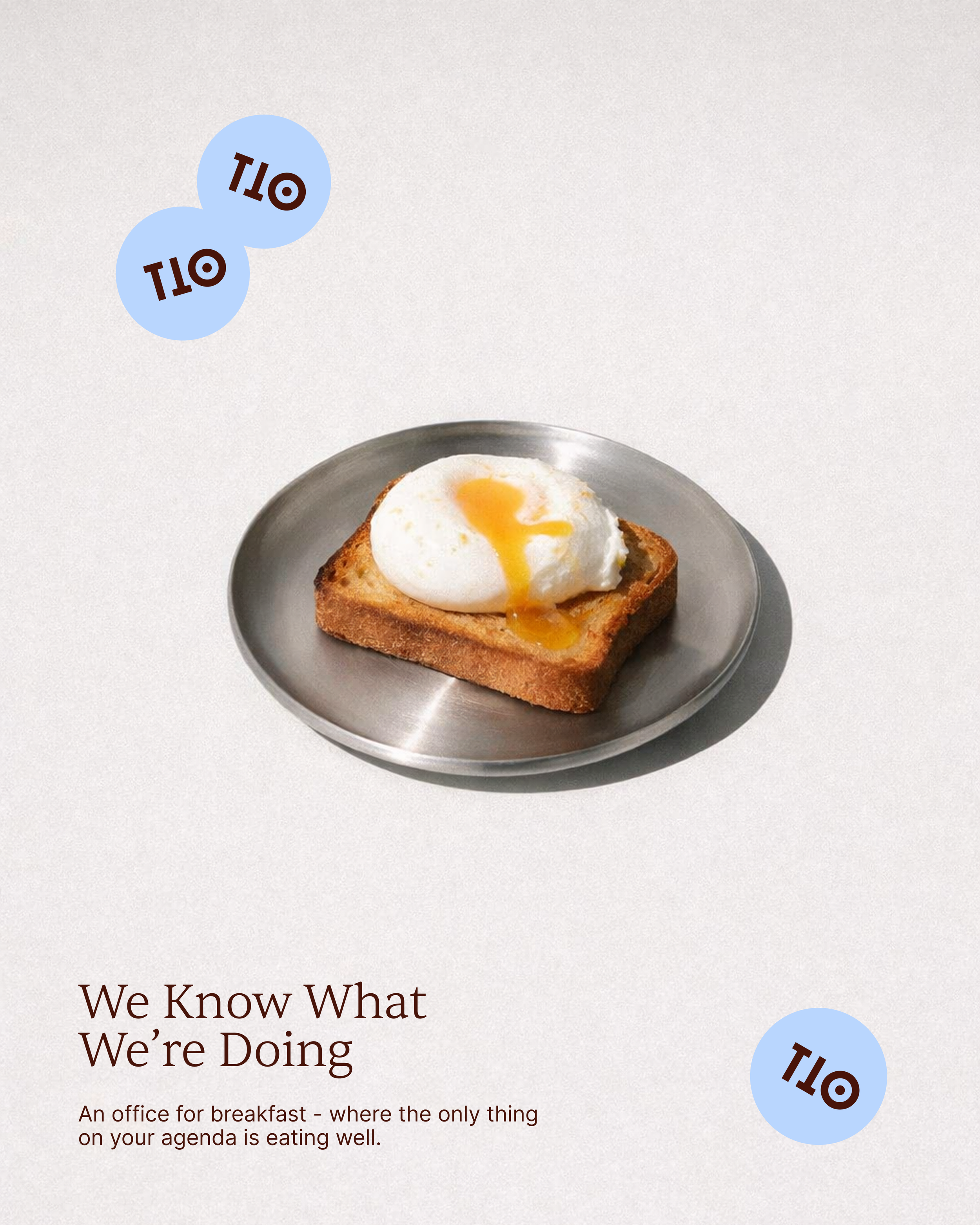
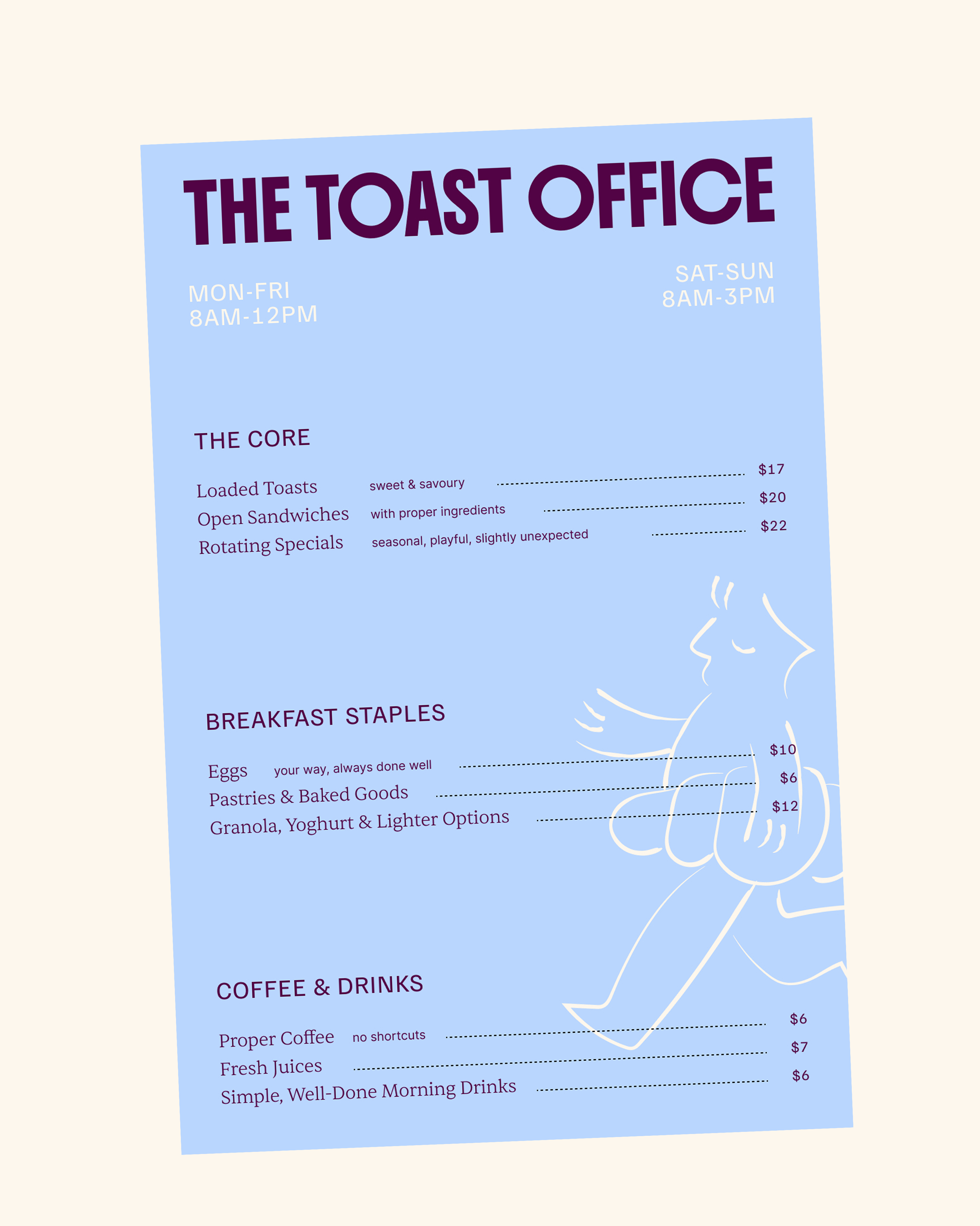
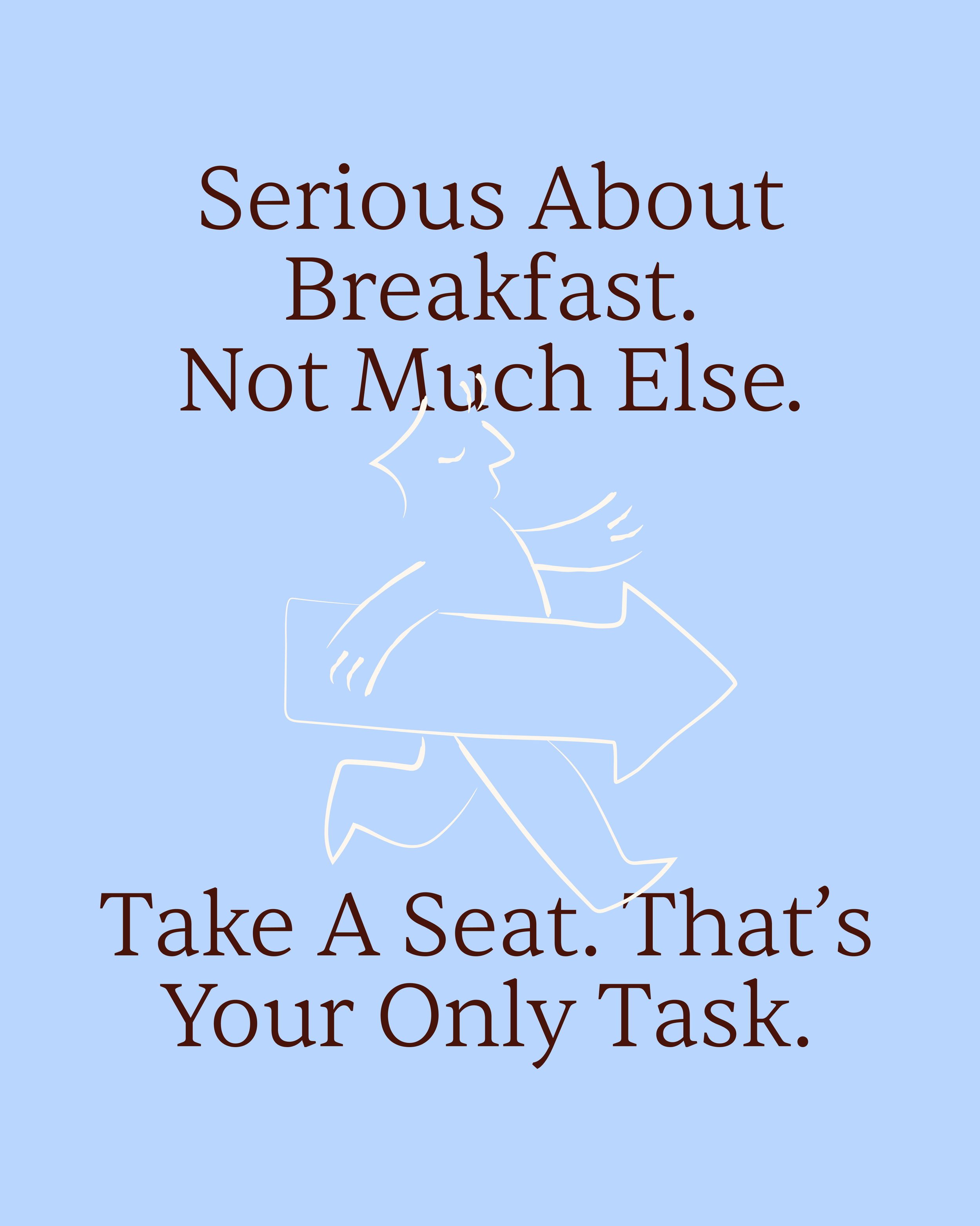
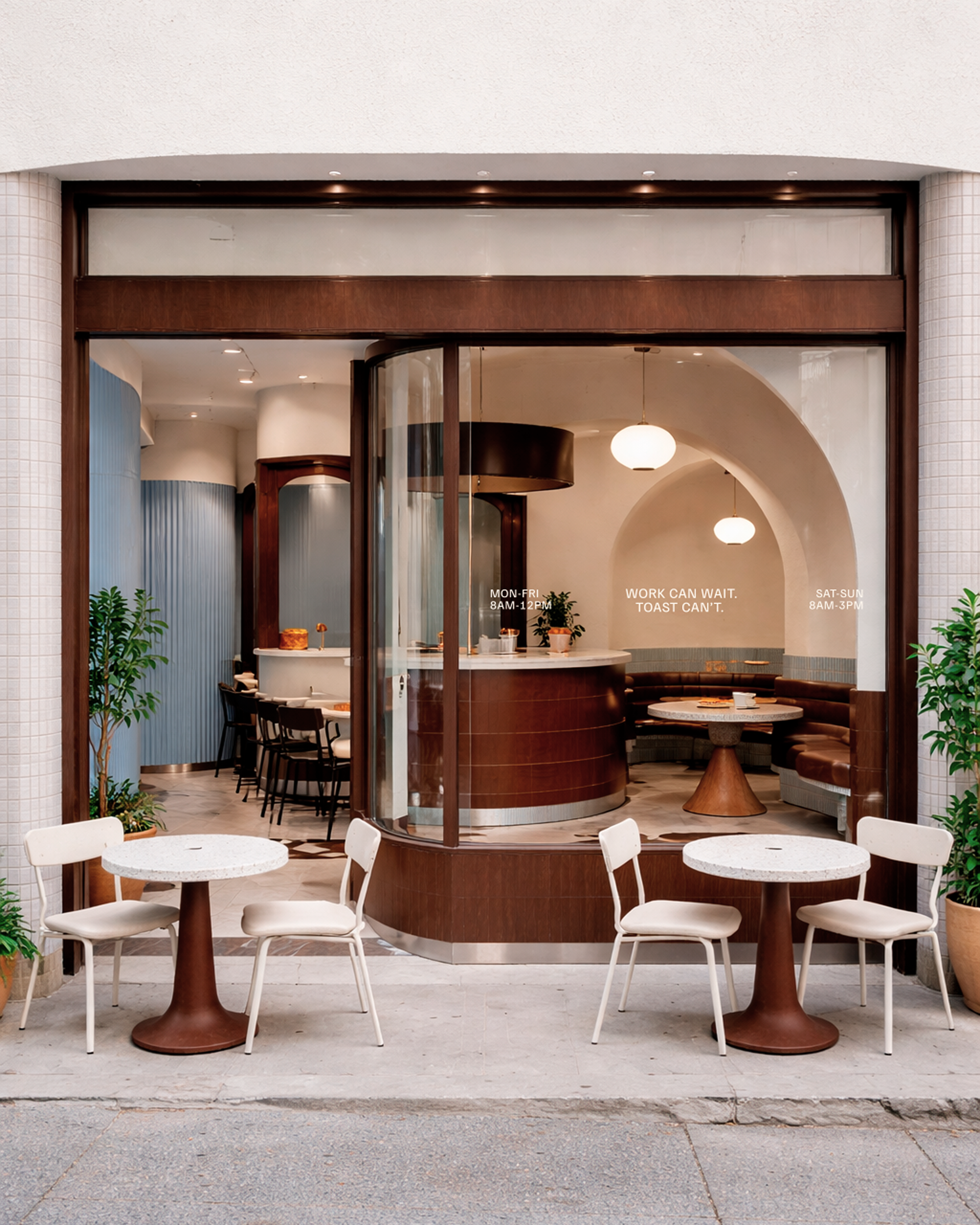
The name itself set the tone, borrowing from the language of work to frame something inherently soft, familiar and ritualistic, giving us a foundation that was both structured and slightly absurd in the best way. From there, the brand was built to feel playful, whimsical and quietly self-aware, leaning into puns and repetition not as decoration, but as a mechanism for consistency. “Work can wait. Toast can’t.” “Mornings, done properly.” “The office, reimagined.” These lines create a rhythm that mirrors the rituals of a morning routine. Visually, the identity balances this lightness with restraint, pairing a nostalgic, almost comforting palette with deeper, grounded tones, and combining bold, functional typography with more expressive moments to create tension between order and personality. Illustration plays a supporting role, introducing a recurring character that brings movement and charm without overwhelming the system. Every touchpoint, from menus and signage to loyalty cards, packaging, merchandise and digital, was designed to operate within the same set of rules, ensuring the brand behaves consistently while still feeling alive and flexible. The result is a brand that doesn’t take itself too seriously, but takes its role seriously enough to do it well, reframing the everyday act of breakfast into something considered, memorable, and worth returning to.