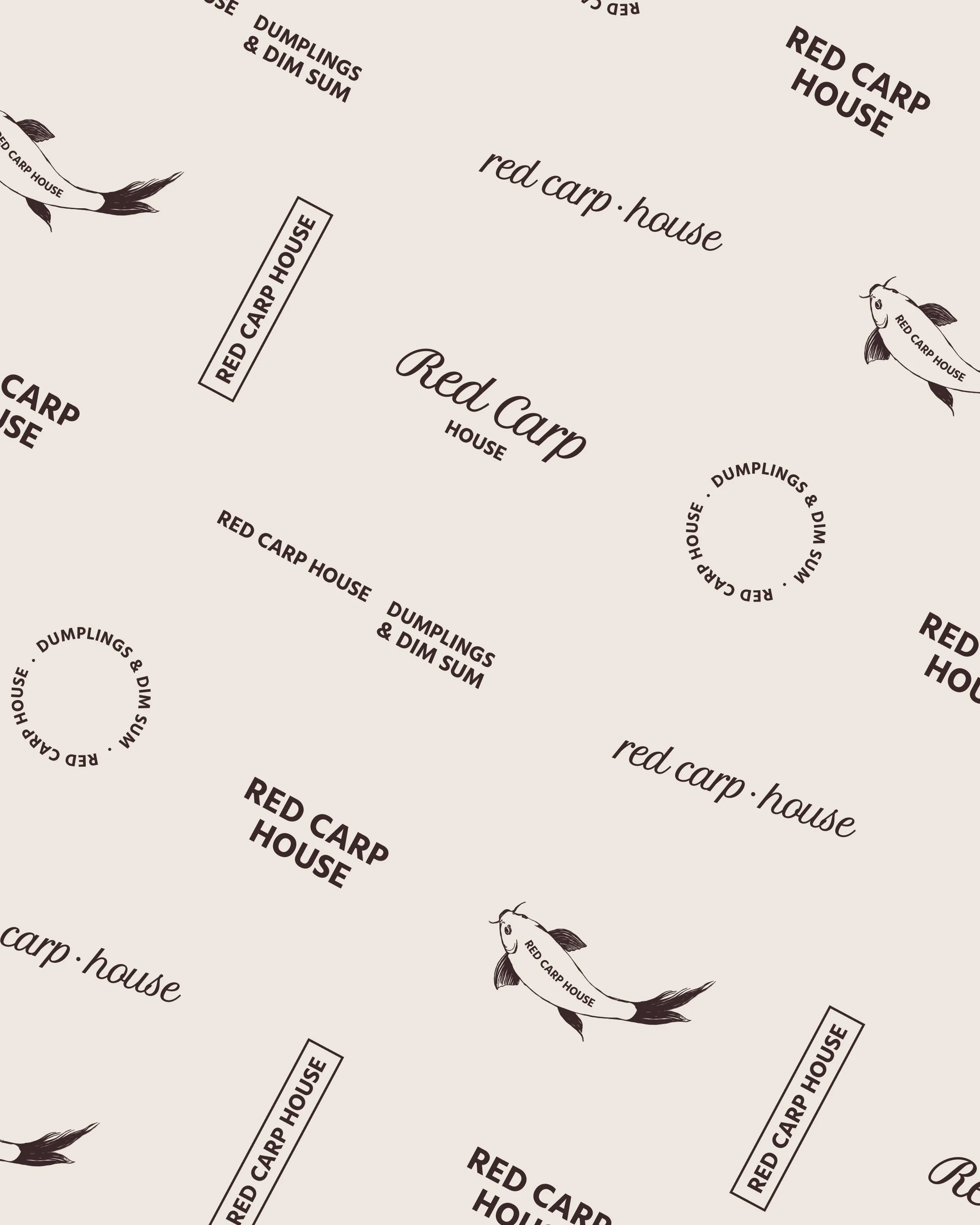
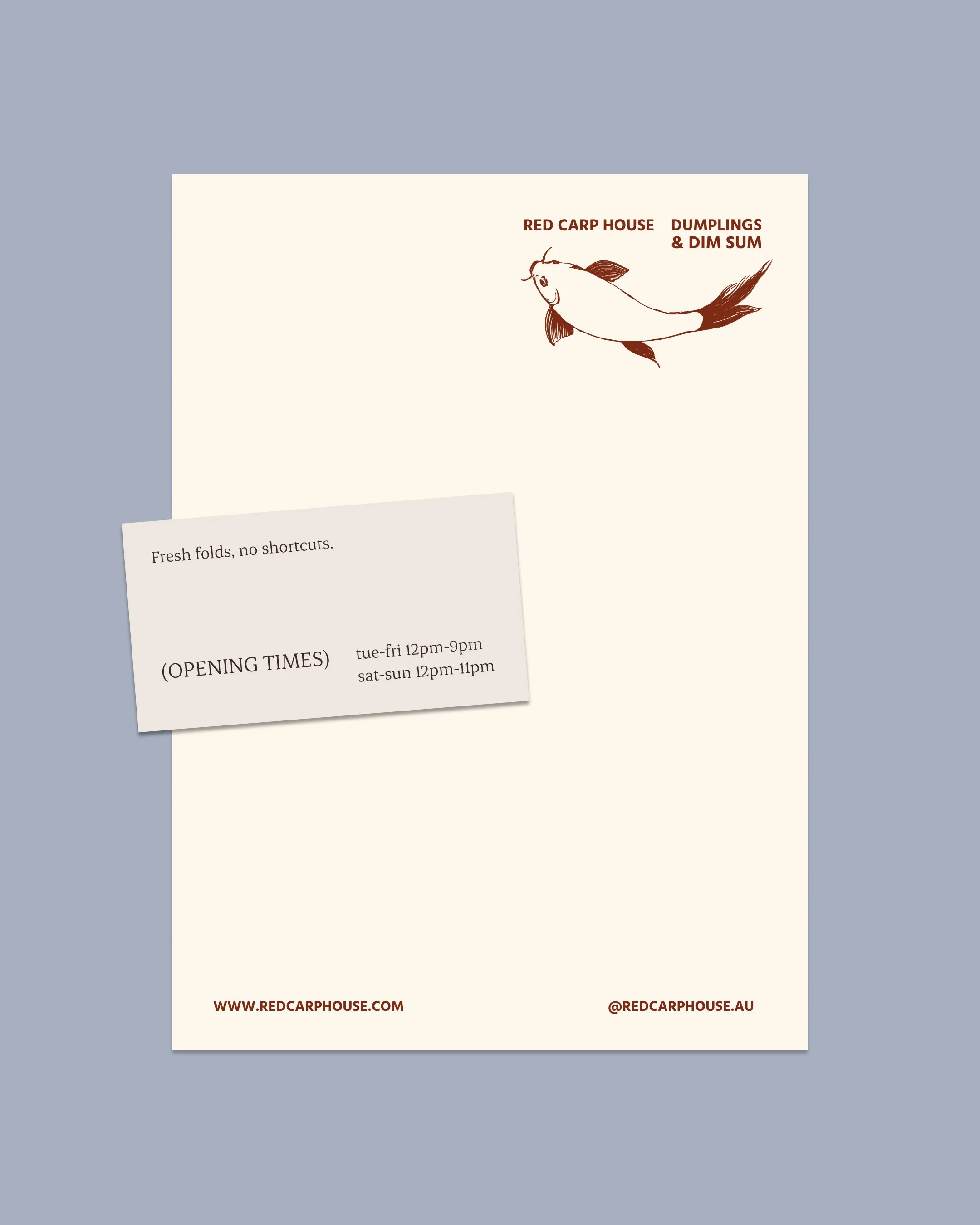
Red Carp House
Project
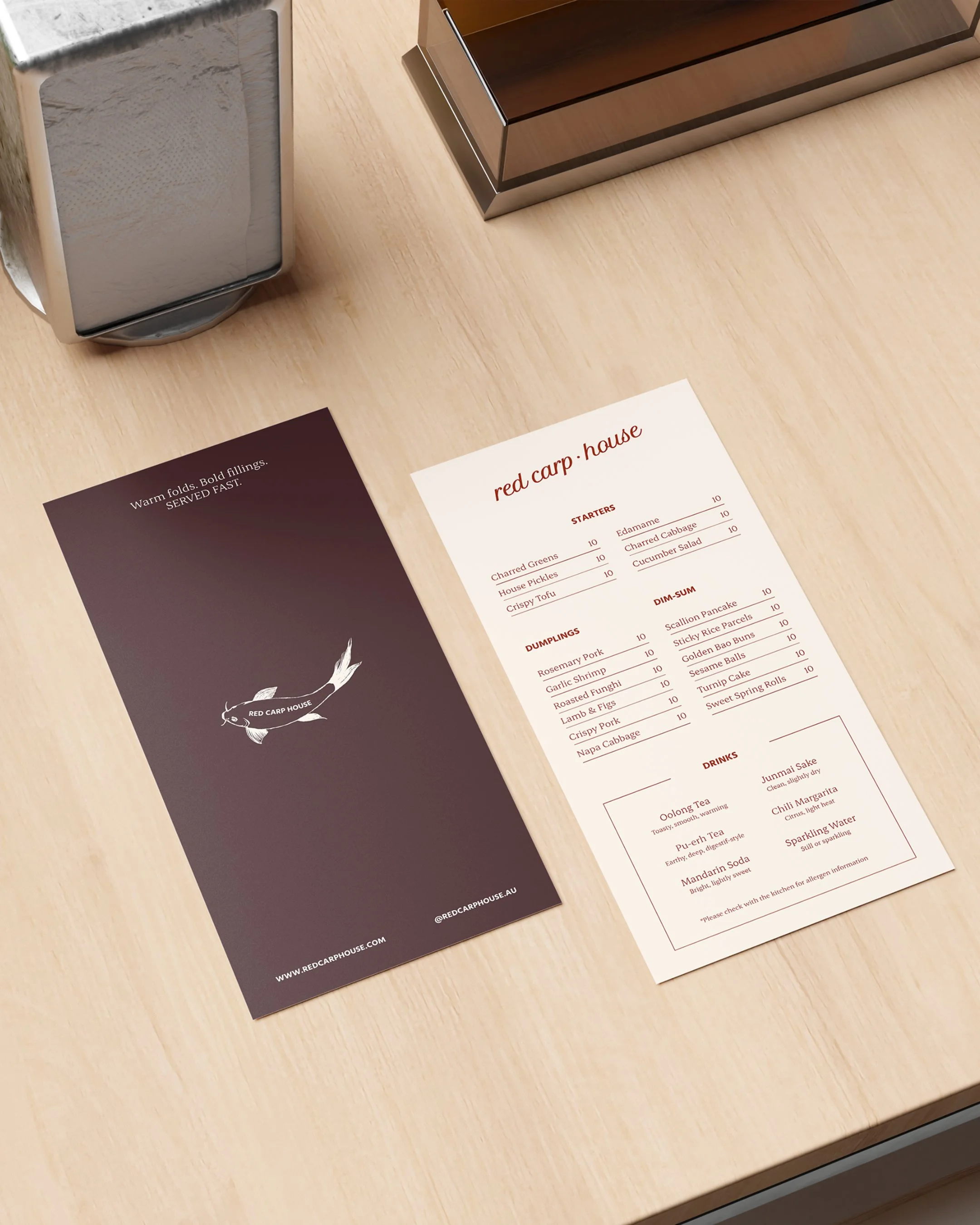
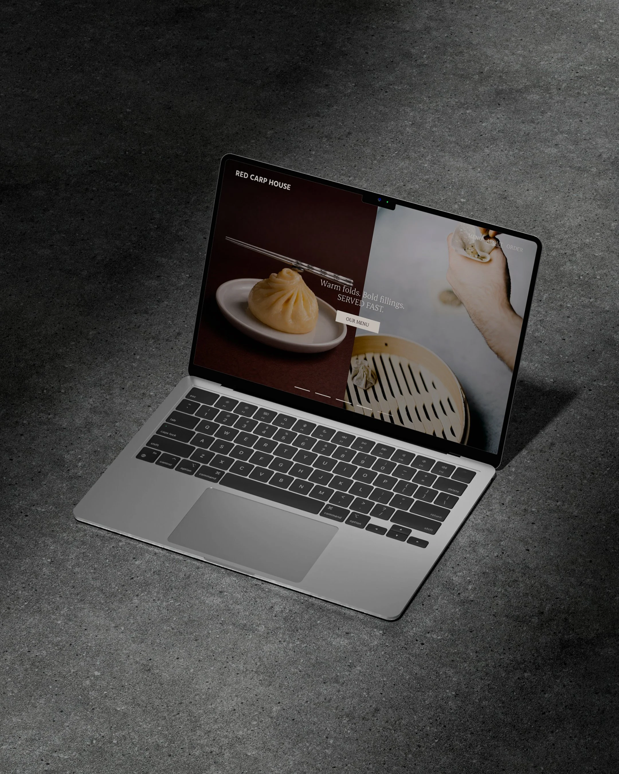
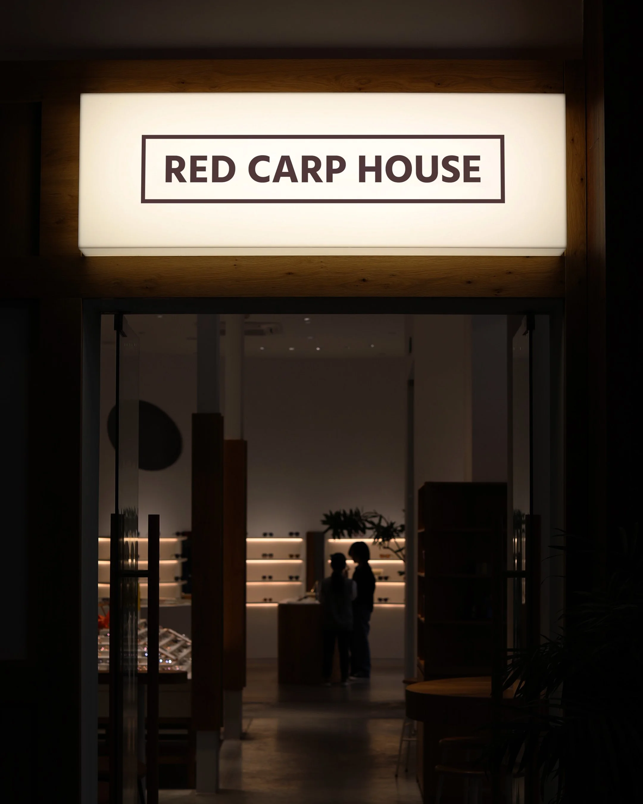
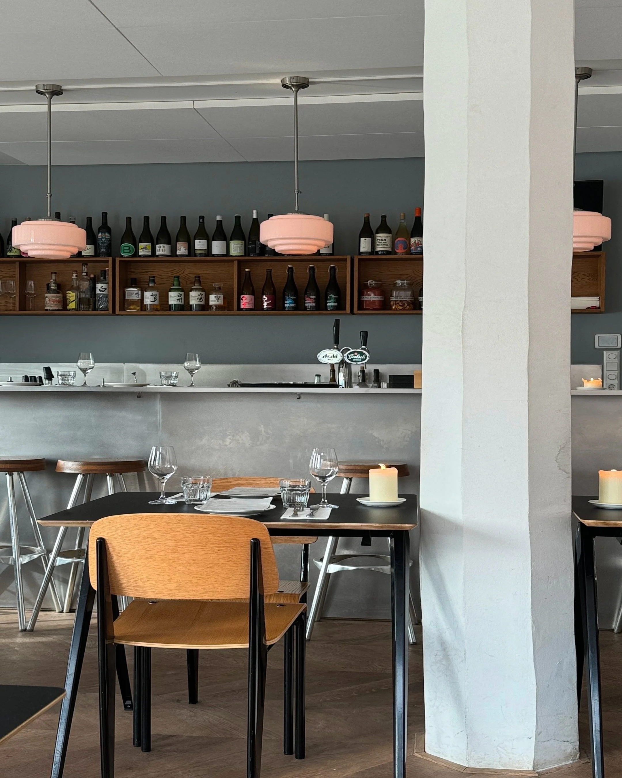
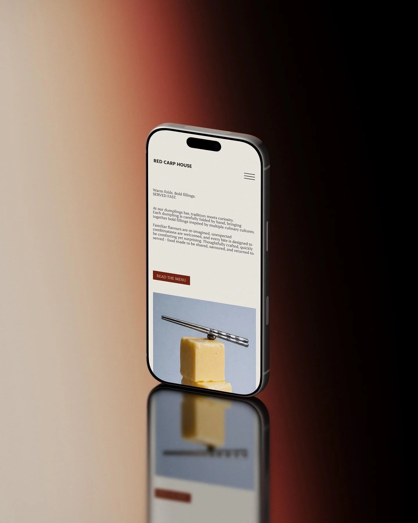
Brand Identity, Campaign Photography, Website Design, Packaging Design, Digital Design, Print Design
Scope
Website Development by The Local Folk
Collaborators
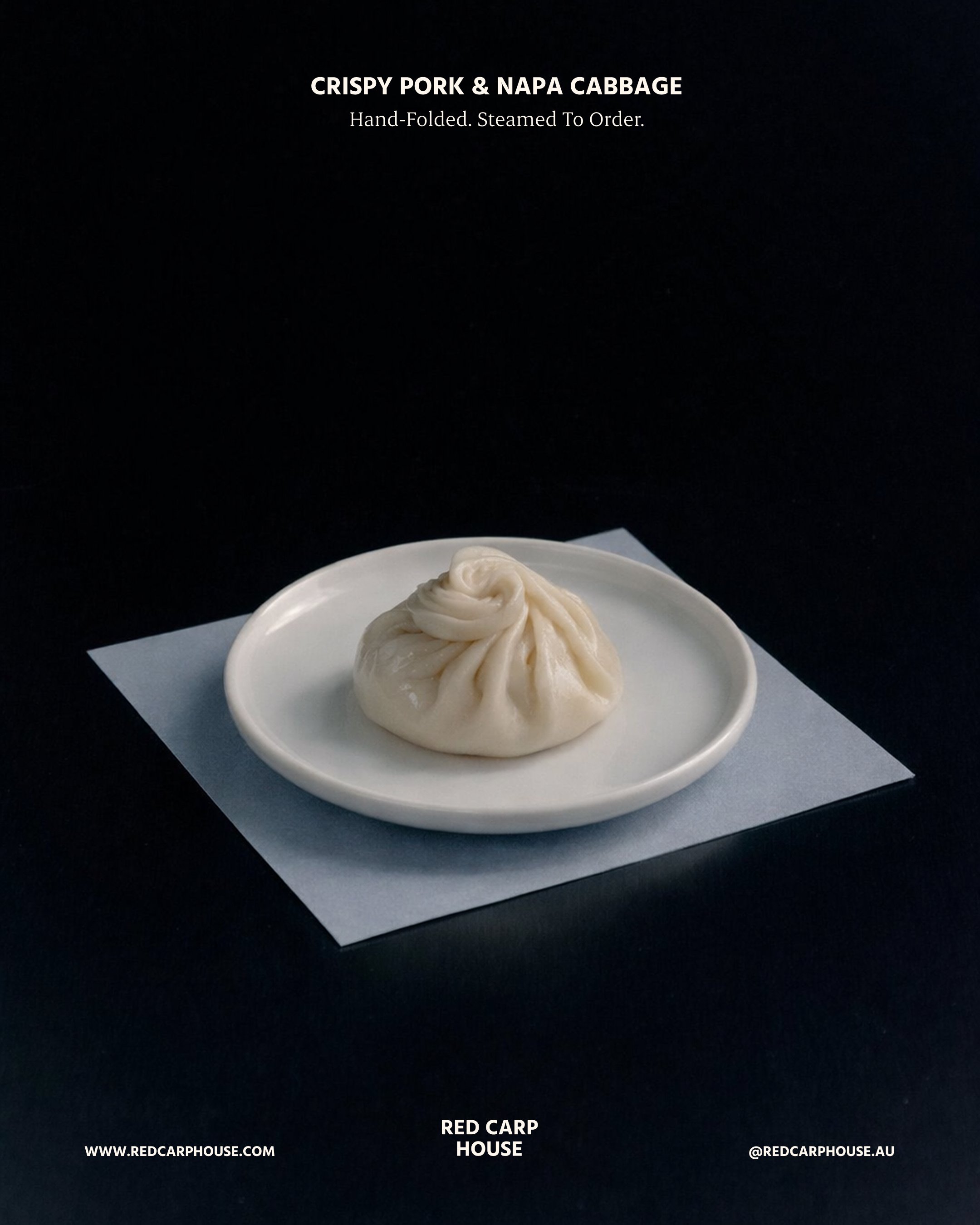
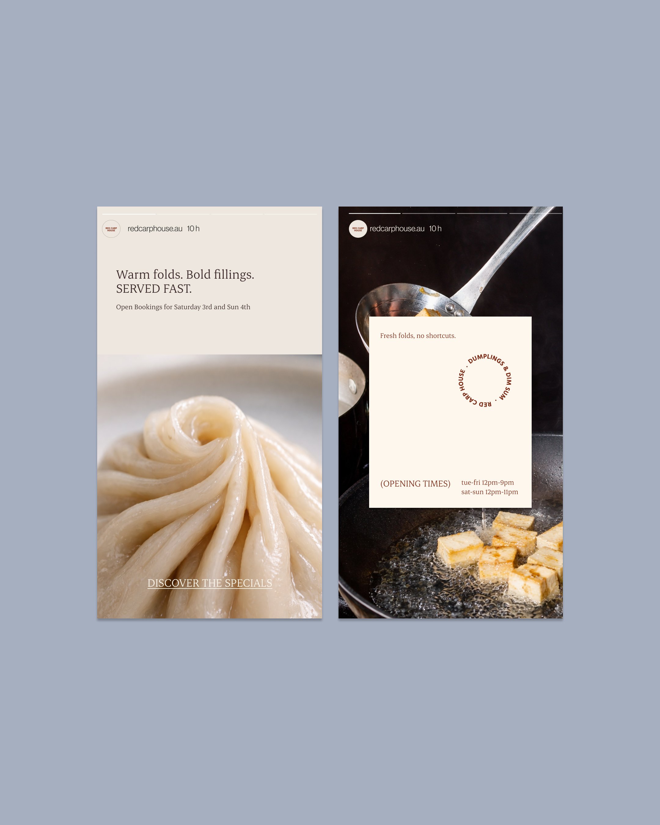
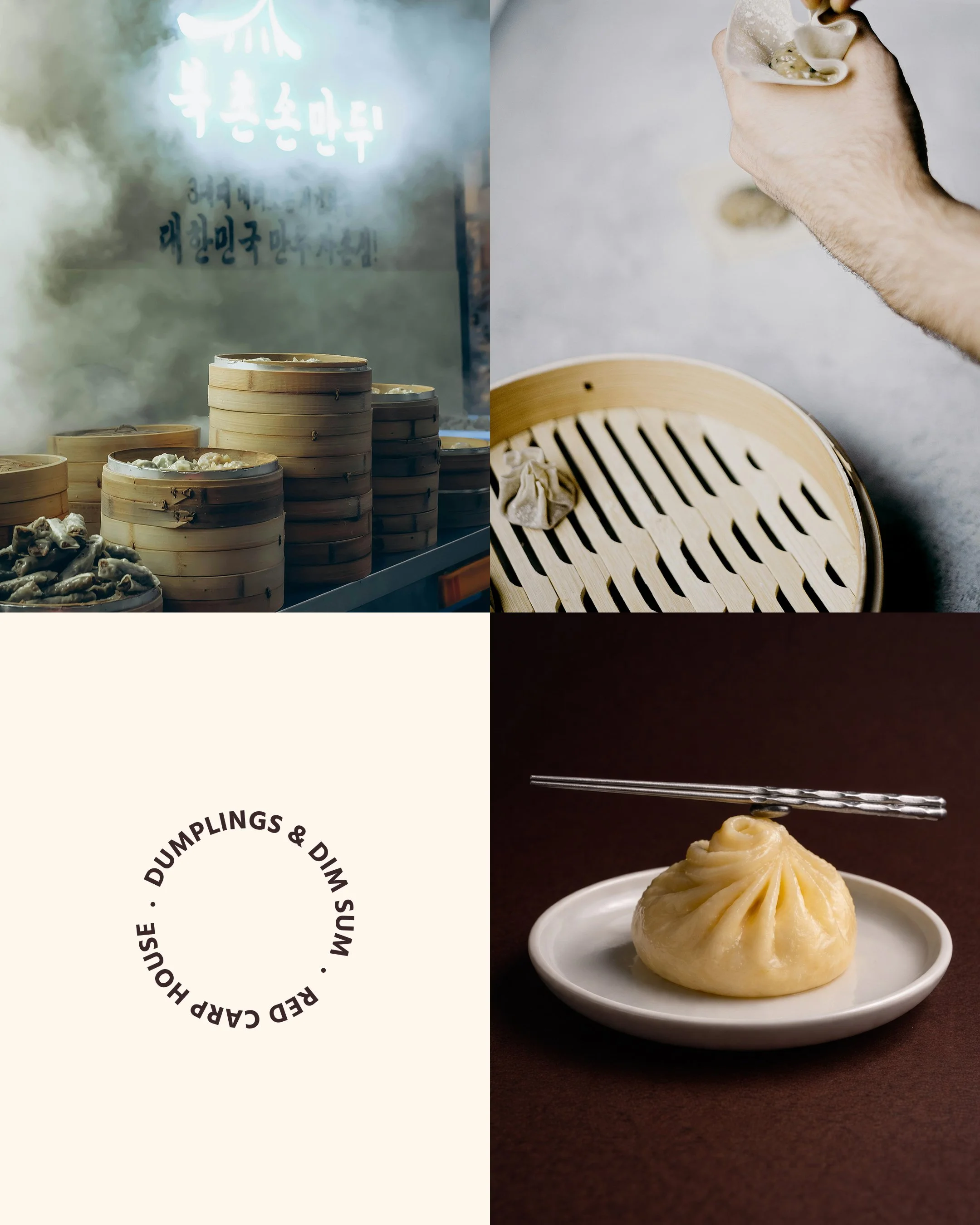
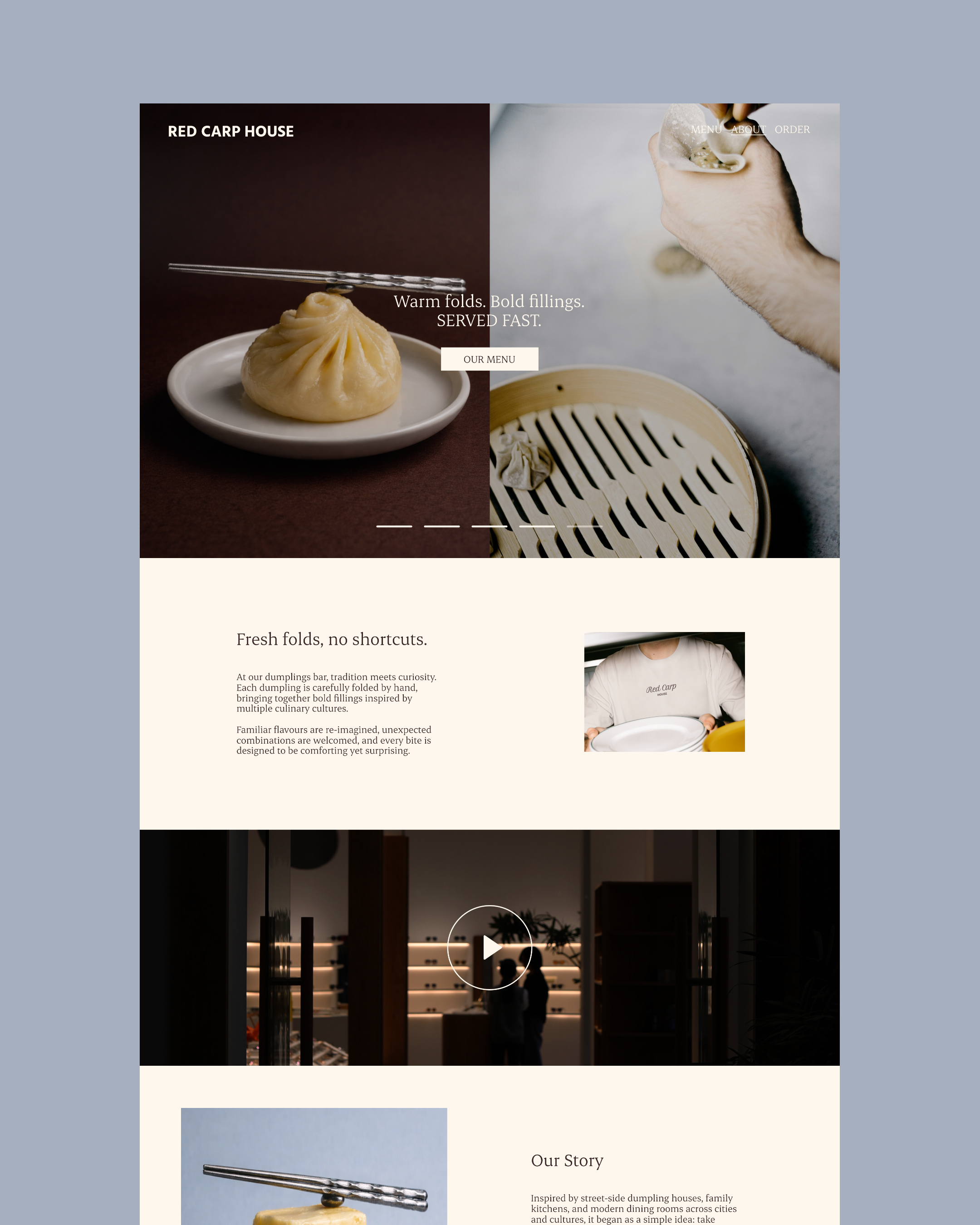
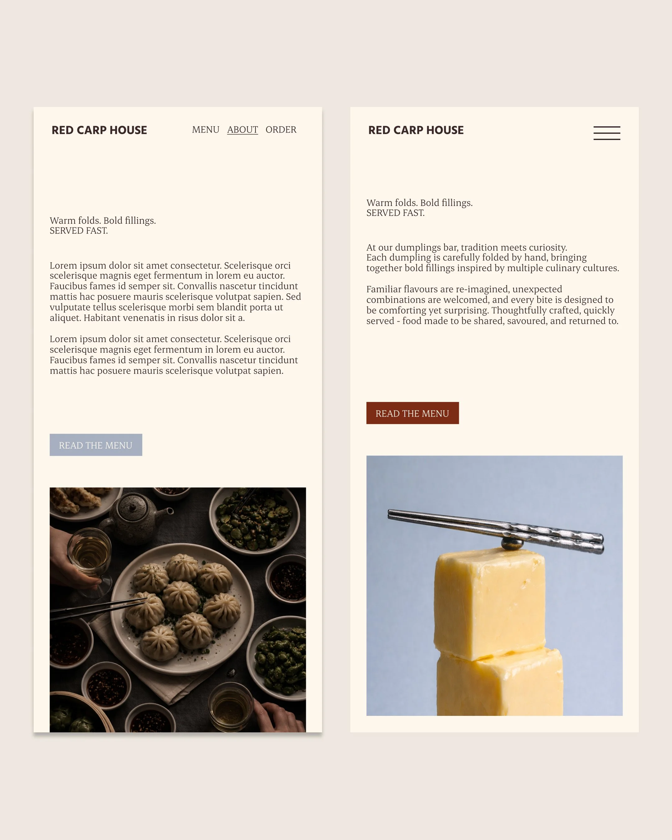
We fold slowly so you can eat freely.
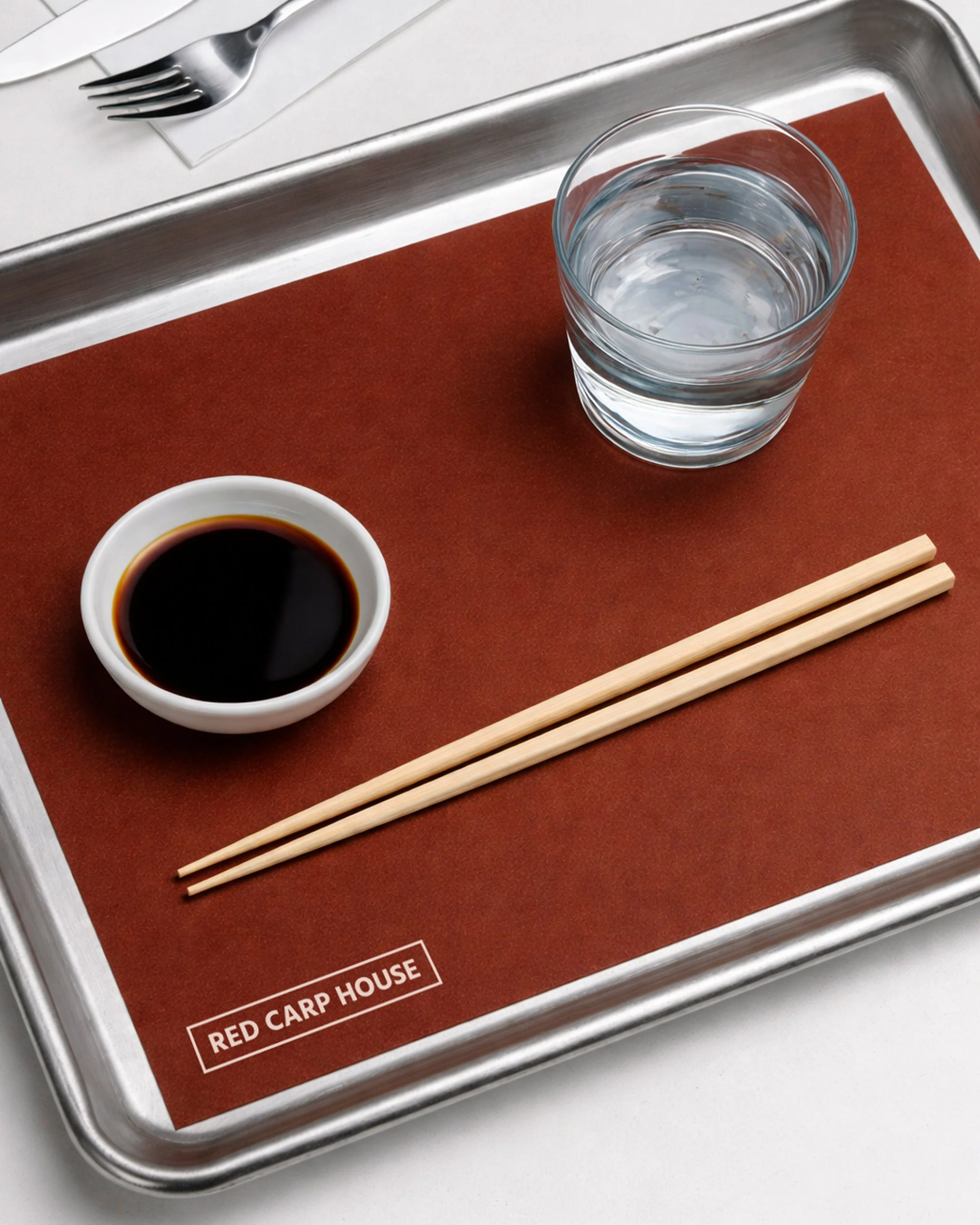
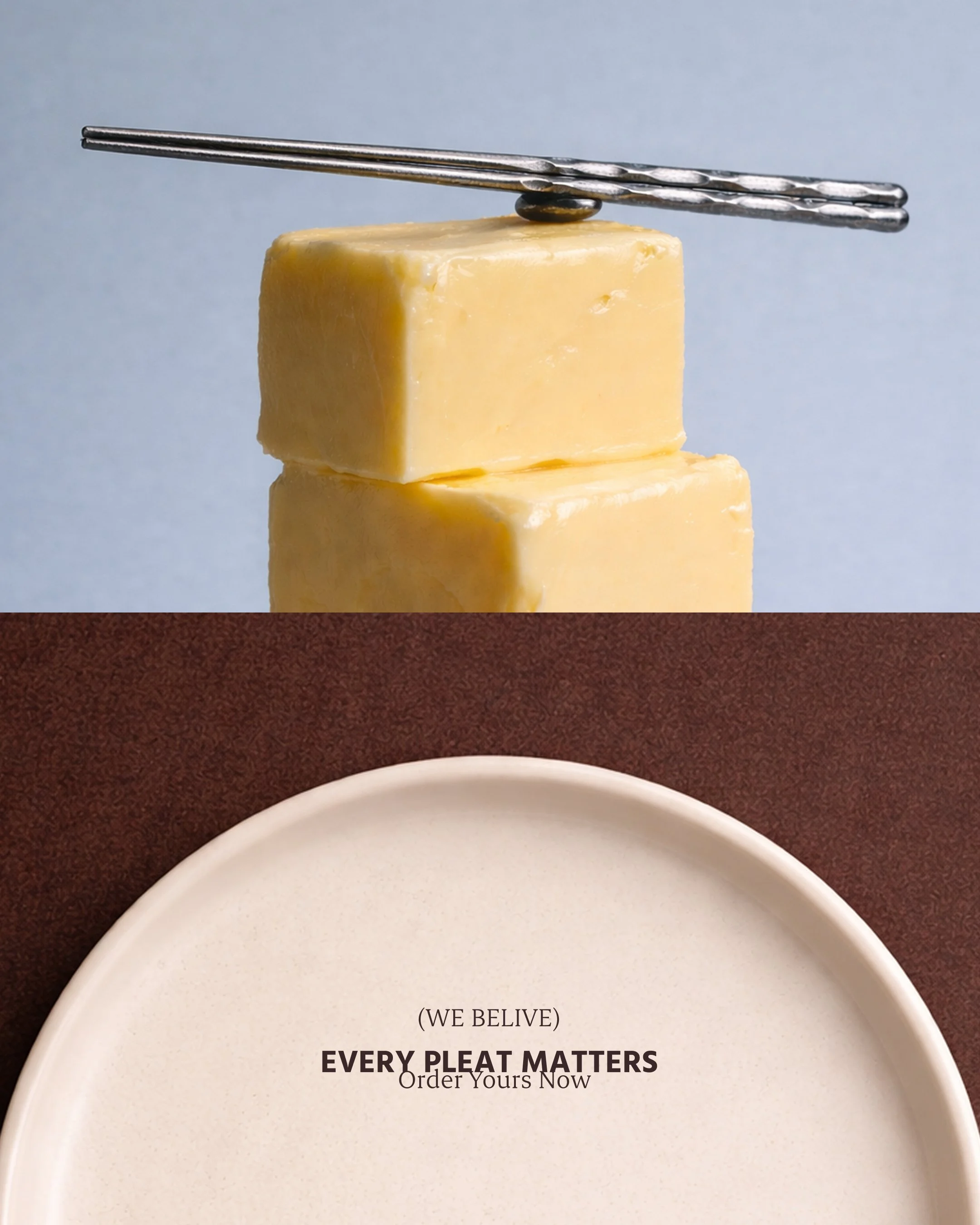
The Red Carp House identity is built on balance between tradition and reinterpretation, restraint and warmth, familiarity and curiosity. Grounded in classic culinary craft, the visual language avoids nostalgia and excess. Instead, it leans into clarity, texture, and considered simplicity. Every element is deliberate, allowing the brand to feel timeless rather than themed. Red Carp House is built on the belief that the simplest things, done well, matter most. At its heart is a respect for traditional dumpling-making — hand-folded, considered, and never rushed — paired with a curiosity for flavour that looks beyond borders. Familiar fillings are re-imagined, unexpected combinations are welcomed, and every dumpling is designed to feel comforting yet quietly surprising. Food that feels nostalgic, but never stuck in the past.