Scope:
Brand Strategy, Brand Identity, Website Design, Packaging Design
Collaborators:
The Local Folk
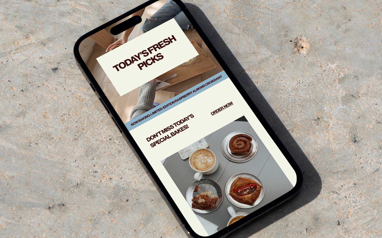
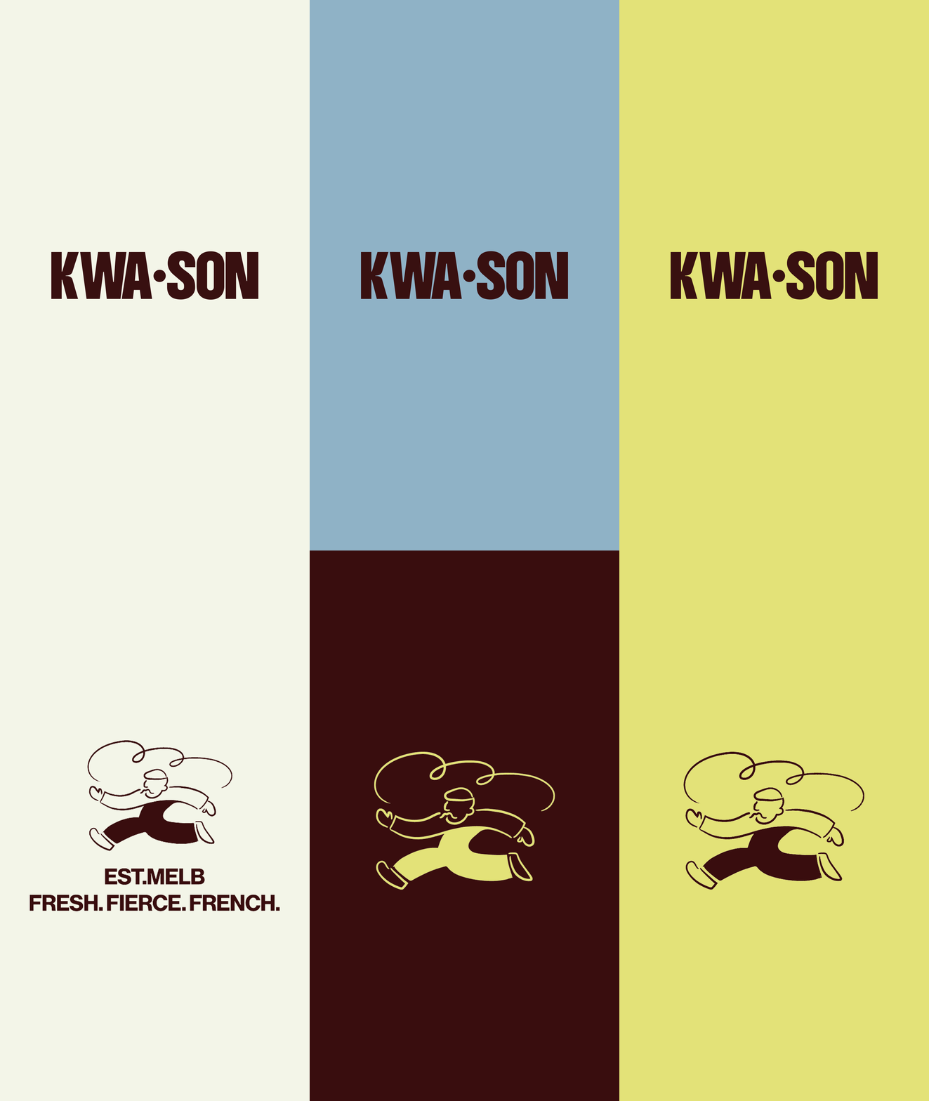
KWA•SON is a French-inspired bakery brand with a little more attitude than your average croissant shop. We created an identity that takes the charm of traditional French patisseries and gives it a playful, modern twist. At the centre is our custom illustrated character, full of personality and hiding a croissant within its design. Paired with bold, heavyweight typography and a striking blue and white palette, the identity feels instantly recognisable, full of character and anything but ordinary.
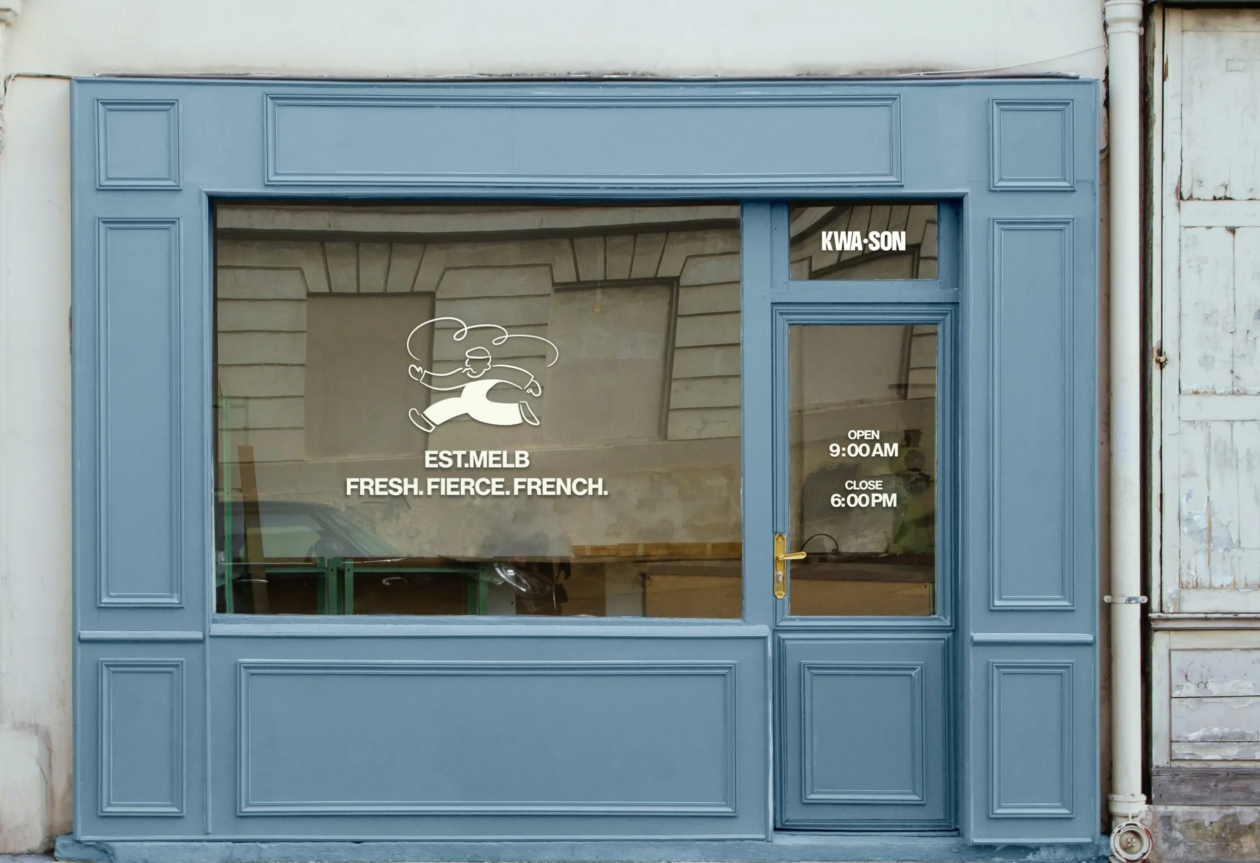
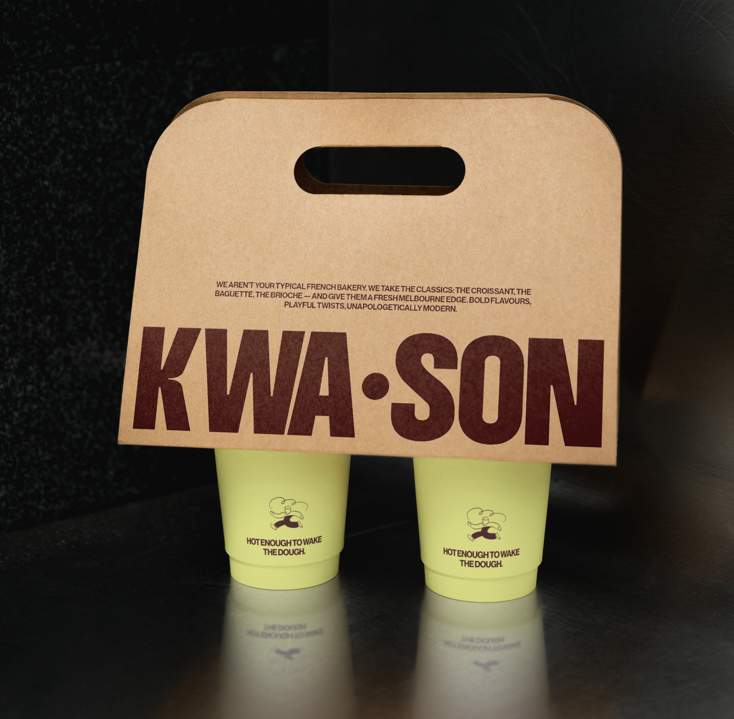
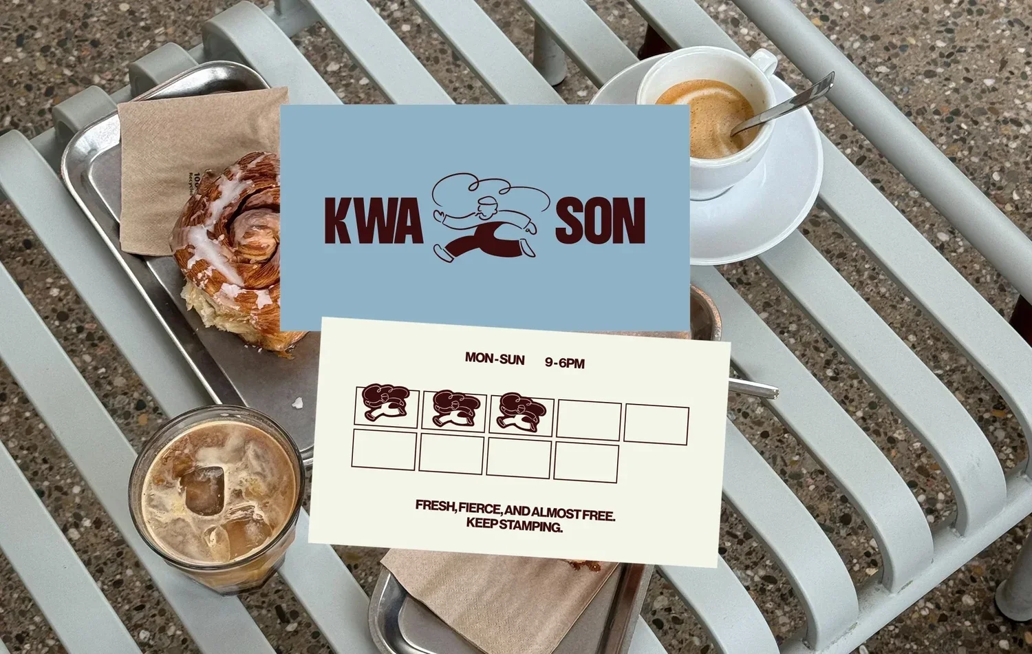
For KWA•SON, the brand doesn't stop at the logo. Packaging and print became a huge part of bringing its personality to life, turning everyday interactions into something worth remembering. From pastry bags and takeaway cups to coffee loyalty cards, every piece was designed to carry a little bit of the KWA•SON story. The illustrated character, oversized typography and playful details work together to create a visual language that feels consistent without becoming repetitive. It's proof that even the smallest touchpoints can make a big impression.